For those of you following my blogs over the last few images, you may have noticed a number of the Benefits enhancements delivered were targeted to improve employee usability for fluid benefits enrollment. The latest enhancements just released in Image 49 is no exception. I will cover both the newly released enhancements and highlight a few of the other features that you may have missed that would be great for your fall open enrollment.
A number of these came directly from the Ideas Lab or from listening to your thoughts in forums, focus groups, or conferences. As each organization approaches enrollment a bit differently, many of these are configuration based. This provides you the flexibility to control the look and feel.
Some employees have had difficulty in finding the Submit and Preview button during the enrollment process. So where is the best place for that button? On the Ideas Lab and even in focus group meeting there was no clear consensus of the best placement of the button, so we delivered three configurable options. You decide which placement is best for your organization. In addition, you can add a Back to Top button for those long enrollments too. This setting is at the Benefits Installation level so that all of your enrollments will have a consistent feel and employees can find them in the same place no matter the type of enrollment.

Some focus group members that felt after three or four years of doing Fluid Open Enrollment, the employees understood that the Submit and Preview button was located in the Enrollment Summary Section.
While, others requested the Preview Statement and Submit button was best placed at the top of the page. If you use the Contact Information the button automatically slides to the left so that it is not covered over. (Read further in the blog for another feature we delivered a few images ago for configuring the Contact Information.)
Then a few insisted that the Preview Statement and Submit buttons should always be at the bottom of the page.
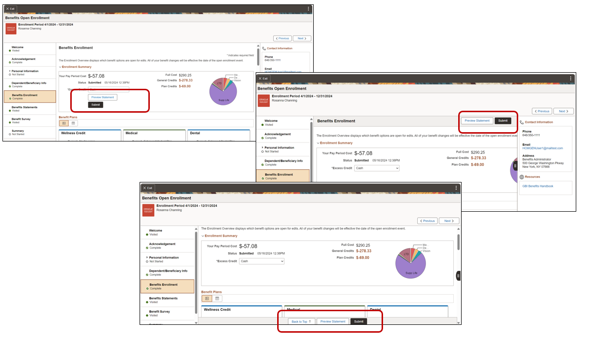
Here you can see the three different locations that you can choose from.
Another request was the ability for employees to see the previous pledge amount for Flexible Spending Accounts (FSA) and Health Savings Accounts (HSA) during fluid enrollment. Before the employee had to navigate out of the enrollment process to the Benefits Summary page or their previous Benefits Statements to see this data.

To bring Insights closer to the Benefits Team, we have now provided the ability to embed them into the WorkCenters. In this example, the Benefits Team can now view the visualizations in the Open Enrollment Insights directly in the Benefits WorkCenter. Without leaving the WorkCenter you can understand how the enrollment process is progressing.

Check out the Image 49 Highlights video for more information.
With the 2025 Open Enrollment season coming soon, here are some additional blogs that might be helpful as you review this year’s Open Enrollment. The majority of these were targeted to help your employees to have a better user experience while in the system and were requested by customers like you.
Benefit Plan Comparison Part 1 – Image 43 and Benefit Plan Comparison Part 2 – Bells and Whistles – Image 44
Life Plans – Dependent Eligibility and Dependent Rules for Dependent Relationships Part 1 – Image 42 and Dependent Rules Part 2- Image 43
Configurable Benefit Statements – Image 44
Assist in Preventing Duplicate Dependents – Image 45
HSA Worksheets – Powerful Benefits Enhancements in Image 46
Enrollment Right Panel Configuration – Powerful Benefits Enhancements in Image 47
And of course the Open Enrollment Insights can provide great statistical and reporting for your Benefits Team. The PeopleSoft Benefits Insights (youtube.com) video is a great intro for you and your team to understand the value.
To see what other customers have successfully deployed Chatbots for Benefits, Benefits Plan Comparison, Benefits Open Enrollment Insights, and other features head over to the Feature Innovators (oracle.com)
