
What’s the news?
The news is the release of the Theme Editor in OGL 25B, which simplifies the process of customizing the OGL theme. Previously, users had to edit HTML and CSS files to make changes, requiring technical knowledge. Now, with the new WYSIWYG (What You See Is What You Get) interface, content developers and administrators can easily adjust the theme’s appearance without needing to touch any code. This feature provides a more efficient and user-friendly way to customize elements like tooltips, backgrounds, text, buttons, launch widget, smart tips, and help icons.
Why does it matter?
The new Theme Editor makes it easier for anyone regardless of technical skill to customize the OGL theme. By eliminating the need for coding, it saves time, reduces errors, and makes the process more efficient. This means faster, simpler customization for elements like tooltips, buttons, and backgrounds, leading to a better user experience without the technical hassle.
How will our customers benefit?
- Easier Customization: No coding required customers can easily modify OGL theme.
- Faster Changes: Easily make theme adjustments without the need for any technical skills.
- More Control: Greater flexibility to personalize the user interface according to specific needs.
- Error Reduction: Less chance for mistakes, as customization is simplified and more intuitive.
- Improved Efficiency: Customers can achieve desired changes in less time, enhancing overall workflow.
Potential Use Cases for how this may be used?
Use case: OGL comes with a default Redwood theme, but it needs to be customizable to match the branding of each company that uses it. As many users may not have experience with HTML or CSS, a straightforward, user-friendly interface is essential for easily customizing the OGL theme to match their brand.
User flow:
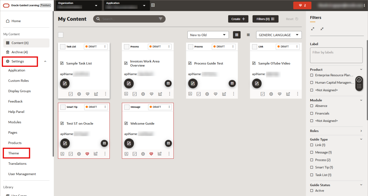
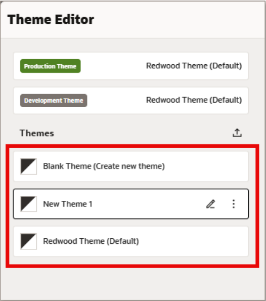
- From the OGL Console, select Settings > Theme
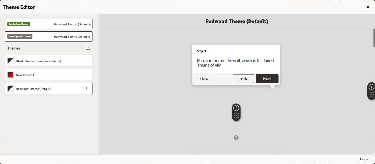
- The Theme Editor modal opens:
- In the Themes section, users can choose from a list of available themes to edit or create a new Blank Theme.
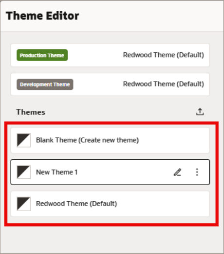
- Select the Edit (

) button next to any theme to open the Theme Settings for the selected theme.
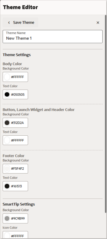
- The following screenshots depict which theme elements will be affected by each theme setting:
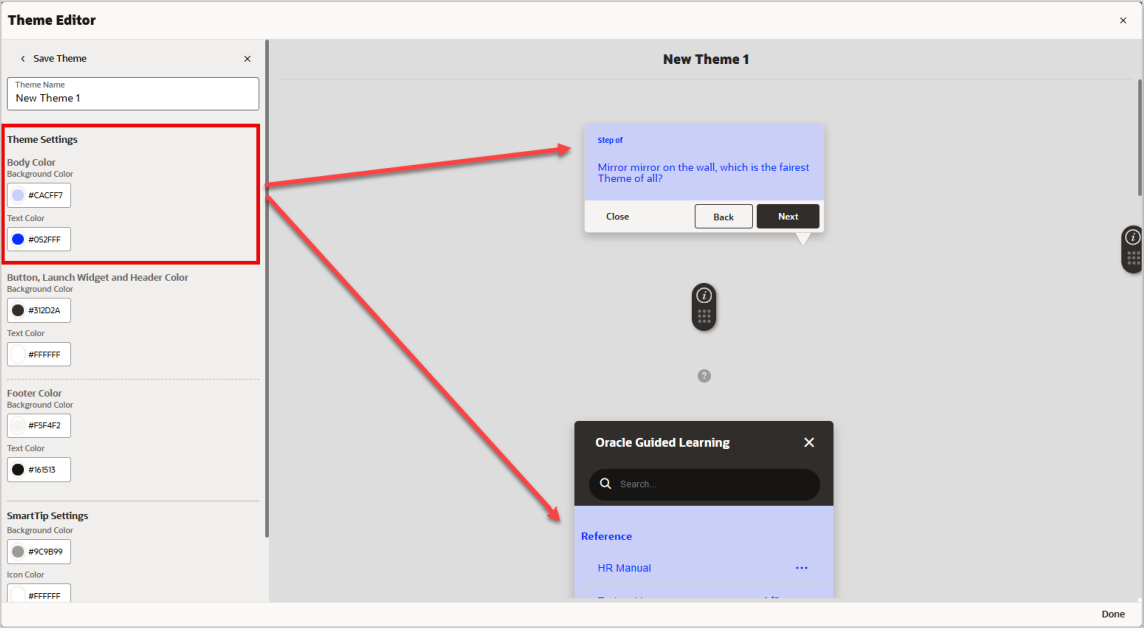
- Body Color – Background and Text:
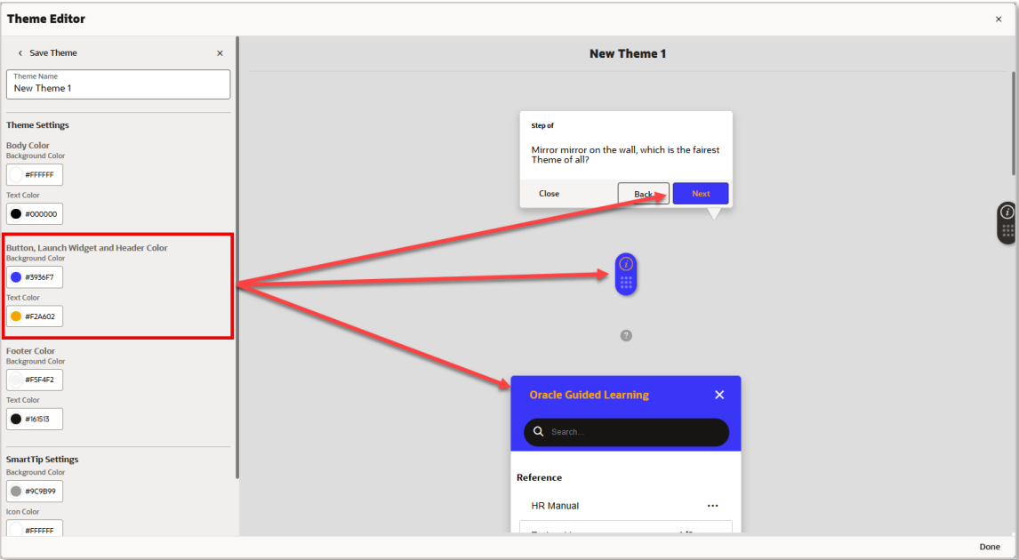
- Button, Launch Widget and Header Color – Background and Text:
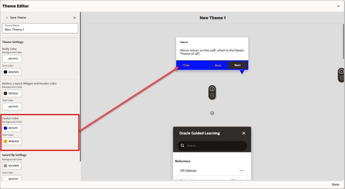
- Footer Color – Background and Text:
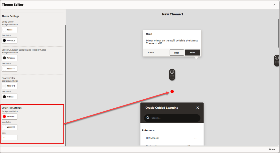
- SmartTip Settings – Background Color, Icon Color, and Icon (character):
- Using the Color Picker
To change the color for an element, select the circle on the left of the color setting to open the color picker. Colors can be selected by dragging the color slider to a desired hue, then selecting the desired shade of the color above. To pick a color, move your mouse cursor about the color picker (or use the arrow keys on the keyboard), then click on the desired color (or press ‘Enter’). Once selected, the color code will be displayed in the color field as a Hexadecimal code value.
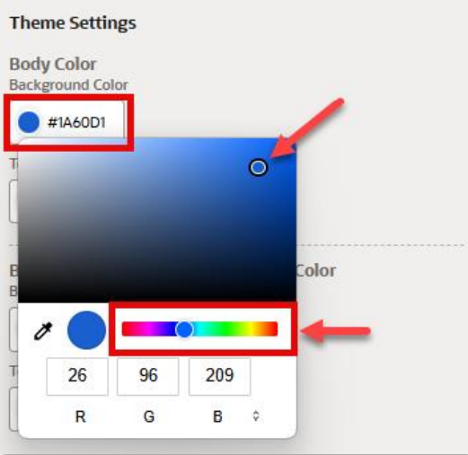
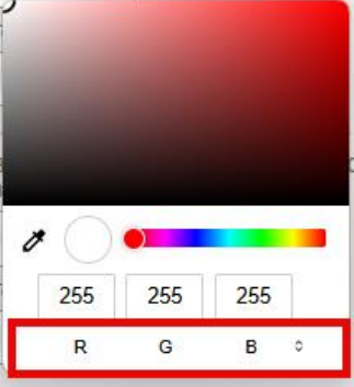
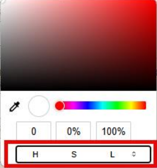
To change the color model, select the arrows ( ) to cycle between RGB, HSL, and HEX color modes.
- RGB (Red, Green, Blue) Color Mode:
- HSL (Hue, Saturation, Lightness) Color Mode:
- HEX (Hexadecimal Code) Color Mode:
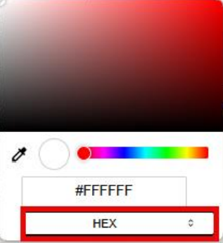
Note: Colors can also be input as a Hex code, RGB, or HSL value directly into the color text field(s).
- Sampling a color on the screen
You can also pick a color by sampling the color of any pixel from anywhere on your screen using the Eyedropper tool.
Select the Eyedropper ( ) to change your mouse cursor into a magnifier that zooms into a selected area (
 ).
).
Move your mouse about the screen (or use the arrow keys) to position the magnifier over any area of the screen. Place the center of the magnifier over a pixel containing the color you wish to sample and click the mouse button (or press the Spacebar) to sample that color. The color picker will update with the selected color code value.
Important Note: To cancel and exit out of the Eyedropper/Magnifier tool, press the Esc key.
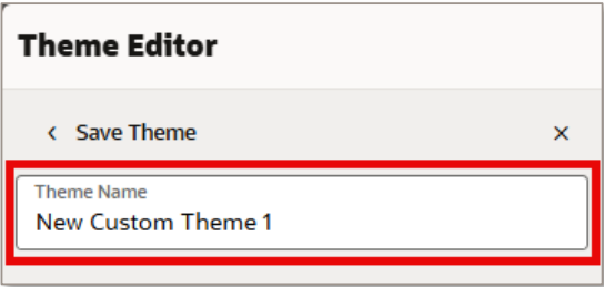
- Saving Your Theme, to save your theme changes, enter a name in the Theme Name field, then select Save Theme.
- More Actions, Selecting the More… (

) button next to any theme will open the More Actions menu.
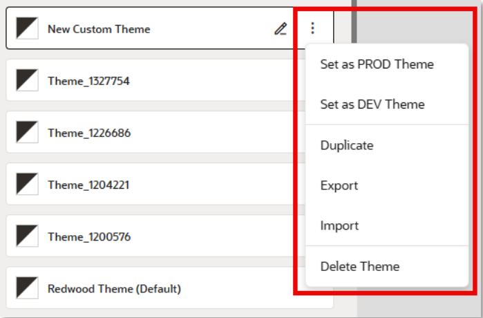
The following actions can be performed from the More Actions menu:
- Set as PROD Theme – Publishes the selected theme to the Production environment.
- Set as DEV Theme – Publishes the selected theme to the Development environment.
- Duplicate – Makes a copy of the selected theme and appends “Copy” to the theme name.
- Export – Downloads the selected theme as an HTML file to your default Downloads folder.
- Import – Opens the Upload modal allowing you to select an existing OGL Theme HTML file to replace the selected theme.
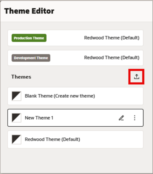
Importing Themes
- Selecting the Import Theme () button allows you to select and upload an existing theme (HTML file) from your file system.
- Enter a name for your theme and then select Choose a file to browse for an existing theme file.
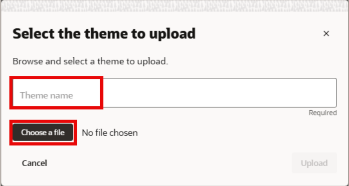
- Once the design kit is uploaded, it will be available in the Themes section, and the theme will be displayed using the name provided during the upload process.
.
Commentary on future direction?
The release of the Theme Editor in OGL 25B is just the beginning of a broader shift towards making customization more accessible and intuitive. Looking ahead, we can expect continued improvements in the user interface, further streamlining the customization process to empower non-technical users even more. Future updates could include:
- Expanded Customization Options: More elements and features will likely be added to the editor, offering deeper control over the theme without the need for coding.
- AI-Assisted Customization: Future updates could incorporate AI-driven recommendations or templates based on user behavior, helping to streamline the customization process and provide smart suggestions for design improvements.