Venn diagrams in Oracle Analytics are now simpler than ever! This Venn diagram custom extension serves as an example to demonstrate how users can build their own custom extensions. While not an official Oracle product, this example highlights the potential of custom extensions and empowers users to create similar visualizations within Oracle Analytics.
This extension is available for download from the Oracle Analytics Community Page.
Watch the quick video demo to see how you can use this extension example to plot a Venn diagram:
Understanding Venn Diagrams and Their Applications
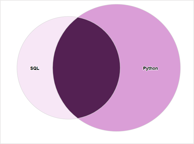
A Venn diagram visually represents relationships between different sets. Each circle denotes a set, and overlapping regions highlight commonalities among them. This visualization is a powerful tool for categorizing data and understanding similarities and differences briefly.
This type of visualization is widely used across industries for solving complex analytical challenges, such as:
- Customer overlap analysis: Identifying customers who engage with multiple product categories or marketing channels
- Fraud detection: Detecting suspicious patterns by visualizing commonalities between fraudulent transactions
- Market segmentation: Understanding shared behaviours across demographic groups for targeted campaigns
Data Structure for Venn Diagrams
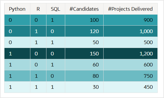
The foundation of a Venn diagram is rooted to set theory, where elements either belong to a set or don’t. Binary values (1 or 0; In or Out) are used to represent this inclusion or exclusion.
- 1 belongs to the set
- 0 doesn’t belong to the set
For example, when visualizing the skillsets of a candidate pool, each column in the dataset corresponds to a set (e.g., Python, R, SQL). The binary values determine whether a candidate possesses a particular skill.
Creating a Venn Diagram in Oracle Analytics
Follow these simple steps to build an interactive Venn diagram:
- Ensure that your dataset uses binary values for set membership.
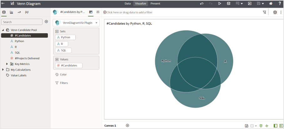
- Drag the relevant attribute columns into the “Set” grammar.
- Update the “Included Value” parameter to match your dataset. By default, the visualization expects the included value to be “Yes”. Change this to “1” for the Candidate Pool dataset.
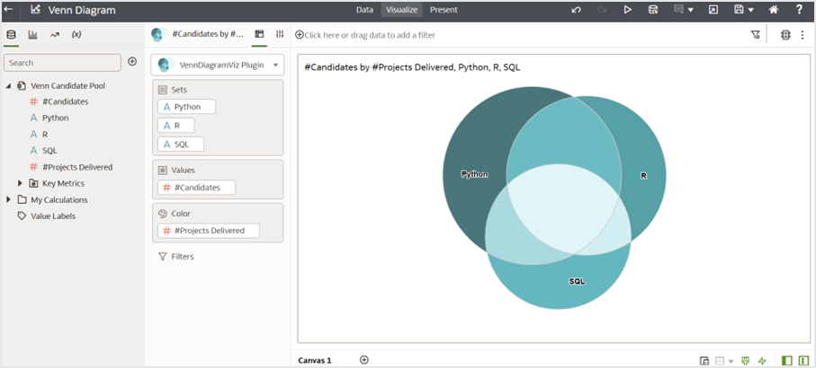
- Drag necessary measures to the “Values” and “Color” grammar.
- Customize further by enabling or diabling the “Data Labels” parameter and leveraging interaction options like brushing, marking, keep selected, and remove selected.
Simply drag and drop columns to the “Set” and “Values” grammar to generate your Venn diagram visualization:
You can also utilize the “Color” grammar for additional insights:
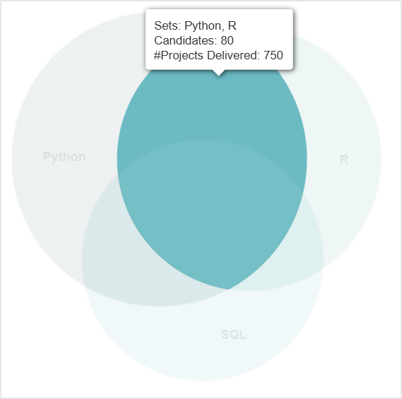
Hovering over the diagram provides interactive tooltips:
Limitations of Venn Diagrams
While Venn diagrams are effective for visualizing relationships for up to three sets, their clarity diminishes with four or more sets due to:
- Overlapping circles becoming difficult to display all the pieces and proportionately display
- The layout becoming overly complex and reducing interpretability
To address this, alternative shapes or visualization techniques can be used.
Why this Example Matters
The Venn diagram custom extension is purely a demonstration of what’s possible with custom extensions. It allows you to visually represent logical relationships as circles, with intersections highlighting shared elements. Whether you’re analyzing skillskets, customer groups, or correlations, this extension example serves as a reference to inspire your own custom extensions.
This is just one example – you can build your own extension and extend Oracle Analytics beyond standard visualizations. See this blog article to learn more about developing custom extensions and how they can enhance your analytics experience.
Call to Action
Download the Venn diagram custom extension example from here.
Follow the Oracle Analytics Community page for the latest updates on features, extensions, and announcements.
Start exploring the possibilities of custom extensions today!