

Use Oracle Analytics Cloud dashboards to monitor OCI consumption, identify cost drivers, and compare month-to-date changes.
Part 2 of a three-part series
Oracle Cloud Infrastructure (OCI) cost and usage data is more useful when readers can compare it by service, tenancy, compartment, region, and time. This article shows how to build dashboards in Oracle Analytics Cloud (OAC) with a curated Oracle Autonomous AI Lakehouse model to support cloud financial management (FinOps) reviews. Part 1 establishes the trusted data foundation; this article focuses on monitoring it.
Prepare the analytical model
Use a cost and usage fact table with a documented row grain. Common attributes include charge date, tenancy, compartment, service, region, user, resource, and tag. Curate reusable measures and attributes in the data model when they must stay consistent across dashboards.
Use an average only when a report row has a defined business meaning. The following expression returns the average billed cost for the reporting rows in the selected analysis. It doesn’t show average cost per resource or user unless the source grain supports that interpretation.
AVG(BILLED_COST)
A parsed geographic label can simplify maps. This example maps an OCI region ID such as eu-frankfurt-1 to frankfurt. Validate the identifier format against the source data before using it.
SUBSTR(REGION_ID, INSTR(REGION_ID, '-') + 1, INSTR(REGION_ID, '-', 1, 2) - INSTR(REGION_ID, '-') - 1)
Connect Oracle Analytics Cloud to Oracle Autonomous AI Lakehouse
After validating the curated tables or views, create a connection from Oracle Analytics Cloud to Oracle Autonomous AI Lakehouse using approved credentials and appropriate database permissions. Follow the Oracle Analytics Cloud connection guide to configure and test the connection before creating datasets.
Identify where cloud spend is concentrated
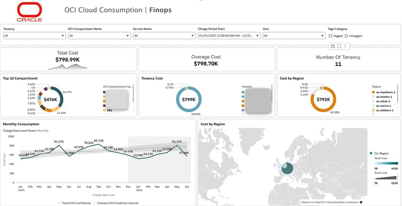
Start with headline measures such as total cost, variance, and the number of tenancies in scope. Let readers filter by tenancy, compartment, service, charge period, user, and tag category. A regional view and a monthly trend provide context for where spending is concentrated and how it changes over time.
Identify what drives cost
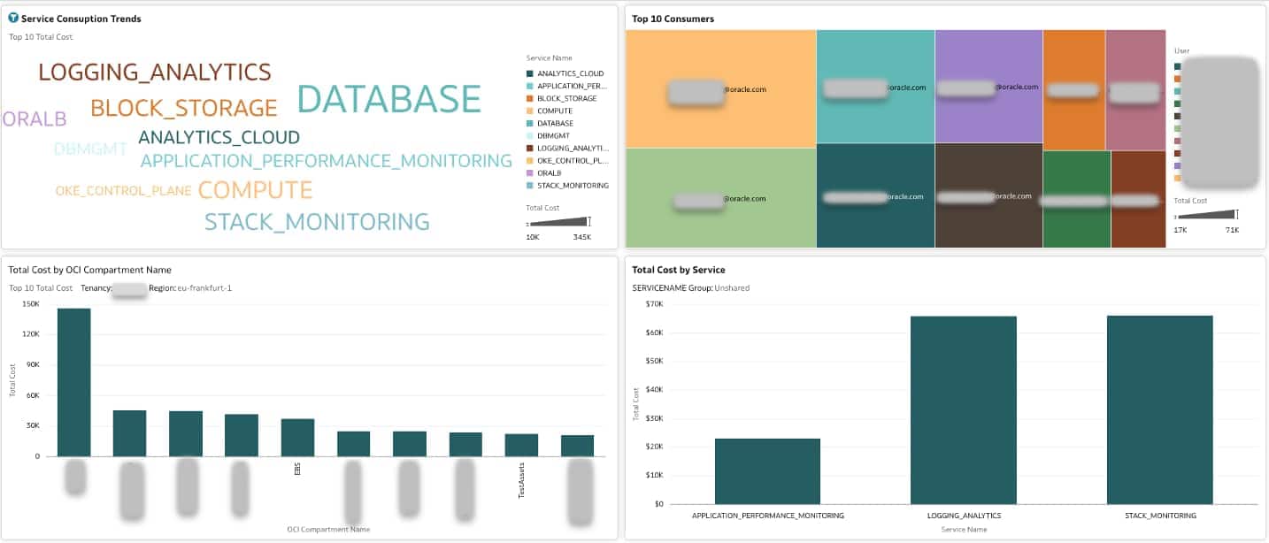
Drill from the portfolio total to service, accountable team, and compartment. Pair a high-level summary with bar charts and a detailed table so readers can compare values precisely. This view helps prioritize an investigation by showing where cost is concentrated; it doesn’t establish the cause of a variance.
Compare month-to-date consumption
For an in-progress month, compare the current period with the same elapsed days in the previous month. Review the daily trend alongside service-level variance so that an unusual day can be distinguished from a sustained change.
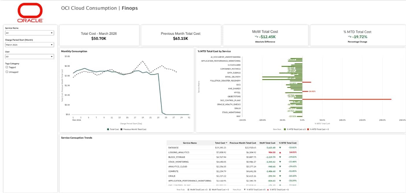
The following expression compares a measure with the preceding monthly period when the model has a valid time dimension. It’s suitable for a completed month or for a month-to-month comparison. By itself, it doesn’t align partial months; apply a same-day cutoff when reporting month-to-date variance.
Total Cost - AGO(Total Cost, Month, 1)
For time-model requirements and supported calculations, see Oracle Analytics Cloud time series functions.
Continue to Part 3
Next, investigate OCI cost anomalies. Use Oracle Analytics Cloud Explain to investigate the changes surfaced by these dashboards. For implementation questions and shared practices, join the Oracle Analytics and AI Community.