Part 1 and Part 2 of Explore Data with Filters focused on filter scope and capabilities in Oracle Analytics. In this third and final part of the series, we’ll share a few more tips and tricks for filters in Oracle Analytics.
Setting a default value for filters
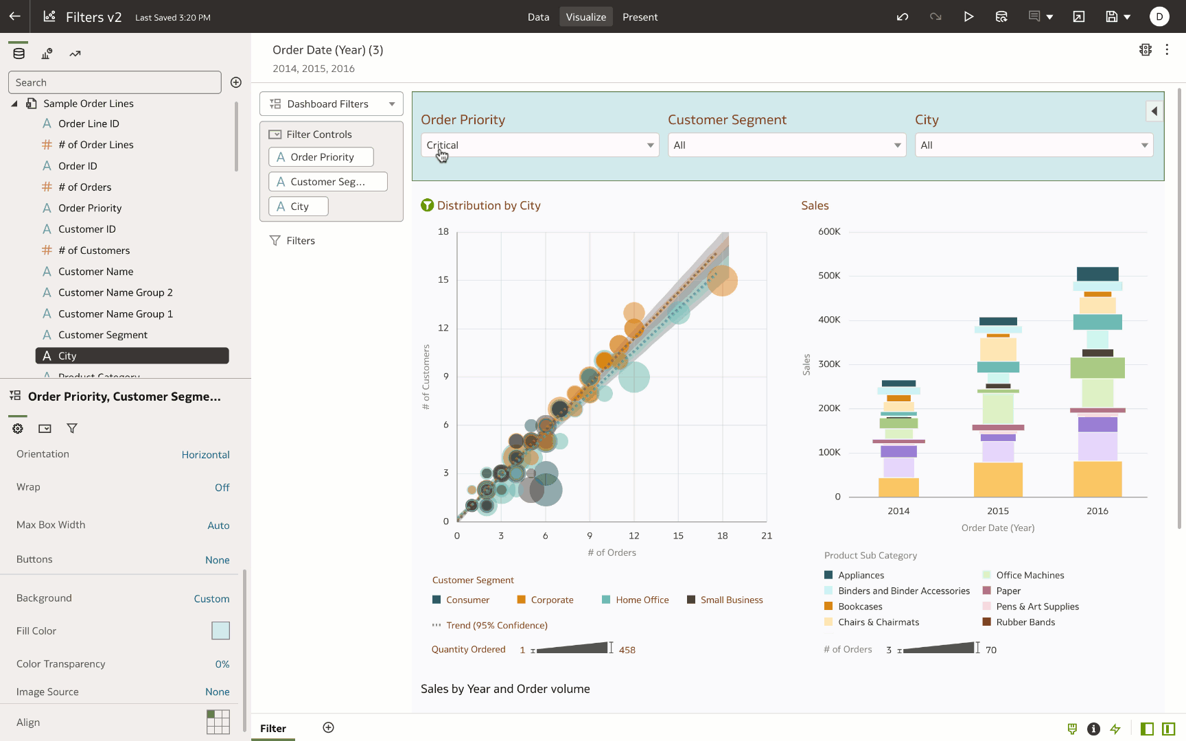
Often the author of a dashboard wants to set a default value on a filter, which can provide a better experience for end users. When opening the dashboard, end users see the visualizations filtered to the default value instead of seeing all values.
This example shows “First in Value” as the default for a dashboard filter. This property selects the first value in the list filter and makes it the default value for the applicable visualizations.
Setting custom values on filters
Consider a use case where the author wants to mark a filter as the “required filter,” meaning that the data in the dashboard refreshes only when the end user has selected a value. This is very helpful when the author wants to start with blank visualizations on the canvas and expects the end user to select a filter value to refresh the data for the selected values. Authors use the Default Value and Selection Required properties of the dashboard filter:
- Navigate to the Filter Controls property tab of the dashboard filter property panel.
- Change the Default Value to “Custom,” and enter custom text for “Select Filter values.”
- Change the Selection Required property to On.
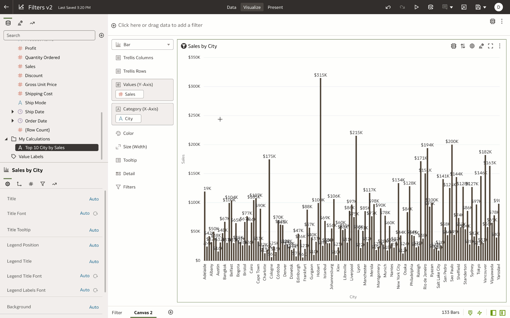
Displaying an ‘Other’ category with Top / Bottom N filters
When using the Top / Bottom N filter, you might find it useful to show the rest of the category grouping as a category in the visualization. Consider a use case where the author applies a Top 10 City by Sales filter. The author wants to manage the rest of the “City & Sales” grouping as an “Other” category, and display it on a bar chart. This tip works only with datasets from CSV or Microsoft Excel files and not on subject area datasets.
- Create a My Calculation with this expression and name as Top 10 City by Sales case when Rank(Sales> <=10 then City else ‘Other’ end
- Navigate to the Values tab of the property panel, select the Sales measure, and change the Aggregation to “Sum” and Select By to “City.”
- Drag and drop the Top 10 City by Sales calculation to the X-axis of the bar chart.
You see the top 10 cities by Sales in the visualization and the rest of the city Sales grouped as an Other category.
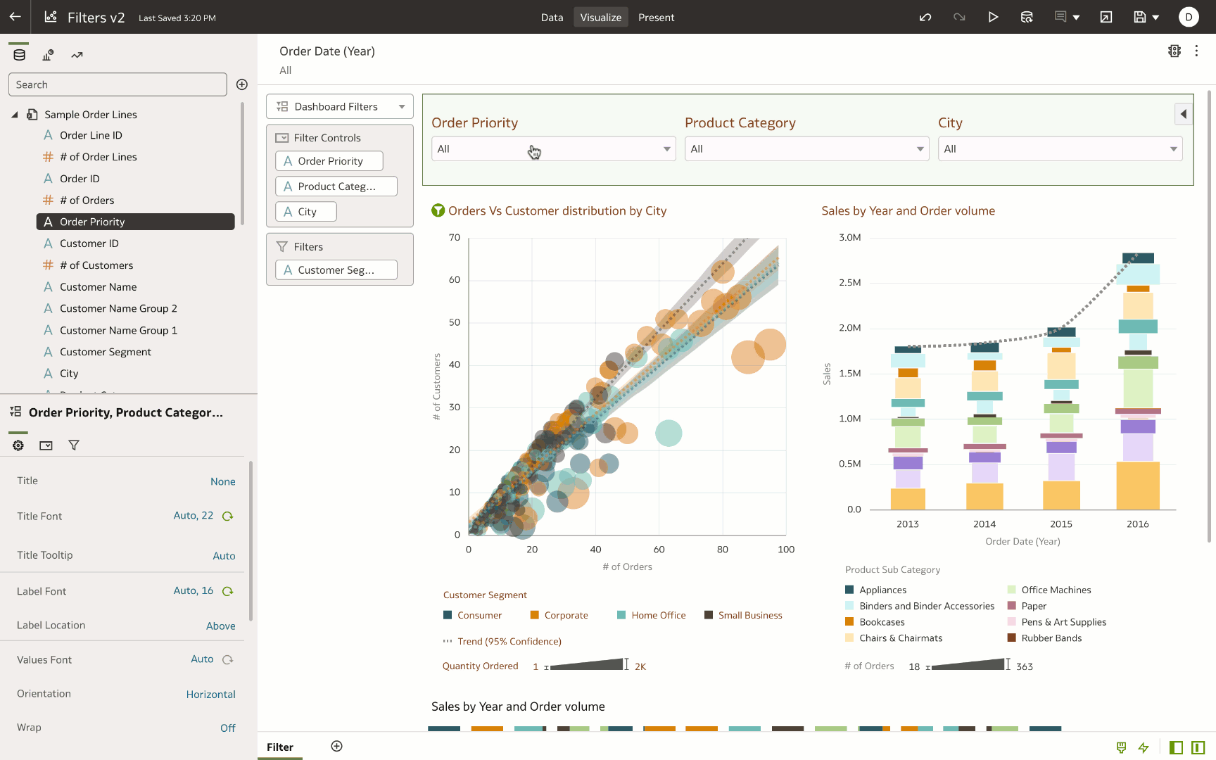
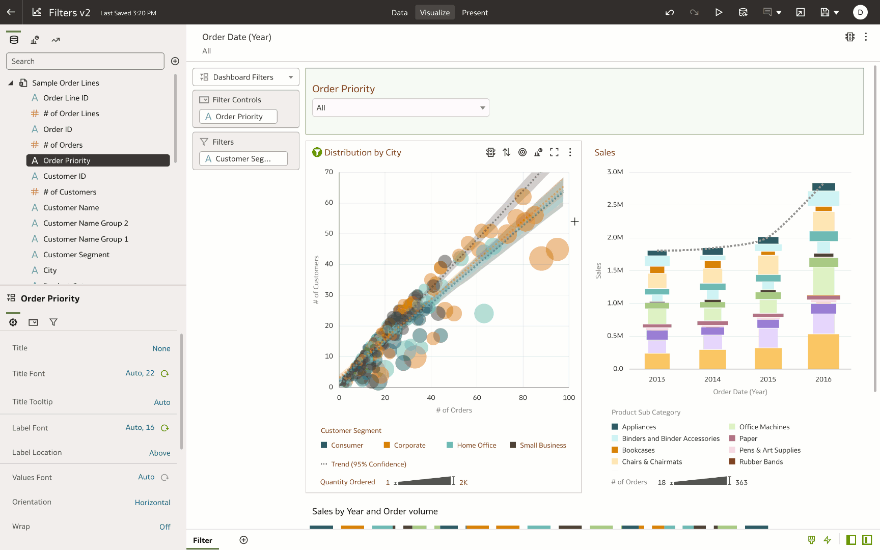
Showing or hiding workbook filters on dashboards
Authors use mainly workbook filters to pre-filter the data in workbooks. The primary purpose of workbook filters is to define the scope of data that end users interact with on the dashboard and aren’t exposed for end-user interaction. In this example, the author has applied a time-period (Year) filter to the workbook filter scope. The author navigates to Present, creates a presentation flow, and curates a customized experience for the end users on the dashboard. One of the customization is hiding the workbook filters:
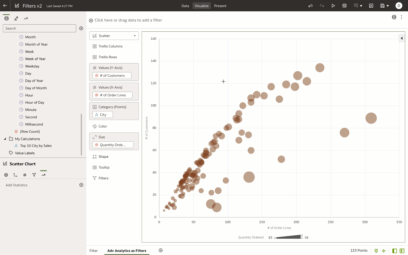
One-click advanced analytics as filters
In this example, the author uses advanced statistics (clusters and outliers) as a filter on the visualization. This allows end users to drill into the specific cluster or outlier category and get to actionable insights very quickly. When the author adds a cluster or outlier to the visualization, the advanced statistics are added to the visualization grammar panel. The author can right-click the advanced statistic and add it to My Calculation as a calculated field in the dataset. This My Calc can be used as a filter to the visualization:
Filtering canvases based on results of a visualization or canvas
This video explains how to use the results of a visualization (using its logical SQL code) as a filter to a canvas in a workbook.
For additional information, see Create and Apply Filters.