Part 1 of Explore Data with Filters focused on the three scopes for adding filters to workbooks. This article (the second of the three-part series) highlights other filter capabilities for exploring data in Oracle Analytics such as showing and hiding data and finding the top or bottom values.
Use a visualization to filter data
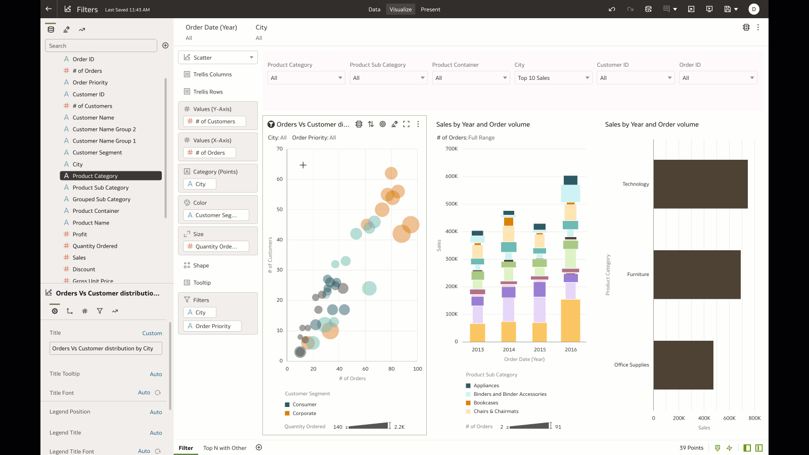
The “Use As” filter is an extremely powerful capability when you want to cascade filter values and pass the context to other visualizations on the canvas. To use a visualization as a filter, simply click the filter icon on the visualization, as shown in this example.
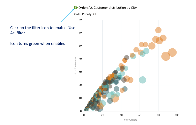
In the following example, selecting a mark on the scatter plot (enabled for the “Use As” filter) passes the selected data context values to other visualizations on the canvas and filters the respective data.
You can specify any visualization in the canvas as “Use As” and very easily filter to the data that you want to double-click to get to insights quickly.
Filter the data that you want focus on (Keep) or Hide
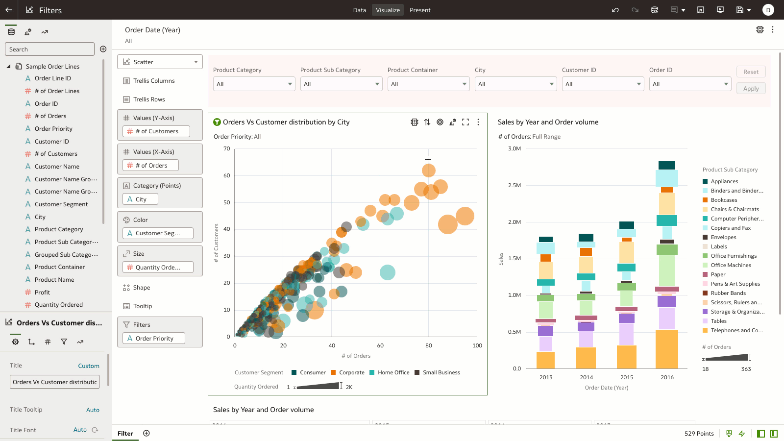
You can easily show or hide certain data in visualizations by using the Keep Selected / Remove Selected option. This option is helpful when you want to focus on certain data (Keep Selected) or to remove noise in the data (Remove Selected).
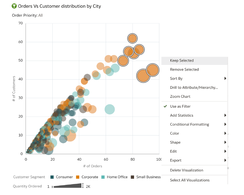
In the following example, “brushing” is enabled, which allows you to select a series of data and keep the selected data on the visualization. When you “keep” certain data selected in the visualization, a expression filter is added to the visualization filter scope (as the example show). You can copy the expression filter and add it as an expression filter on the Workbook filter bar or in a calculation.
Finding the Top or Bottom N of the data
When working with dense data, you might want to see the Top or Bottom grouping of that data. Top Bottom N is an option available for each filter added to the filter scope. On a workbook or visualization filter, find the Top Bottom N operation under the Filter menu options.
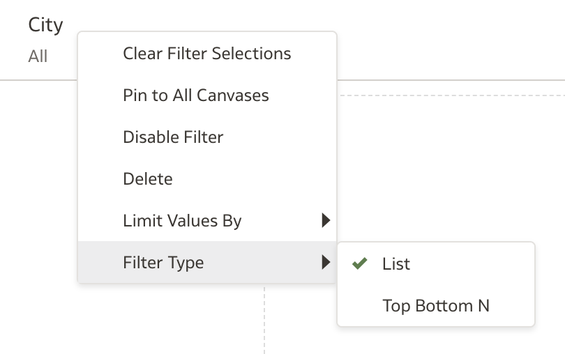
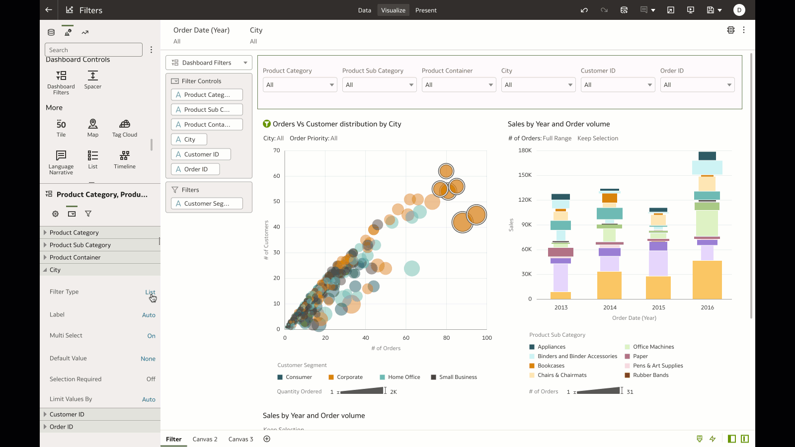
In the following example, the City filter is set to show the Top 10 Cities by Revenue. For filters on the Dashboard Filter bar, you find the Top Bottom N operation on the Property panel of the Dashboard Filter visualization, under the filter control tab.
Filter data based on a Data Action
Consider a scenario where you want to design an experience for end users to select data on a visualization and pass the context of the selected data to filter data on a different canvas in the workbook or to a different workbook. The Data Actions feature passes context values as parameters to external URLs or as filters to other workbooks.
In the following example, the “Analytics Link” Data Action is added on a attribute on the visualization (in the example, on City). The goal is to provide an experience for end users to perform a data action on a summary tab, pass the context of the selected data to the Customer Order Details canvas, and filter the detailed data. This allows end users to easily navigate from summary data and filter down to detailed transactions of a selected data point.
In the third and final article in this series, we’ll present useful tips and tricks for filters.
For additional information, see Create and Apply Filters.