This article is the second part of the blog series, Unlocking Custom Visualizations in Oracle Analytics. The previous article introduced foundational setup, file structure, and initial commands required to create a plug-in skeleton, culminating in a simple text message display.
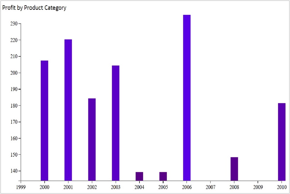
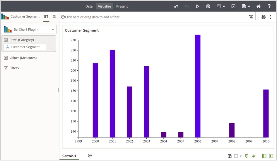
In this article, you’ll learn how to enhance the plug-in to render a basic HTML-based bar chart visualization using D3.js. The chart illustrates the relationship between a numerical and a categorical variable, using hard-coded data for simplicity. Here’s an example of the expected output:
Expected outcome
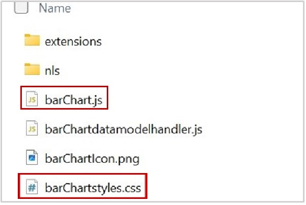
File structure recap
As outlined in the first part of the series, the plug-in directory consists of several files. For this post, only two files need modifications:
- barChart.js
- barChartstyles.css
Enhance the barChart.js file
The barChart.js file serves as the core of the plug-in, encapsulating the logic and handling the rendering of the chart. Follow these steps to create the bar chart:
1. Import libraries
Begin by importing the necessary libraries and modules, including D3.js, in the define block:
define([
        'jquery',
        'obitech-framework/jsx',
        'obitech-report/datavisualization',
        'obitech-reportservices/datamodelshapes',
        'obitech-reportservices/events',
        'd3js',                                                //D3 library
        'knockout',
        'ojs/ojattributegrouphandler',
        'obitech-framework/messageformat',
        'skin!css!com-company-barchart/barChartstyles'],

function($,
         jsx,
         dataviz,
         datamodelshapes,
         events,
         definitions,
         logger,
         messages,
         euidef,
         data,
         d3,
         ko,
         attributeGroupHandler
         )
Ensure that the order of imports in the define and function blocks matches. For instance, datamodelshapes and d3 in the define block must align with their respective variable names in the function block.
Note: The D3.js library is represented by a variable corresponding to D3 v3. If you prefer using D3 v6, replace d3js with d3v6js in the define block.
Important Update: Starting with the Oracle Analytics Cloud March 2026 build, D3 v3 is planned to be deprecated and removed from the default runtime. It’s therefore recommended that all new custom extensions be developed using D3 v6.
If you already have existing extensions built on D3 v3, you can continue to run them using an explicit RequireJS configuration override. See the section “Configuring D3 v3 Support for Existing Extensions” at the end of this blog for details.
2. Define the Render Function
BarChart.prototype.render = function(oTransientRenderingContext)The render function generates the visualization. Follow these steps to implement the bar chart logic:
Step A: Initialize the container
Retrieve the root container and define its properties. By default, the code generates a line starting with “$(elcontainer).htm…”. Replace it with these lines:
var elContainer = this.getContainerElem();

var htmlContent = "<div class='barcharttest' id='barcharttest'></div>";
$(elContainer).html(htmlContent);
var width = $(elContainer).width() - 20;
var height = $(elContainer).height() - 20;
Step B: Load the data
The sample dataset used for this plug-in is as follows:
| Year | 2000 | 2001 | 2002 | 2003 | 2004 | 2005 | 2006 | 2007 | 2008 | 2009 | 2010 |
| Sale | 202 | 215 | 179 | 199 | 134 | 134 | 230 | 40 | 143 | 34 | 176 |
Convert the dataset into JSON format:
data: [
          { "sale": "202", "year": "2000" },
          { "sale": "215", "year": "2001" },
          ….
        ]
Step C: Create an SVG element
Append an SVG element to the container. You can also add margins to the SVG image:
var svgConfig = {
                id:"barcharttest",
                width:width,
                height:height
                };
// append svg element
          var bodySelection = d3.select("#barcharttest");

          var svgSelection  = bodySelection.append("svg")
                    .attr("id", svgConfig.id)
                    .attr("width",svgConfig.width)
                    .attr("height",svgConfig.height);
This code fragment also adds a group element to the SVG element.
Step D: Define scales
Set up linear scales for the x and y axes:
// Create x scale
      var xScale = d3.scale.linear()
          .range([svgConfig.margin.left, svgConfig.width - svgConfig.margin.right])
          .domain([
               d3.min(chartConfig.data, function(d) { return +d.year; }) - 1,
               d3.max(chartConfig.data, function(d) { return +d.year; })
          ]);

      // Create y scale
      var yScale = d3.scale.linear()
      .range([svgConfig.height - svgConfig.margin.top,   svgConfig.margin.bottom])
      .domain([
          134,
          d3.max(chartConfig.data, function(d) { return +d.sale; })
      ]);
Step E: Render bars
Use the scales to position and size the bars in the chart:
// create bars
          svgSelection.selectAll("rect")
                   .data(chartConfig.data)
                   .enter()
                   .append("rect")
                   .attr("x", function(d) {
                    return xScale(+d.year) - chartConfig.barWidth/2;
                   })
                   .attr("y", function(d) {
                    return yScale(d.sale) - svgConfig.margin.bottom;
                   })
                   .attr("width", chartConfig.barWidth)
                   .attr("height", function(d) {
                    return svgConfig.height - yScale(d.sale);
                   })
                   .attr("fill", function(d) {
                    return "rgb(90, 0, " + (+d.sale) + ")";
                   })
Step F: Generate axes for the chart
Generate and position the x and y axes:
// Create the axes using the scales
      var xAxis = d3.svg.axis()
        .scale(xScale)
        .tickFormat(d3.format("d"));

      var yAxis = d3.svg.axis()
        .orient("left")
        .scale(yScale);
Now, append these axes to the chart and position them using the transform property.
// Add x-axis to chart
      svgSelection.append("g")
        .attr("id", "xAxis")
        .attr("class", "axis")
        .call(xAxis);

      // Position the x-axis vertically using transform property
      d3.select("#xAxis")
        .attr("transform", "translate(0," + (svgConfig.height - svgConfig.margin.bottom) + ")");

      // Add y-axis to chart
      svgSelection.append("g")
        .attr("id", "yAxis")
        .attr("class", "axis")
        .call(yAxis);

      // Position the y-axis using transform property
      d3.select("#yAxis")
        .attr("transform", "translate(" + svgConfig.margin.left + ",0)");
    }
Enhance the barChartstyles.css file
Customize the appearance of the chart with features such as font family, size, and color.
.axis path, .axis line {
    fill: none;
    stroke: #777;
    shape-rendering: crispEdges;
}
.axis text {
    font-family: Lato;
    font-size: 13px;
}
rect {
    -moz-transition: all 0.3s;
    -webkit-transition: all 0.3s;
    -o-transition: all 0.3s;
    transition: all 0.3s;
}
rect:hover{
    fill: orange;
}
Set up the icon for the plug-in
Update the .png file to set your plug-in icon. Be sure to retain the original file naming convention.
Once you’ve updated these files, do a gradle clean build run to get these changes reflected:
C:\custom-plugins>.\gradlew clean build run
With these steps, the plug-in now renders a basic bar chart using hard coded data. You can adapt the process outlined here for other custom plug-ins.
Configure D3 v3 support for existing extensions
If you have already built a custom visualization using D3 v3, you can still run it by explicitly mapping D3 v3 through a RequireJS configuration in your extension. This approach helps maintain backward compatibility while newer extensions move to more recent D3 versions.
Since your extension package already contains a plugin.xml file, follow these steps:
Step 1: Update plugin.xml
Open your plugin.xml file and add the following extension entry inside the <extensions> section.
   <extension id="com.example.requirejsConfig.d3v3" point-id="oracle.bi.tech.plugin.requirejsConfig" version="1.0.0">
       <configuration>{"paths":{"d3v3":"https://cdnjs.cloudflare.com/ajax/libs/d3/3.5.17/d3.min"}}</configuration>
   </extension>
Add this alongside your other extension entries, as shown in the reference example below.
<?xml version="1.0" encoding="UTF-8" standalone="yes"?>
<obiplugin xmlns="http://plugin.frameworks.tech.bi.oracle" id="barchart" name="barchart" version="1.0.0.1770715384473" optimized="false" optimizable="true" category="customviz" categoryVersion="1.0.0.1770715384473">
    <resources>
        <resource type="script" id="barchart" path="barchart.js"/>
        <resource type="script" id="barchartdatamodelhandler" path="barchartdatamodelhandler.js"/>
        <resource type="binary" id="barchartIcon" path="barchartIcon.png"/>
        <resource type="css" id="barchartstyles" path="barchartstyles.css"/>
        <resource-folder id="nls" path="nls" optimizable="true">
            <extensions>
                <extension name="js" resource-type="script"/>
            </extensions>
        </resource-folder>
    </resources>
    <extensions>
        <extension id="barchart" point-id="oracle.bi.tech.plugin.visualization" version="1.0.0">
            <configuration>{"host":{"script":{"module":"barchart/barchart","method":"createClientComponent"},"vizSettings":{"_version":"1.0.0","viewConfig":{"viz:chart":{"type":"barchart","dataValues":true}}}},"resourceBundle":"barchart/nls/messages","properties":{"displayName":{"key":"BARCHART_DISPLAY_NAME","default":"Barchart Plugin"},"shortDisplayName":{"key":"BARCHART_SHORT_DISPLAY_NAME","default":"Barchart Plugin"},"category":{"key":"BARCHART_CATEGORY","default":"Barchart Plugin"},"customSettings":{},"categoryOrder":500,"icon":"barchartIcon","dataModelHandler":"barchart.visualizationDatamodelHandler","dataModelGovernor":{"dm1":{"rows":10000,"columns":5000}},"isEmbeddable":false,"isMarkingSupported":false}}</configuration>
        </extension>
        <extension id="barchart.visualizationDatamodelHandler" point-id="oracle.bi.tech.plugin.visualizationDatamodelHandler" version="1.0.0">
            <configuration>{"module":"barchart/barchartdatamodelhandler","method":"getHandler","config":{"vizPreference":50,"measureLabelConfig":{"supportedEdges":["color","detail","size"],"defaultEdge":"color","visibility":"hidden"},"edgeConfig":{"measures":{"contentType":"measures","global":{"minCount":0,"maxCount":1,"priority":10},"ui":{"customName":{"key":"BARCHART_ITEM_SIZE","default":"Item Size"}}},"row":{"contentType":"mixed","global":{"priority":1,"preferredMax":1},"ui":{"customName":{"key":"BARCHART_ROW_LABEL","default":"Barchart Plugin Row"}},"categorical":{"functionalInfo":["inner","row","categoricalType"]}},"color":{"contentType":"both","global":{"preferredMin":1,"preferredMax":1,"priority":7},"measures":{"maxCount":1},"categorical":{"functionalInfo":["inner","col","categoricalType"]}},"size":{"contentType":"measures","global":{"maxCount":1,"preferredMax":1,"priority":3}},"glyph":"none","detail":"none"}}}</configuration>
        </extension>
		<extension id="com.example.requirejsConfig.d3v3" point-id="oracle.bi.tech.plugin.requirejsConfig" version="1.0.0">
			<configuration>{"paths":{"d3v3":"https://cdnjs.cloudflare.com/ajax/libs/d3/3.5.17/d3.min"}}</configuration>
		</extension>
    </extensions>
</obiplugin>
This small configuration creates a module alias named d3v3 and load it from the specified CDN URL.
Step 2: Use d3v3 in your define block
After adding the RequireJS configuration, update your module dependencies to reference d3v3 instead of d3js.
define([
    'jquery',
    'obitech-framework/jsx',
    'obitech-report/datavisualization',
    'obitech-reportservices/datamodelshapes',
    'obitech-reportservices/events',
    'd3v3',   // D3 version 3 loaded via RequireJS CDN mapping
    'knockout',
    'ojs/ojattributegrouphandler',
    'obitech-framework/messageformat',
    'skin!css!com-company-barchart/barChartstyles'],

    function ($,
        jsx,
        dataviz,
        datamodelshapes,
        events,
        definitions,
        logger,
        messages,
        euidef,
        data,
        d3,
        ko,
        attributeGroupHandler
    )
Your code can continue to use the d3 variable exactly as before – only the source version changes.
While the compatibility method is available, migrating existing extensions to D3 version 6 is strongly recommended for long-term support and maintainability.
Step 3: Add safe domain whitelisting
Since the D3 v3 library is loaded from a CDN (Cloudfare), you must allow this domain in Oracle Analytics Cloud safe domain settings. Without this step, the browser will block the external script and the visualization will not load correctly.
a. In the Oracle Analytics Cloud Console, navigate to Safe Domains.
b. Add the following domain entry and enable the available options.
*.cloudflare.comCall to action
Are you ready to take your custom plug-in development to the next level? Start experimenting with the steps outlined in this post to create your own bar chart visualization. Don’t forget to explore Part 1, if you’re just starting out, and stay tuned for Part 3, where you’ll delve into integrating external data sources and exploring grammar properties to create more dynamic visualizations.