The majority of our analytics tally numbers, count widgets, and provide information for the administrator. While this data is very useful information, and provides answers to many long standing questions from your Administrators and Executives, PeopleSoft Benefits has delivered a new twist on analytics for the Benefits Specialist.
Our newest Life Events and Ben Admin Processing Insights dashboards are designed for the Benefits Specialists that review, analyze, and take action. Without them, the benefit changes and processes would not get completed. The work that they do is vital to the smooth operation of your HR and Payroll processes, so it is important to provide them with tools to make their work more efficient.
MANAGE BENEFITS TILE
With the addition of two new analytic dashboards we have created a new homepage, Manage Benefits, to encompass the Benefits Specialist and Benefits Administrators tiles. Now they have one convenient place for them to do their benefit work.
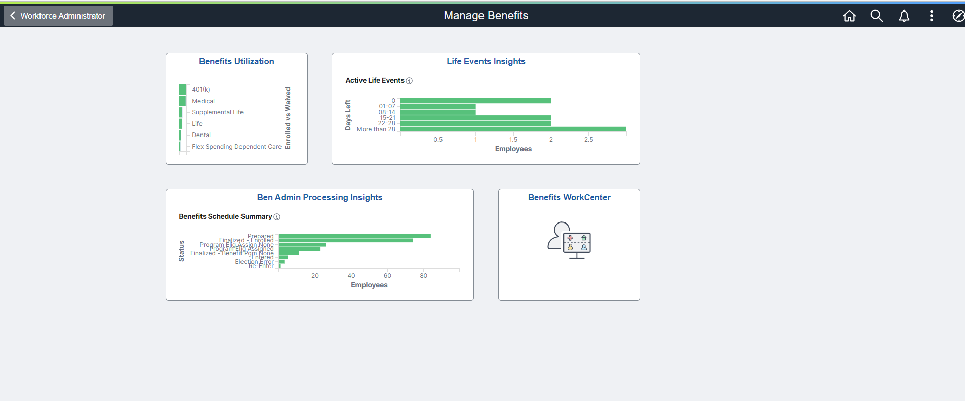
LIFE EVENTS INSIGHT
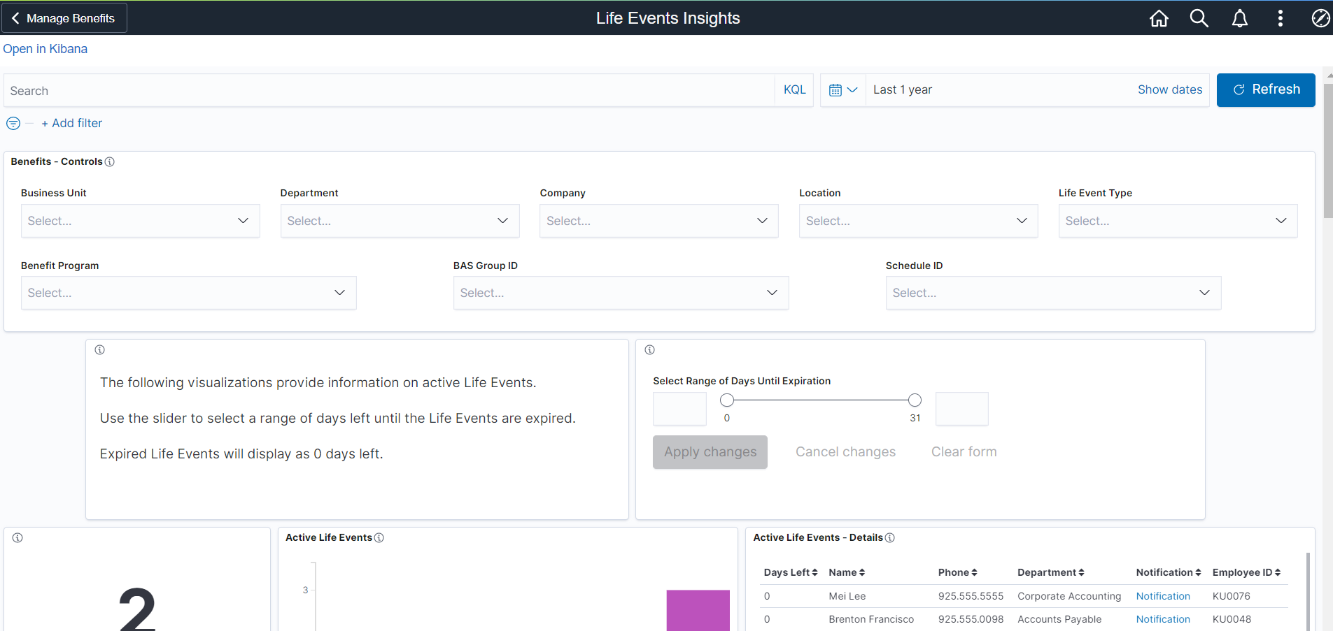
Life Events are time sensitive and each event has a different date of expiration based on when the event happens. For instance, employee A gets married on November 5th and Employee B has a baby on November 10th. While both may only have a 30 day enrollment period, Employee A must complete the paperwork and enrollment by Dec 5th and Employee B must do the same by December 10th. Because all of this is so individualized by employee, keeping track of all of these moving parts can be cumbersome.
To assist the Benefits Specialist or Administrator, the Life Event Insights was developed to provide more than just information but also links to perform actions. A number of filters are provided to narrow the search. There is also range selector to assist with viewing the days until expiration.
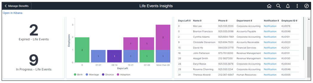
The first sets of visualizations provide important information to help the Benefits Specialist understand what type and how many Life Events have been started and includes the number of days left before the event expires. The recently expired events are also available for your review along with a Notification link to easily send the employee an email without leaving the system.
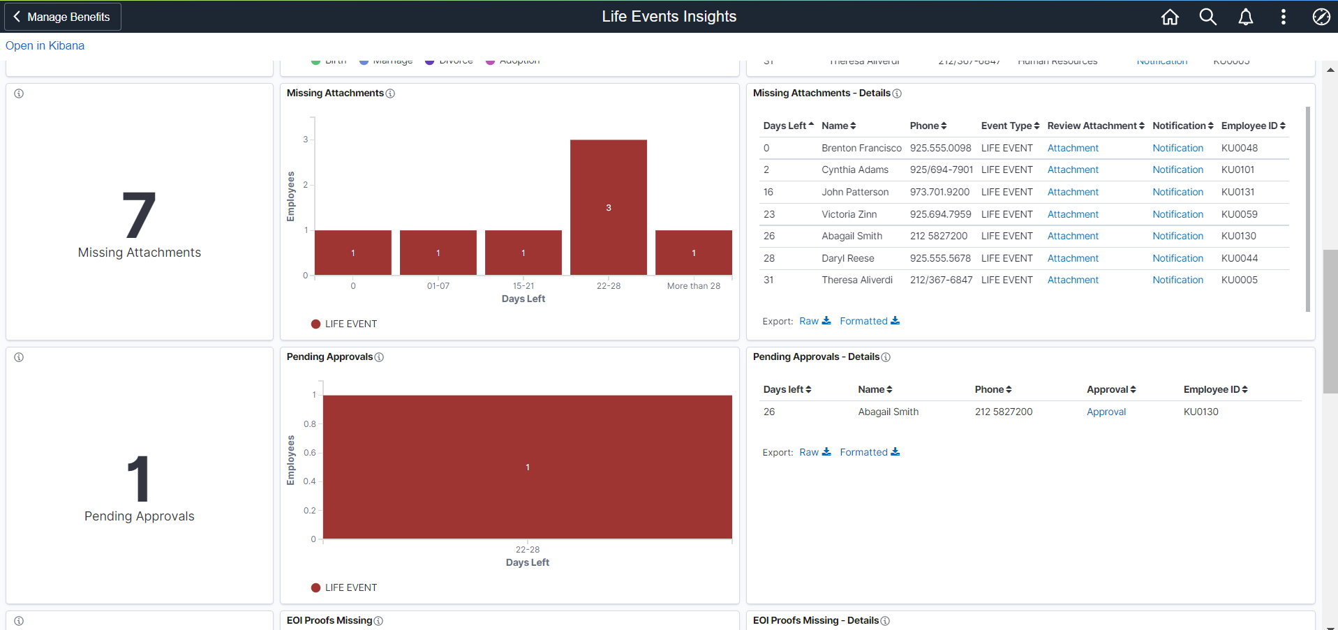
The next two sets of visualizations uses the Dependent Data Upload or Life Event Document Upload process to identify the employee’s missing attachments and the documents pending your approval. There are links available to review the attachment, notify the employee or process the approval. Again, the goal is to provide the Benefits Specialist with this information in a simple to read and easy to navigate format.
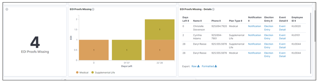
Evidence of Insurability can also be a tricky step to track. This group of visualizations, again, gives you links for notifying or asking the employee about the status of their documentation. There are also links to verify if proof is required and to mark the proof received so further Ben Admin processing can continue.
All of the above visualizations are supported by Real Time Indexing (RTI). This means that you can set the index and visualizations to automatically be refreshed thus giving you the latest data without having to schedule the index to be run. With time sensitive processes, like Life Events, this can be very important.
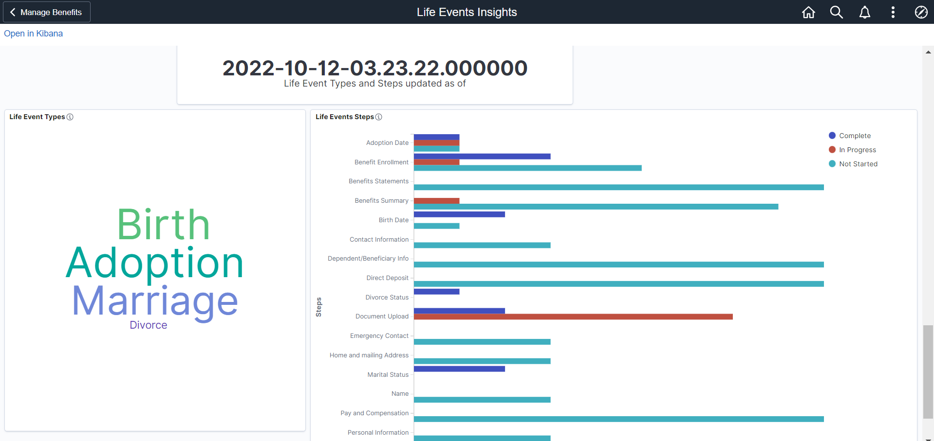
The last sets of visualizations is used to understand how employees are using the Life Event Activity Guide. One of the use cases is to understand which steps are being utilized by the employees during a life event. This may help you streamline very long processes or understand if you need to make certain steps required that are always skipped but the organization feels are important.
Since this data comes from a different index and is not as time sensitive, the information is only refreshed when the index is scheduled or manually run. The timestamp is provided for the user’s convenience. The Life Event Type Word Cloud can help you visualize which events are more frequently used and can also be used to filter the step data. The Life Event Steps help the benefits team to understand the process flow.
BENEFITS ADMIN PROCESSING INSIGHTS
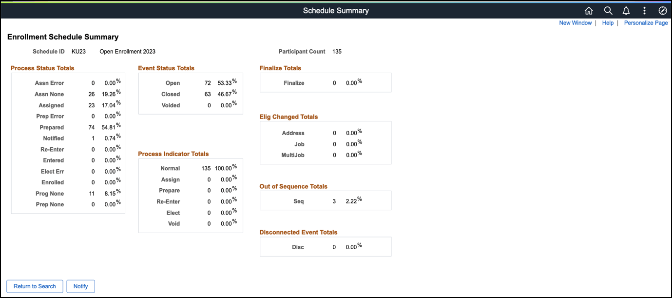
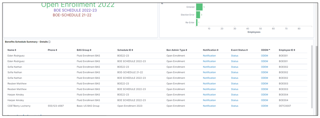
Over the years, PeopleSoft has created numerous static reports that provide data to the user. An example of that is the Schedule Summary that allows the Benefits Administrator to see limited data about the Benefits Administration process.
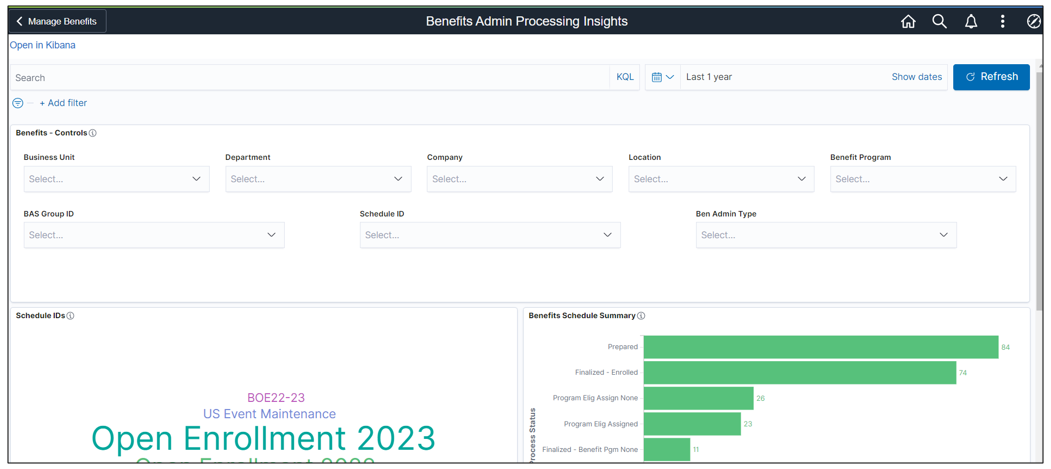
Now with the ability that Kibana visualizations provides, what was just an online view can become an interactive analytic providing greater detail and action links. The Benefits Admin Processing Insights dashboard can be filtered by meaningful fields including BAS Group ID and Schedule ID. From here the Benefits staff can view and filter down into the many steps that can occur during the Ben Admin process. The grid provides the Admin with employee details associated with the process. The visualization also gives you the ability to take action directly from the grid, such as notify the individual, investigate the status, and take action with the On-Demand Event Process. More information, less clicks, and better navigation means more efficiency for staff.
ADDITIONAL RESOURCES
Like all of our Kibana Analytics, we give you a starting point to build dashboards that are meaningful for your organization. We don’t expect you to stop here but look for you to expand on these examples as you build visualizations for your organization.
To find more information about getting started with Kibana, check out the Kibana Analytics page that is filled with links to blogs, videos, and documentation. I would also encourage you to view the Image 44 Highlights video to see a demo of these two dashboards and learn more about the Benefits Utilization analytics.
