Oracle Application Performance Monitoring (APM) features distributed tracing that provides deep visibility into application performance and availability. APM Trace Explorer allows to query traces and spans using Trace Query Language (TQL) to identify performance issues and bottlenecks.
TQL now features a new command CLUSTER BY that allows to cluster traces and spans to quickly detect outliers. The command can be used to group traces or spans based on similarity in attributes which saves time since it allows to study few clusters instead of thousands of traces/spans and has built-in outlier detection to highlight problematic traces/spans. For example, clustering traces by duration would highlight the anomalous traces running significantly longer than most traces. This blog reviews how to use the new CLUSTER BY TQL command to cluster APM traces or spans and detect outliers.
Oracle defined Dashboard with CLUSTER BY
There is a new out-of-the-box widget “Top Server Requests” which is available in “Service Overview” dashboard that clusters top server requests by their span duration. Each bubble represents a cluster of spans with its size reflecting the count of spans in the cluster. The outliers are highlighted in red in the image below.
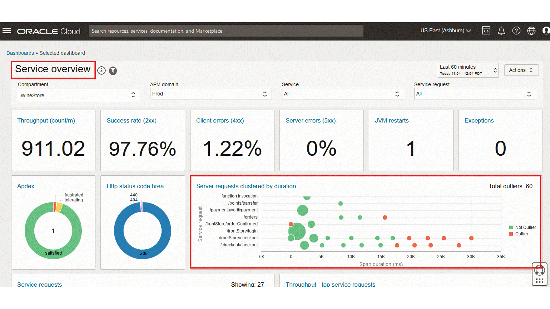
The highlighted cluster in above GIF is an outlier showing that two requests to orders have taken unusually long. The two spans can be drilled into by clicking on that cluster or further analysis.
Execute CLUSTER BY in Trace Explorer
APM Trace Explorer allows to query traces and spans using TQL. CLUSTER BY can be used in Trace Explorer to cluster traces or spans by attributes and identify outliers. CLUSTER BY supports both metric and dimension attributes. The results are shown in a tabular format with the following columns: Cluster ID, Count, Percentage, Outlier, Dimension values and Metric Values (center, min, max).
Example:
Say we have a service named ‘wsk-checkout’ and want to detect which operations in the service ran unusually long. The CLUSTER BY command can form clusters of spans and mark the clusters that have taken unusually long as outliers.
cluster by show spans SpanDuration, OperationName where ServiceName = 'wsk-checkout'
The above query clusters the server spans by span duration and operation name for the ‘wsk-checkout' service.
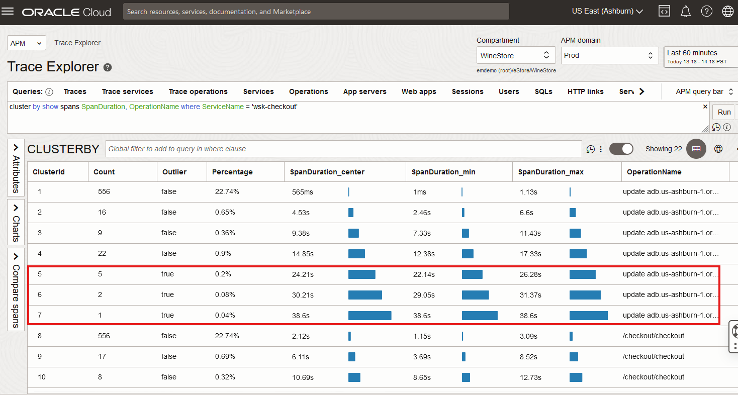
After reviewing the clustered server spans in Trace Explorer in the above Figure 1, we see that the outliers are marked as “true”. There are three outliers which show the anomalous spans that have taken unusually long.
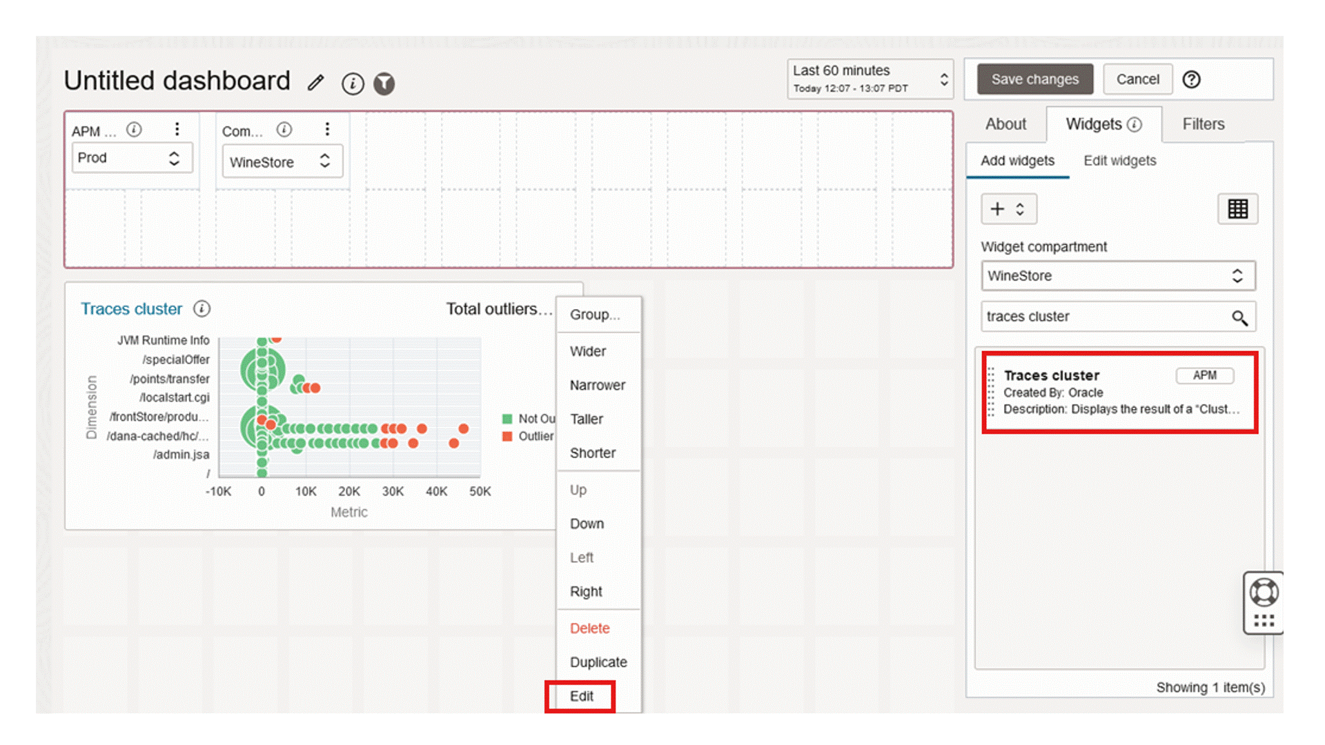
Traces Cluster a predefined widget for clustering
Clustering results are better visualized in a bubble chart. Oracle APM provides a predefined widget for clustering called Traces Cluster that can be added to a dashboards (See here for how to create or edit a dashboard). The Traces Cluster widget visualizes the results of a CLUSTER BY query as a bubble chart. It allows a dimension on the Y axis and a metric on the X axis. The bubble size represents the count of spans/traces and the color indicates whether the cluster is an outlier or not.
Create a new dashboard and select the Traces Cluster widget to add it to this dashboard.
Edit the widget and input the CLUSTER BY query.
Example:
To look at the connect times to our service from different locations, we can use CLUSTER BY to cluster by GeoCity and ConnectTime. The outliers in the chart show the anomalous behavior.
cluster by show (traces) GeoCity as yDimension, ConnectTime as xMetric where ApmrumType='Connection' and ConnectTime is not omitted
Review the above short demo for additional details on Predefined Widget for clustering – Traces Cluster. The highlighted cluster in the chart tells us that the connect time from San Jose is high, therefore the connection is slow.
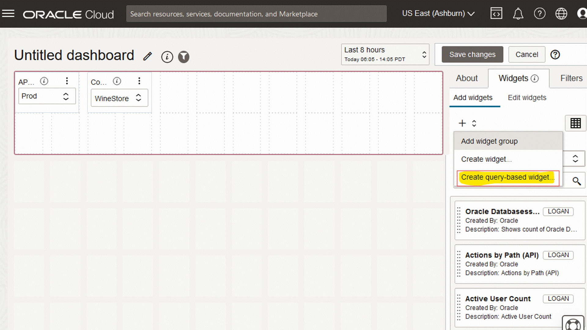
Trace Query-based Widget
To allow customization, Oracle APM provides a widget builder that can be used to build custom visualizations with CLUSTER BY queries. Create a new dashboard and select “Create query-based widget”. Select Traces as DataSource and provide the CLUSTER BY query. Select Bubble Chart as the Chart Type and select the attributes to visualize the data.
Here is an example of a bubble chart visualization that clusters pages by response time:
- Query: cluster by show (traces) OperationName, PageResponseTime where PageResponseTime is not omitted
- Chart Type: Bubble Chart
- X axis: PageResponseTime_Center
- Y axis: Percentage
- Size: Percentage
- Color: OperationName
Query-based Widget details below.
In summary, CLUSTER BY provides a way to cluster APM spans (or traces) so that you can focus on a few clusters instead of individual spans. There are several ways of using CLUSTER BY:
- Part of TQL, run in the Trace Explorer
- In the Traces Cluster widget, to visualize results of any CLUSTER BY query in a custom dashboard
- In the Oracle provided dashboard Service Overview to show server requests clustered by duration