How to Effectively Manage Your Multi-Cloud Costs
OCI, AWS, Azure and GCP cost and usage analysis
In a previously posted blog, I described the no-cost, OCI Cost and Usage Analytics Application for OCI resources. In this blog we see how this application expands on the OCI cost and usage analysis to include multi-cloud resource cost and usage analysis for AWS, Azure, and Google Cloud Platform (GCP). The Multi-Cloud cost management capabilities now provide a consistent way of analyzing all your cloud costs regardless of the cloud vendor. You no longer need to learn the particulars of each cloud vendors tools and you now have one, simple, intuitive way of looking at all your cloud costs.
Building on the workflows developed for OCI resource cost and usage, the AWS, Azure and GCP dashboards provide the same look-and-feel with timeseries, multi-dimensional and user defined tagging analysis capabilities. As resource consumption patterns change, for example new or terminated resources, or resource costs change, these changes are picked up by the application and are automatically reflected in the cost and usage reports.
This blog gives you a high-level, navigational walk-through of each of the cloud vendor cost and usage dashboards with a brief description of applied filters, drill down, and general workflow. In addition, we will look at the Multi-cloud Home, which is a cost comparison of current and 6 months historical spend across the vendors. We finish with the initial configuration requirements for each of the cloud vendors managed though a configuration dashboard.
Each of the following examples below begins at the OCI Home dashboard. Each cloud vendor home dashboard reflects the:
- current month/year defined budget,
- current spend, the remaining balance,
- burn rate for the month,
- links to the cost and usage reporting dashboards for the resources consumed
The dashboard is organized with a navigational menu on the left invoked by the hamburger button to allow for easy navigational flow through the various dashboards.
Managing AWS Costs Using the ADB Cost and Usage Application
The dashboard makes it easy for you to understand your cloud expenditures. In Figure 1 below, we navigate to the AWS Home dashboard to evaluate current spend and budget for the month. We then drill down to the AWS Cost Analysis dashboard to evaluate cost and consumption from the period 01-Jan-2024 until 23-Jan-2024 for all regions, for all AWS services, grouped daily and selecting only the top 5 services.
You can view summarized expenditure trends and then drill down into more detail. The Cost Analysis dashboards are organized with built-in multi-dimension filters on the left, graphs in the top right region and detail tables below the graphs. As depicted in the Top N Cost Summary pie chart, the largest cost is attributed to EC2 instance usage, with some cost attributed to AWSKMS, AmazonRoute53 and RDS. Clicking on the AmazonEC2 slice of the pie, we get a more complete breakdown of cost associated with that service by Top Cost Type and a Detail Cost Data table for the consumed service resources.
Returning to the AWS Cost Analysis dashboard we have the Cost Data As per Grouping Entity detail table. As our group by interval is daily, this detail table gives us a daily breakdown of cost for each service for our defined Start Date and End Date of 01-JAN-2024 to 23-JAN-2024.
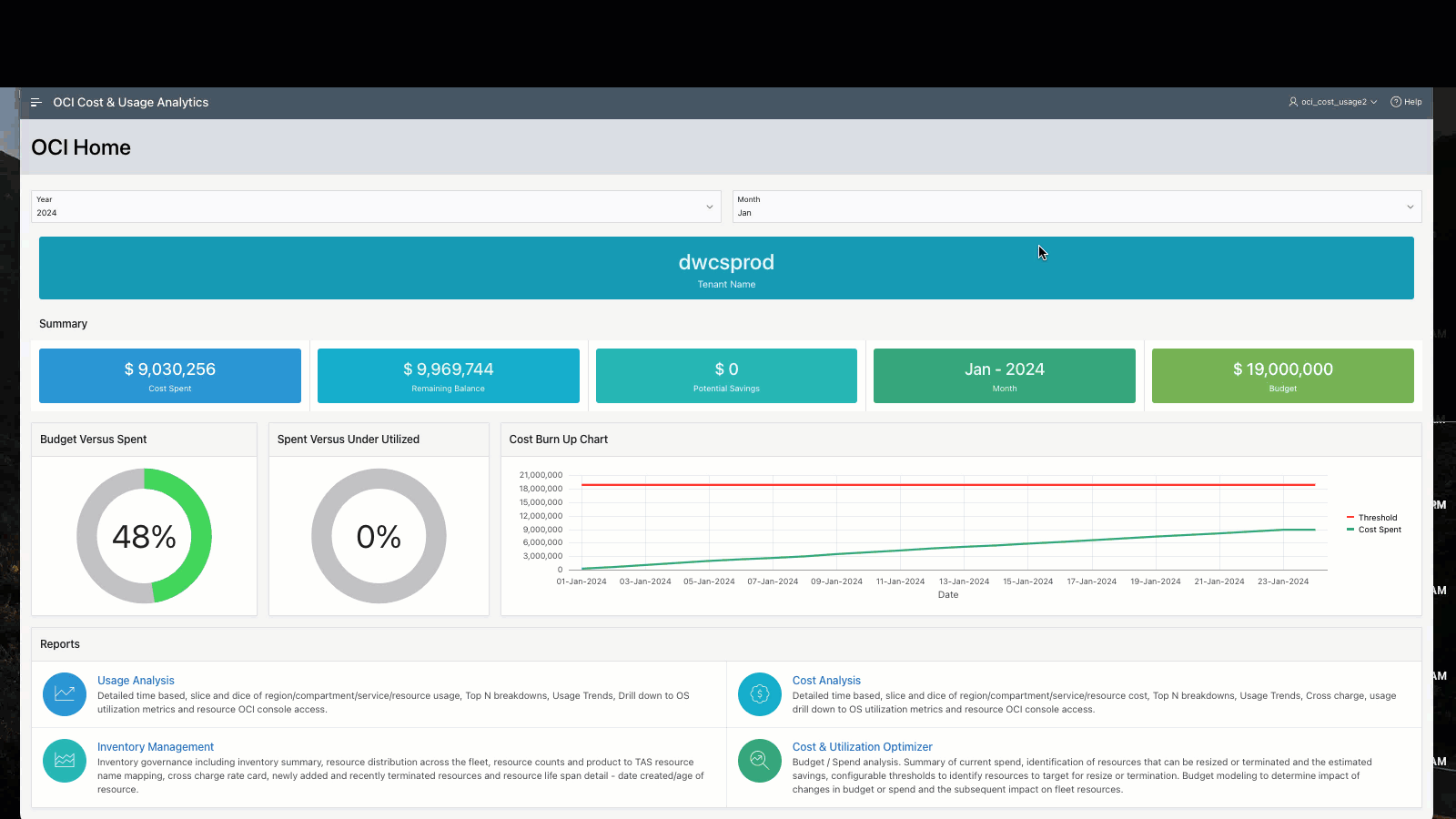
Figure 1 AWS Cost Analysis navigational demo
Managing Azure Costs Using the ADB Cost and Usage Application
Like the AWS Cost reports, the Azure cost report provides the same, rich, multi-dimensional analysis. In this example, Figure 2 below, we review costs for the period 01-Jun-2023 to 31-Jul-2023 for all consumed Azure services grouped by Resource Type for all regions. The navigational flow is similar to the OCI and AWS cost analysis dashboards. We open the navigation side menu and connect to the Azure Home dashboard where we see the executive summary of spend, budget, burn rate and budget balance for the current month. Again, from the navigation menu on the left, we select Azure Cost Analysis to get to the Azure Cost Analysis dashboard.
The Azure Cost Analysis dashboard has the same look and feel as the OCI and AWS dashboards. Filters for analysis are defined on the left region with Top Cost, Cost Summary, and Cost Trend charts on the upper right region. Cost data detail tables are below the graphs. Azure Service filters include all consumed Azure Services listed in the Azure generated cost data with group by functionality for Operation Category, Region, Resource Group, Resource Type and Service Category. In this Azure example below, Storage Accounts (all Azure storage services) represents 95% of total spend. Applying filters in the graphs directly allows us to filter out the predominate cost of the Storage Accounts service to see relative spend for the other services. The Cost Data Detail tables in the application located below the graphs give us a cost breakdown grouped by service and, a Cost Data detailed table with unit, usage, and cost breakdown for each resource type with product description.
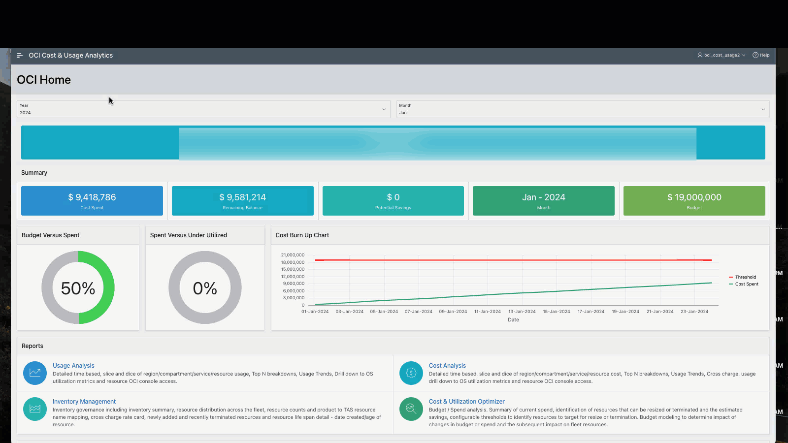 Figure 2 Azure Cost Analysis navigational demo
Managing GCP Costs Using the ADB Cost and Usage Application
In the following GCP example, Figure 3 below, we first navigate to the GCP Home page to review the executive summary for the current month, January 2024. We see that we have breached our defined $1000 budget on January 9th and continued to consume resources well beyond our budget. In the GCP Cost Analysis dashboard, we explore GCP costs for the month of January 2024. We filter on all consumed GCP Services and examine resources consumed daily focusing on the top 25 GCP services. Once we identify the cost of top resource consumed by service, we change the filter to identify the top consuming projects.
Figure 3 GCP Cost Analysis navigational demo
Multi-Cloud Cross Cloud Cost Comparison
The Multi-Cloud Home dashboard, Figure 4 below, provides a monthly side-by-side spend comparison across the 4 cloud vendors for the current month, and below that, a comparison of historical costs for the past 6 months. We can filter on the vendor by eliminating vendors in the graph. For example, we see that the predominate spend is in OCI. We can see the relative spend for the other vendors by de-selecting OCI from the bar graph and we can now gauge which cloud vendor is providing the most value.
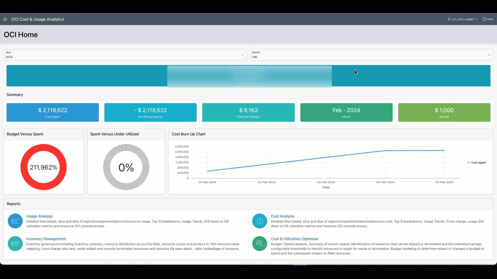
Figure 4 Multi-cloud Cross Cost Analysis Dashboard
Cloud Vendor Configuration
When accessing the respective cloud vendor home dashboard for the first time, you will find the configuration dashboards requesting required configuration setup to access your cloud vendor cost data. Each cloud vendor home dashboard in the application includes setup instructions to be configured and the required information to provide to your ADB Cost and Usage application for access. Examples of these configuration dashboard for AWS, Azure and GCP are below Figures 5,6,7, respectively.
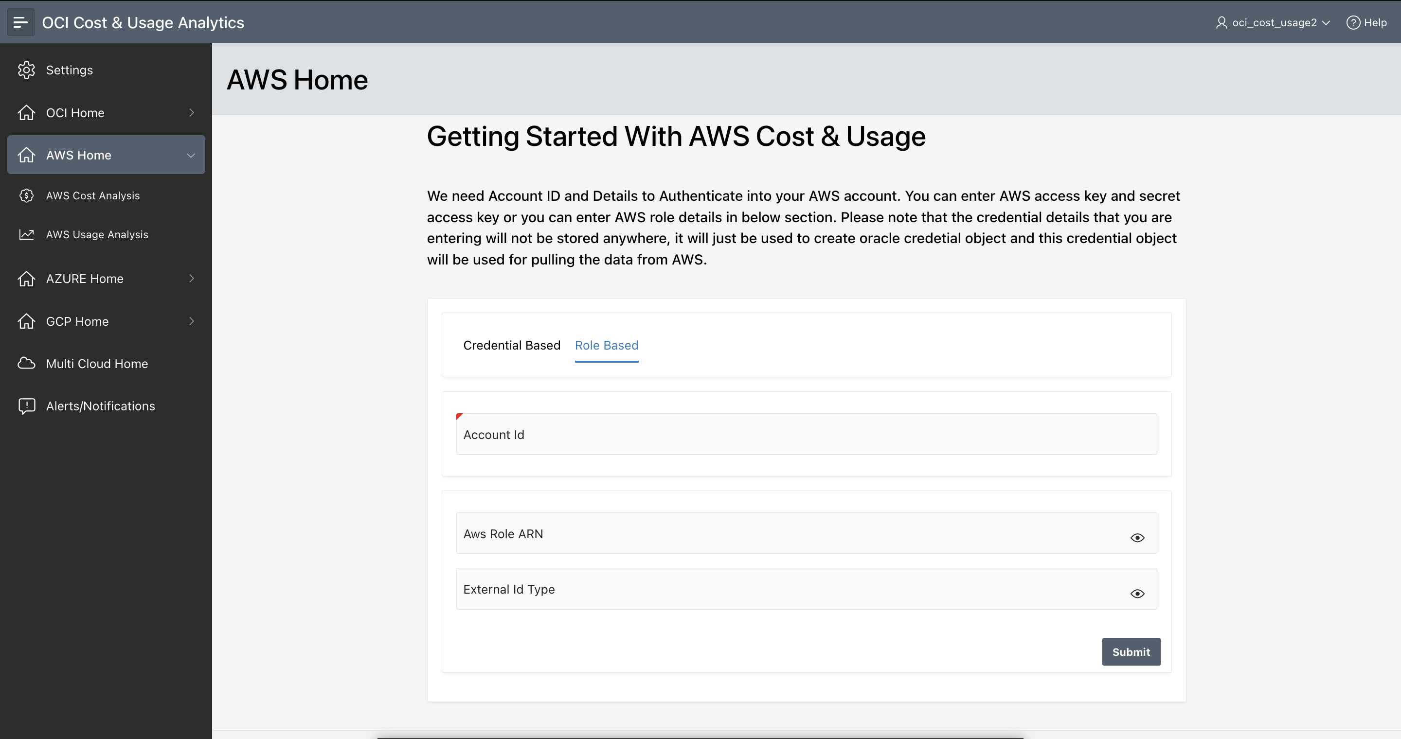
Figure 5 AWS Cost Analysis configuration
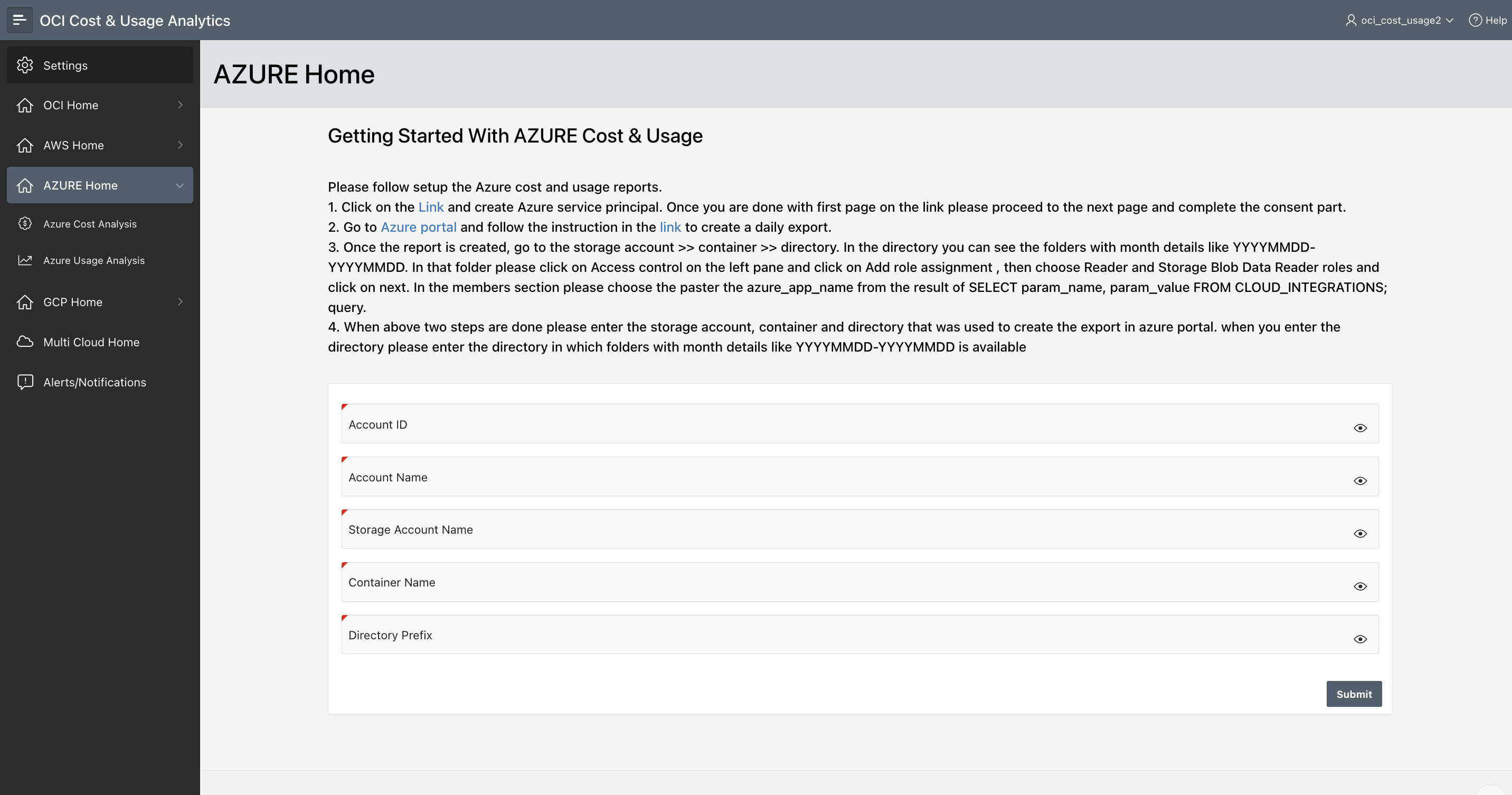
Figure 6 Azure Cost Analysis configuration
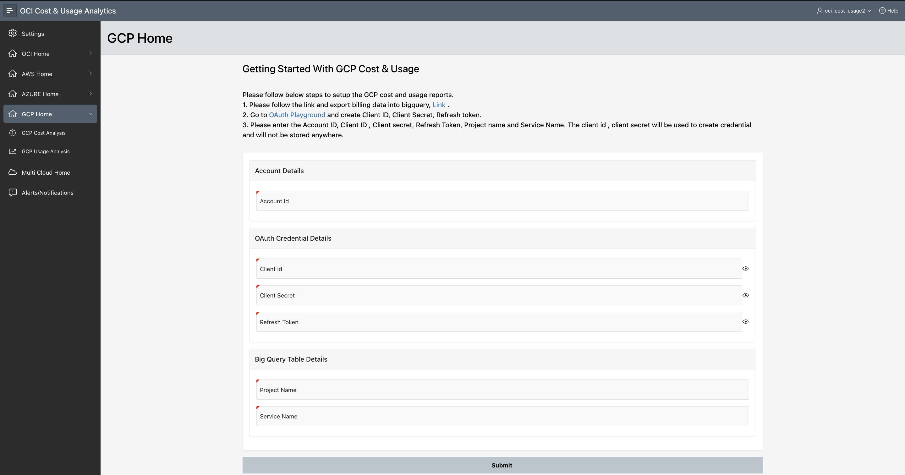
Figure 7 GCP Cost Analysis configuration
Multi-Cloud Cost & Usage Analytics
Cost governance is a critical component of cloud management. To have a common application that aggregates and reports on your cross-cloud vendor costs facilitates the cloud cost management experience. The OCI Cost & Usage Analytics application provides you with the means to understand your cost across cloud vendors, identify usage patterns, model budgets, identify and explore fluctuation in resource consumption, and have the capability to drill down and compare actual usage versus billed usage. You now have a consistent way of analyzing all your cloud costs – regardless of the vendor. It’s dramatically simpler. You no longer need to learn the particulars of each cloud vendors tools. You have one, simple, intuitive way of looking at it all.