Introduction
Welcome to the third article in the Unlocking Custom Visualizations in Oracle Analytics series. In Part 2, you explored how to implement the render function to generate a basic bar chart visualization using hardcoded values. This section focuses on configuring the Grammar Panel, which plays a crucial role in defining how data interacts with the visualization.
Understanding the Grammar Panel
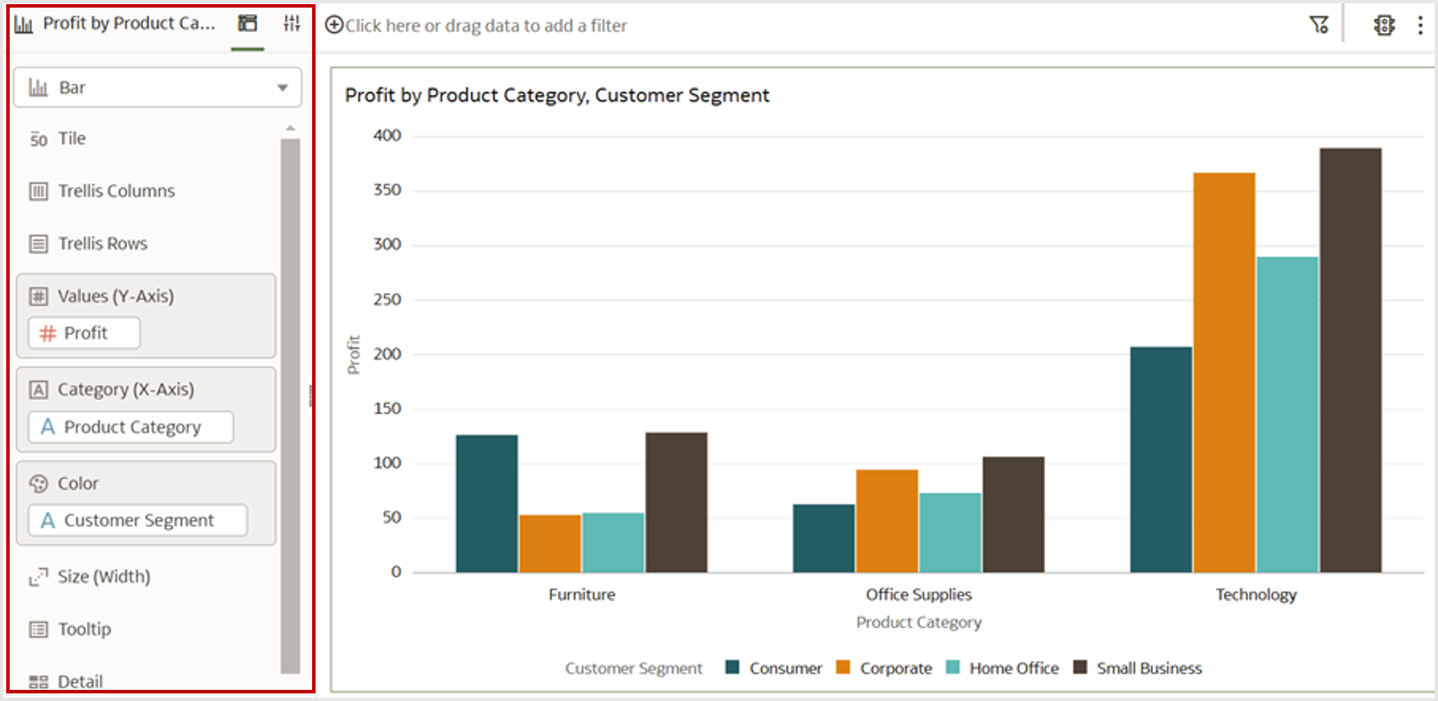
The Grammar Panel, as shown in Figure 1, is an essential interface element within the visualization canvas where dataset fields are dragged and dropped to define the structure of a visualization. It dictates how data is displayed by assigning fields to grammar edges such as X-axis, Y-axis, Color, and Size.
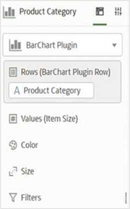
Default Grammar Panel for the Custom Extension
When creating a new data visualization custom extension, the default Grammar Panel includes 4 edges: Rows, Measures, Color, and Size.
You can modify these edges to better suit your visualization needs. This article walks you through configuring the Grammar Panel and customizing its edges accordingly.
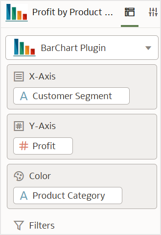
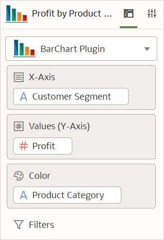
Expected Output of the Grammar Panel Configuration
By end of this article, you will:
- Understand the role of the Grammar Panel in Oracle Analytics
- Configure grammar edges for a bar chart, including Rows, Values, and Color
- Modify the Visualization Data Model Handler to define these grammar rules
After configuring the Grammar Panel, your custom bar chart extension should have the following edges:
- X-Axis (Rows edge): Accepts only categorical values and appears first in the panel
- Y-axis (Values edge): Accepts only measure fields and is placed second
- Color edge: Accepts only categorical fields and is placed at the end
To achieve this, modifications are required in the Visualization Data Model Handler Configuration file.
Configuring the Visualization Data Model Handler
The Visualization Data Model Handler defines how data fields are structured and interpreted within a custom extension. It determines how users interact with data visually, ensuring that the extension processes inputs correctly.
Key functions of the Data Model Handler
- Defines the Data Binding Slots: Determines if an edge should accept categorical fields, measures, or both
- Specific rules: Controls how data is assigned to different grammar edges
- Acts as a bridge: Ensures seamless integration between the UI and backend logic
Locating the Data Model Handler Config file
The Data Model Handler JSON file is located in the following directory, as shown in Figure 4:
C:\custom-plugins\src\customviz\com-company-barchart\extensions\oracle.bi.tech.plugin.visualizationDatamodelHandler
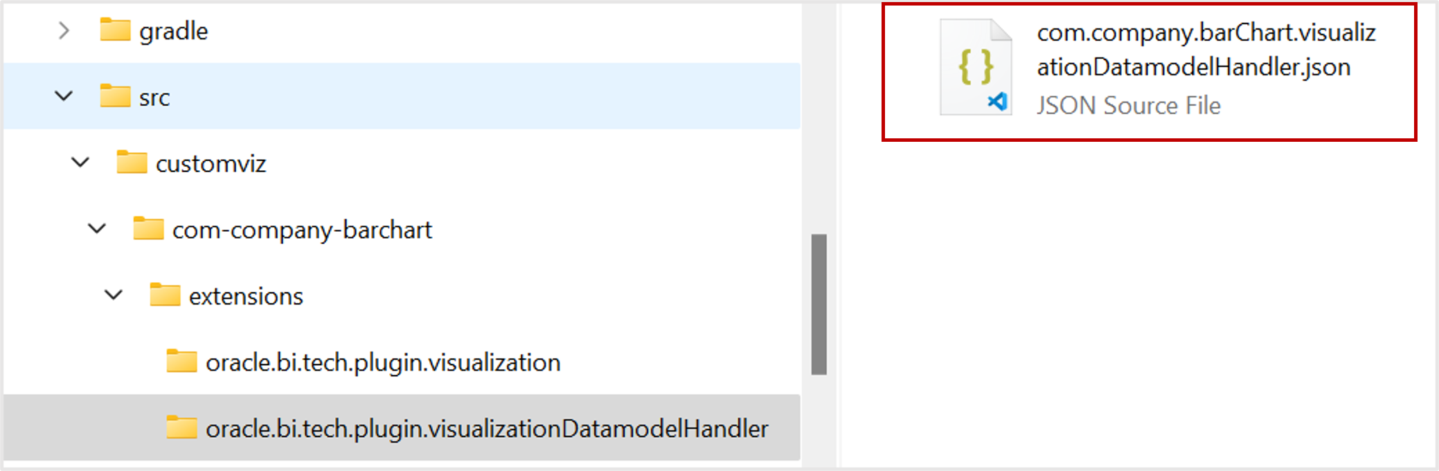
The JSON file com.company.barChart.visualizationDatamodelHandler.json controls how the Grammar Panel interacts with data fields.
Configuring Grammar Edges
Each grammar edge can be customized based on your extension’s needs. Modify the JSON configuration file, com.company.barChart.visualizationDatamodelHandler.json, to set up the following edges:
Configuring the Measures edge
"measures": {

    "contentType": "measures",

    "global": {

        "minCount": 0,

        "maxCount": 1,

        "priority": 10

    },

    "ui": {

        "customName": { "key": "BARCHART_ITEM_SIZE", "default": "Item Size" },

        "order": 2

    }

}
- contentType: Set to measures, and allows only numerical fields (e.g., profit)
- MinCount: 0 means measure fields are optional
- MaxCount: 1 restricts selection to only one measure
- Order 2: Positions this item as the second field in the Grammar Panel
- Custom name: Allows setting a custom name for the grammar
Configuring the Rows edge
"row": {

    "contentType": "categorical",

    "global": {

        "priority": 1,

        "preferredMax": 1

    },

    "ui": {

        "customName": { "key": "BARCHART_ROW_LABEL", "default": " BarChart Plugin Row" },

        "order": 1

    },

    "categorical": {

        "functionalInfo": ["inner", "row", "categoricalType"]

    }

}
- contentType: Set to categorical, allowing only categorical fields (e.g., product category)
- preferredMax: 1 ensures only one categorical field is allowed
- Order 1: Places this item in the first position of the Grammar Panel
- Custom name: Allows setting a custom name for the grammar
If the grammar should accept both categorical and measure values, update contentType as “mixed” or “both”.
Configuring the Color edge
"color": {

    "contentType": "categorical",

    "global": {

        "preferredMin": 0,

        "preferredMax": 1,

        "priority": 20

    },

    "ui": {

        "order": 3

    },

    "categorical": {

        "functionalInfo": ["inner", "col", "categoricalType"]

    }

}
- contentType: Allows categorical values to be assigned to Color properties in the visualization
- preferredMin: 0 sets categorical fields as optional
- preferredMax: 1 ensures only one categorical field is allowed
- Order 3: Places this item third place in the Grammar Panel
Disabling the Size edge
If the Size edge isn’t required, you can disable it:
“size”: “none”
Adding Additional Grammars
Some extensions may require extra grammar edges such as Glyph and Detail. By default, these are disabled (set to none), but you can enable them similarly to Rows, Values, and Color.
Renaming Grammar Edges
To make the grammar names more user-friendly, update the messages.js file located in the following path:
C:\custom-plugins\src\customviz\com-company-barchart\nls\root
By default, it contains the following names:
define({

    "BARCHART_DISPLAY_NAME": "BarChart Plugin",

    "BARCHART_SHORT_DISPLAY_NAME": "BarChart Plugin",

    "BARCHART_CATEGORY":"BarChart Plugin",

    "BARCHART_ROW_LABEL":"BarChart Plugin Row",

    "BARCHART_ITEM_SIZE":"Item Size",

    "TEXT_MESSAGE": "Hello!  This is the {0} visualization and I have {1} rows of data."

});
Modify the JSON entries above to reflect UI-friendly names, as shown below:
define({

    "BARCHART_DISPLAY_NAME": "BarChart Plugin",

    "BARCHART_SHORT_DISPLAY_NAME": "BarChart Plugin",

    "BARCHART_CATEGORY":"BarChart Plugin",

    "BARCHART_ROW_LABEL":"X-Axis",

    "BARCHART_ITEM_SIZE":"Y-Axis",

    "TEXT_MESSAGE": "Hello!  This is the {0} visualization and I have {1} rows of data."

});
- Rename “Rows(BarChart Plugin Row)” to “Rows(X-Axis)” by changing BarChart Plugin Row to X-Axis in “BARCHART_ROW_LABEL”.
- Rename “Values(Item Size)” to “Values(Y-Axis)” by modifying Item Size to Y-Axis in “BARCHART_ITEM_SIZE”.
This should rename the grammar edges to: Rows(X-Axis), Values(Y-Axis), and Color.
If simply X-Axis is preferred instead of “Rows(X-Axis)”, also update the default section in “ui” to “X-Axis”, as shown below:
"row": {

    "contentType": "categorical",

    "global": {

        "priority": 1,

        "preferredMax": 1

    },

    "ui": {

        "customName": { "key": "BARCHART_ROW_LABEL", "default": "X-Axis" },

        "order": 1

    },

    "categorical": {

        "functionalInfo": ["inner", "row", "categoricalType"]

    }

}
Similarly, change the “Values(Y-Axis)” to “Y-Axis” by updating the default to “Y-Axis” within “ui” for the Measure edge.
Final Output
After implementing these changes, the Grammar Panel for your custom bar chart should display:
- “X-Axis” as Rows grammar edge
- “Y-Axis” as Values grammar edge
- “Color” grammar edge for encoding additional categorical information
Next Steps
The article covers configuring the Grammar Panel for a bar chart extension. However, the visualization still displays hardcoded values from this blog series articles Part 1 and Part 2.
Part 4 in the series focuses on mappers and integrating external data sources to dynamically generate bar charts based on dataset inputs.
Stay tuned!
Call to Action
Now that you’ve read this post, try it yourself and let us know your results in the Oracle Analytics Community, where you can also ask questions and post ideas. It’s free and easy to join.
If you have questions or need more details, you can always check the Oracle Help Center for Oracle Analytics.