Oracle Analytics Cloud (OAC), a Visionary in the Gartner Magic Quadrant, is a cloud-first platform that provides rich data visualization and interaction capabilities for end users.
Oracle Analytics provides easy and powerful filter interaction capabilities on dashboards that empower users to slice and dice data quickly, perform deeper data analysis, and narrow down to the data that users are interested in.
This post (Part 1 of a three-part series) describes filter scope in detail.
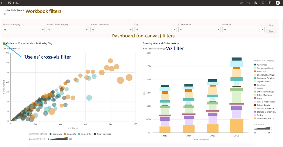
Oracle Analytics provides the ability to apply filters at the Workbook, Canvas, and Visualization scope. In this example, the dashboard author added multiple filter scopes for end-user interaction.
Workbook Filters
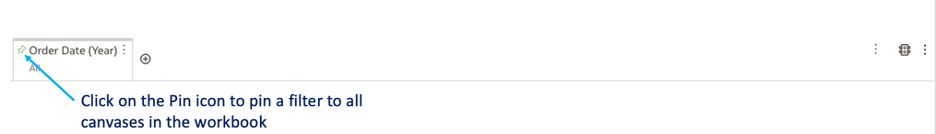
Workbook filters can be canvas-specific or applied for the workbook (that is, for all canvases in the workbook).
You can include workbook filters to pre-filter data on the canvas or workbook and you can hide filters from end users. Suppose that you’re a dashboard author and you want to filter the workbook data to certain Order Date Years and allow end users to interact only with the filtered data. To achieve this outcome, you can add the filter in Visualize and hide the filter in Present.
In Visualize:
- Add the column to the Workbook filter bar and pin it to all canvas.
- Filter the Year dimension to the appropriate periods.
In Present:
- Navigate to the Property panel of a canvas.
- Navigate to the Filter tab of the Property panel.
- Hide the page filter.
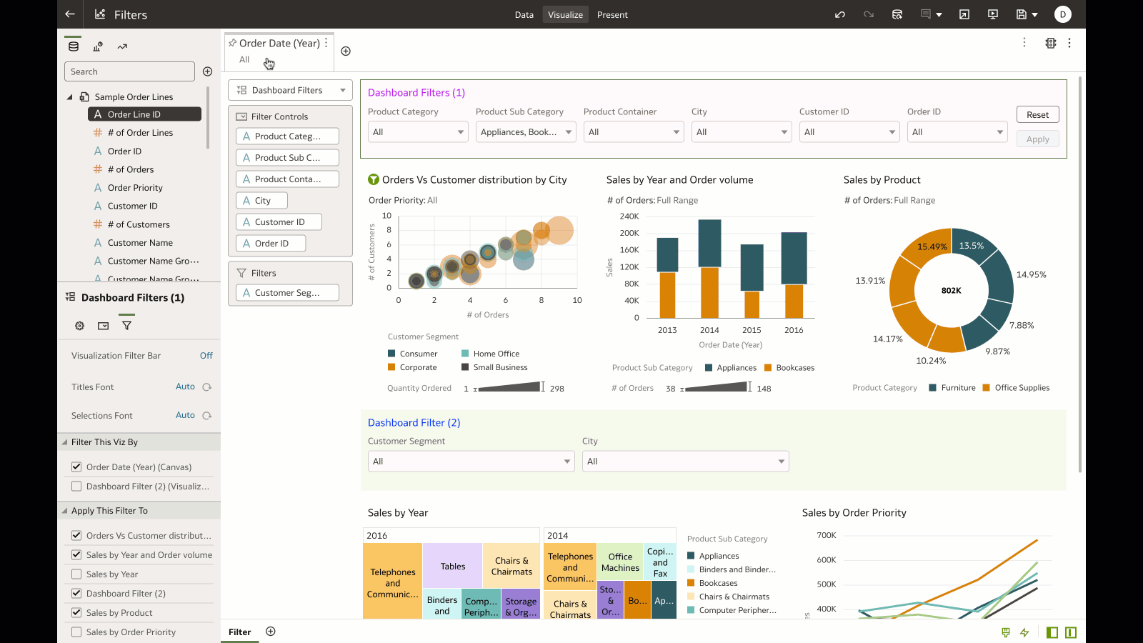
Dashboard Filters
The Dashboard Filter bar is an easy-to-use visualization type with a grammar element to add multiple filter controls for end-user interaction and another grammar to limit the values of the filters.
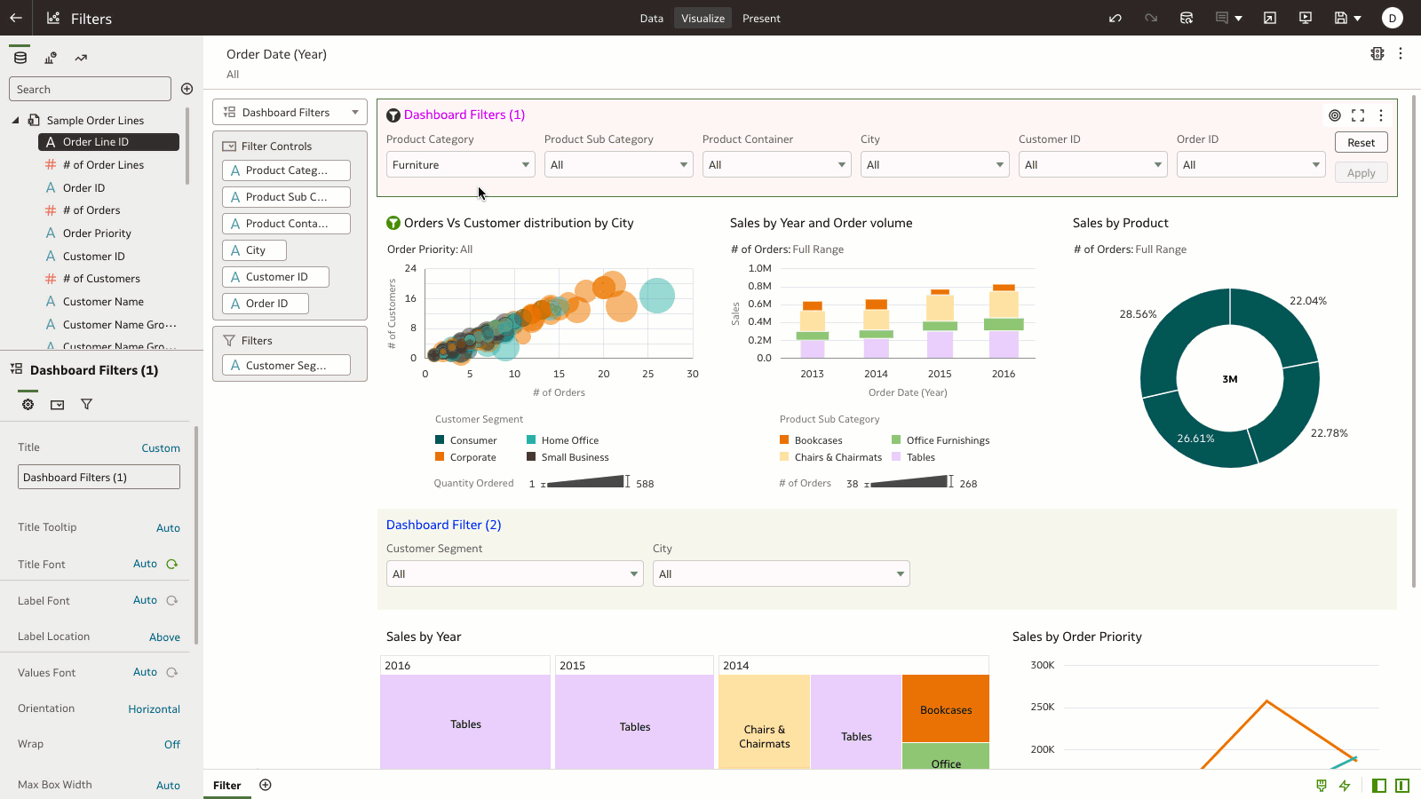
In this example, Product Category, Product Sub-Category, and other filter values are limited by the selected Consumer Customer Segment only.
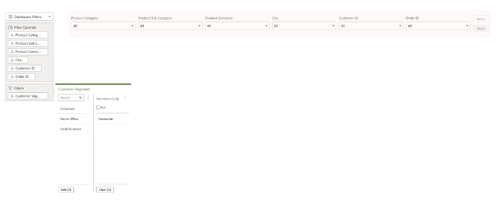
Dashboard filters:
- Are canvas-specific.
- Can have multiple filters added to the Dashboard Filter bar (unlike list filters).
- Have rich property controls that allow for customizing the orientation, flexible layout, and button options (such as Apply and Reset).
- Can be applied to specific visualizations on the canvas.
Use this link to watch a demo of dashboard filter capabilities.
Add multiple dashboard filter bars
You can add multiple dashboard filter bars on a single canvas and apply the filters to specific visualizations on the canvas. In this example, the author designed the canvas to have two dashboard filter bars and the filters are applied specifically to certain visualizations on the canvas.
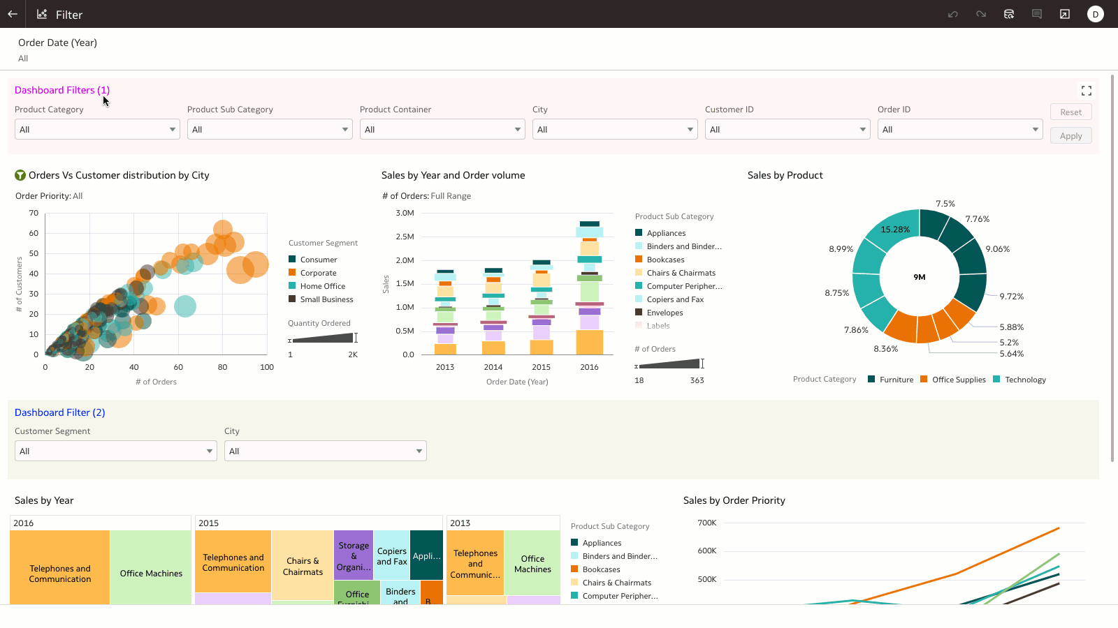
Apply dashboard filters to specific visualizations
In this example, the author configured a dashboard filter to affect certain visualizations on the canvas using the “Apply This Filer To” property setting. This property is extremely helpful when you want to have multiple dashboard filters on a single canvas and limit the filter values on specific visualizations.
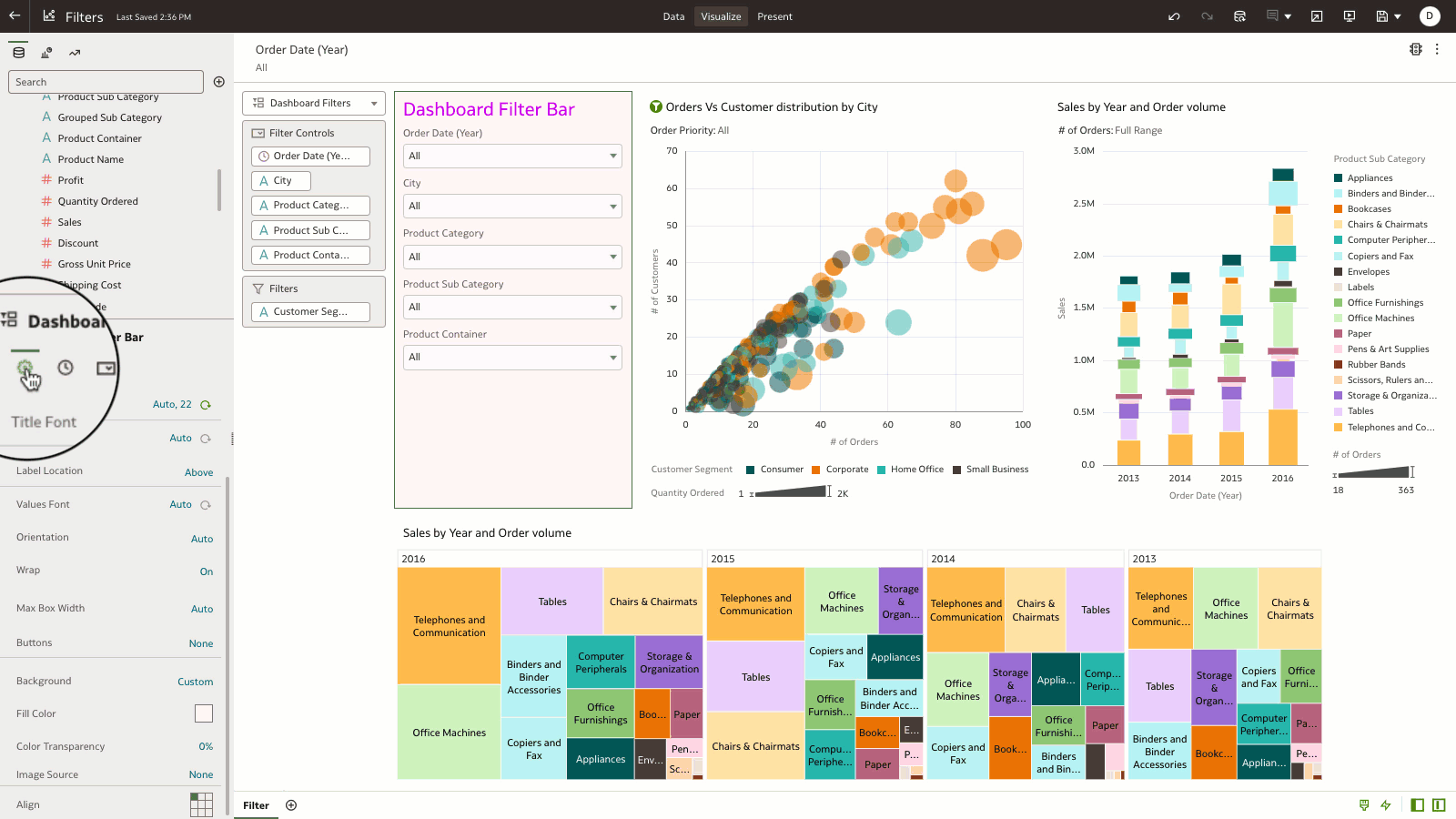
Change the orientation of the dashboard filter bar
Dashboard filter properties provide control of the layout of the filter controls and the orientation and configuration of the Apply and Reset buttons. In this example, the author is changing the position of the label location and the orientation of the filter controls to optimally place them within the filter bar.
Visualization Filters
You can add filters to an individual visualization by dragging the columns onto the filter edge of the visualization’s grammar. These filters are local to the visualization.
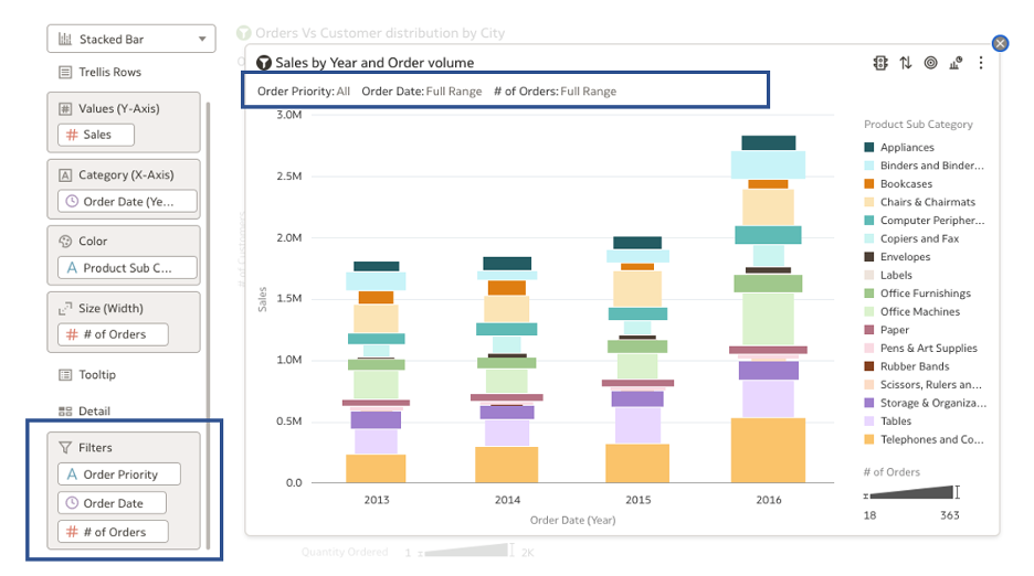
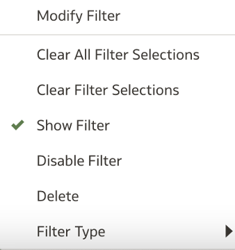
Click the filter columns to show additional capabilities to:
- Show and hide visualization filters: You can decide to hide or show the filters that apply to visualizations.
- Enable and disable filters: Filters that are disabled aren’t applied to the visualization.
- Change the filter type to List or Top Bottom: You can specify the filter experience to show as list filters or as Top N / Bottom N.
Best Practices for Workbook and Dashboard Filters
As an author designing the dashboard experience, you’ll want to optimally expose filters for end-user interactions.
With workbook filters, you have the option of pinning or unpinning a filter:
- When a filter is unpinned (default), the filter is canvas-specific.
- When a filter is pinned, the filter is available on all canvases in the workbook.
Workbook filters is the primary scope for authors to pre-filter the data on the workbook.
- The primary purpose of workbook filters is to define the scope of data that end users interact with on the dashboard and aren’t exposed for end-user interaction.
Dashboard filters are the primary interaction paradigm for end users.
- Dashboard authors have the flexibility to curate canvas-specific filters based on the reporting requirements.
- A dashboard filter is a visualization type and provides several customizations as explained in this article.
- A dashboard filter can be copied and pasted across multiple canvases and provides agility when recreating the same dashboard filters across multiple canvases.
For additional information, see Create and Apply Filters.