
Data visualization has become one of the primary interfaces through which enterprise users interpret data, communicate insights, and influence decisions and actions. Yet the evaluation of visualization quality often remains subjective: a dashboard may be called “good,” “too busy,” “executive-ready,” or “unfinished,” but those judgments are frequently based on personal preferences rather than a model.
Oracle Patent 12,625,873, granted on May 12, 2026, to Benjamin Arnulf, and titled “System and method for generating data visualization scores for use with a data analytics environment” introduces a more systematic approach. The patent describes a system that can examine a data visualization, identify the elements present, compare those elements against an analytics data visualization score matrix, and generate a score associated with the visualization.
This article presents the conceptual foundation of the Analytics Data Visualization Score Matrix, its relevance for Oracle Analytics users, and its evolution through an LLM lens, where the matrix can become a reusable AI evaluation framework inside environments such as ChatGPT Enterprise, Codex-style development workflows, and the Oracle AI Data Platform.
Introduction: The Evaluation Problem in Data Visualization
Enterprise analytics platforms such as Oracle Analytics enable users to create dashboards, workbooks, reports, infographics, and interactive visual experiences. These artifacts are no longer passive outputs. They are decision interfaces.
A data visualization used for personal exploration doesn’t need to meet the same standard as a dashboard presented to an executive team. A workbook shared with an internal project group doesn’t require the same level of polish, context, interactivity, and storytelling as a customer-facing presentation or conference demo.
This creates a practical problem for analytics users: How does a user know whether a visualization is appropriate for its intended audience?
The Data Visualization Matrix addresses this challenge by translating data visualization quality and complexity into a measurable scoring framework. The granted patent describes a system that operates like an expert system, or according to a series of rules and processes, to examine a visualization, compare found elements against a score matrix, and generate a data visualization score.
Analytics Data Visualization Matrix
The central idea behind the matrix is simple: The higher the visualization score, the more suitable the visualization becomes for broader, more strategic, and more demanding audiences.
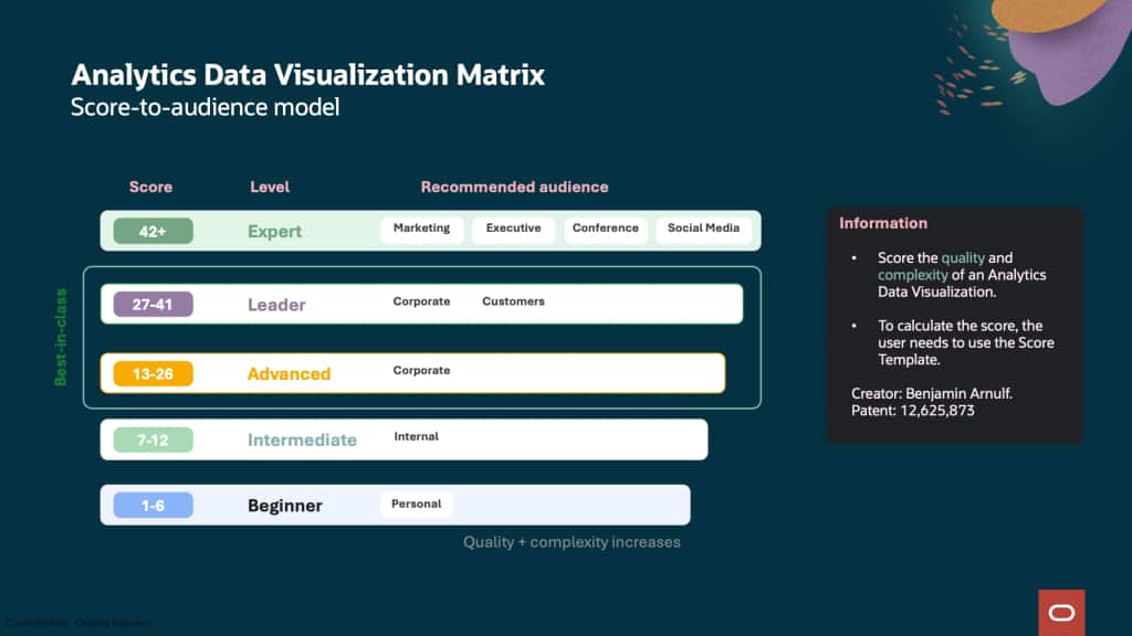
The score is intended to be an audience-readiness model. The slide defines five levels of visualization maturity: The patent describes a similar progression:
- Beginner: Visualizations may be suitable for personal or internal use.
- Intermediate: Visualizations may be appropriate for teams or meetings.
- Advanced: Visualizations may be shared within an organization.
- Leader: Visualizations may be suited for senior corporate representatives, partners, or customers.
- Expert: Visualizations may be appropriate for marketing, executive, conferences, or social media.
This score-to-audience framing is important because it shifts the conversation from taste to purpose.
Analytics Data Visualization Score Matrix
At the center of the invention is the Analytics Data Visualization Score Matrix. The matrix assigns weighted point values to visualization elements that may appear in an Oracle Analytics workbook, dashboard, or related analytical artifact.
These elements include structural components, design features, filters, interactive objects, advanced analytics, geospatial capabilities, and ML/AI-driven functions.
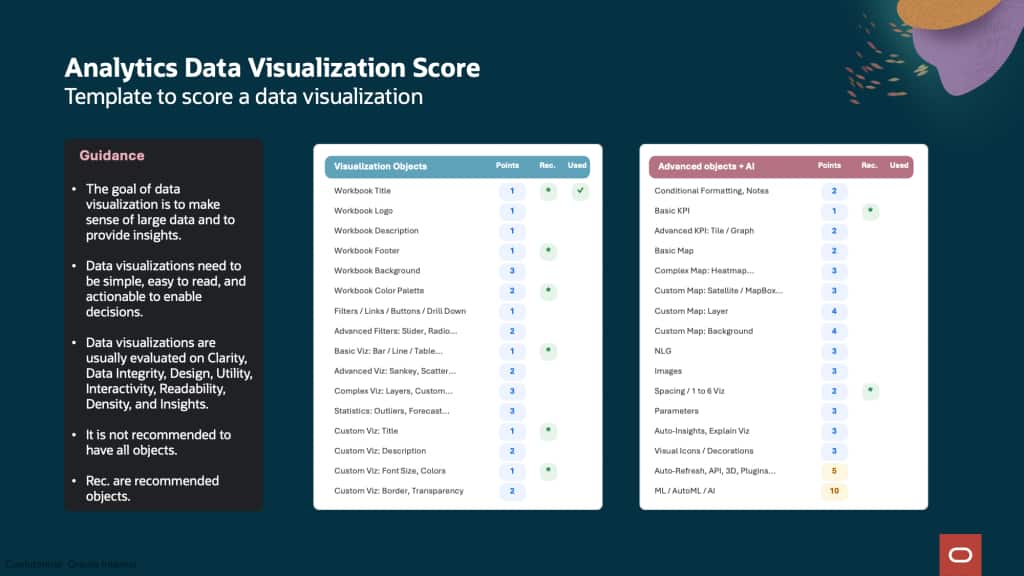
The patent includes a 32-element example matrix, where each visualization object type has an associated point value and a “used” indicator. The patent also notes that some objects, such as AI or natural language generation, contribute greater weight to the overall score because they may represent more advanced analytical capabilities. The matrix can be customized based on the enterprise tool used.
Formally, the scoring model can be expressed as:
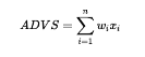
Where:
• (ADVS) is the Analytics Data Visualization Score.
• (w_i) is the point weight assigned to visualization element (i).
• (x_i) is a binary indicator representing whether the element is present.
• (n) is the number of evaluated visualization elements.
This turns visualization assessment into a measurable, explainable, and repeatable process.
Generating Data Visualization Scores
Generating visualization scores that can be summarized in four steps:
- The system receives a request to assess a visualization of interest, for example within a workbook.
- It examines the visualization. This examination may be based on the visualization associated JSON, XML, software code, and metadata.
- The system prepares a matrix or list of found elements within the visualization and compares those elements against the Analytics Data Visualization Score Matrix.
- The system generates a data visualization score, which may be displayed in the user interface as a score, icon, recommendation, or other quality and complexity indicator.
Beginner to Advanced Practical Example
The slides illustrate a progression from a basic visualization to a more advanced analytical experience. The beginner example receives a score of 5, while the more advanced example receives a score of 25.
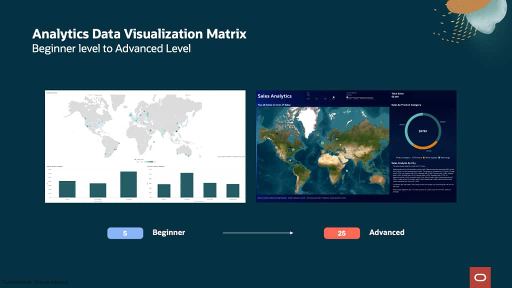
A beginner visualization may contain a few basic charts and a map, but lack the contextual elements needed for effective communication. It may not include a title, description, footer, data source, author attribution, custom palette, advanced analytics, interactivity, or narrative explanation.
The patent gives a similar example of a visualization receiving a score of 5 based on basic visualization objects, a basic map, and good spacing. However, it also explains that such a visualization may still be difficult to understand because it lacks context, title, footer, interactivity, customized formatting, advanced analytics, and visual decorations.
By contrast, a higher-scoring visualization includes more of the elements expected in enterprise communication: meaningful layout, visual hierarchy, custom palette, KPIs, maps, advanced chart types, explanatory text, natural language insight, filters, and potentially AI- or ML-driven analysis.
The score creates a path for improvement. It does not simply judge the author. It helps the author understand what to refine in order to make the visualization more suitable for the intended audience.
A Research Perspective
From a research perspective, the Data Visualization Matrix sits at the intersection of data visualization, human-computer interaction, expert systems, analytics automation, and AI-assisted design.
Traditional visualization evaluation often focuses on perceptual accuracy, chart selection, cognitive load, color theory, or task completion. These dimensions remain important. However, enterprise analytics introduces another dimension: communication readiness.
In an enterprise setting, a visualization is rarely just a chart. It may contain business context, filters, drill paths, KPIs, forecasts, maps, images, branding, narrative text, AI explanations, and automated refresh mechanisms. The analytical artifact is a composed experience.
The Data Visualization Matrix recognizes that the quality of this experience depends on more than chart type. It depends on the presence, balance, and appropriateness of multiple elements that together shape how the audience understands and acts on the data.
Important considerations
A critical nuance is that a higher score doesn’t mean every visualization should include every possible object. The guidance slide explicitly notes that it’s not recommended to have all objects.
The goal is not maximal complexity. The goal is appropriate complexity.
The Data Visualization Matrix should be interpreted as a score-to-audience alignment model, not as a universal instruction to maximize every score. The best visualization isn’t necessarily the one with the most objects. It’s the one whose design, analytical depth, and communication structure match the audience and purpose.
Extending the Matrix Through LLMs and Enterprise AI Platforms
A compelling evolution of the Data Visualization Matrix is its application through large language models and enterprise AI platforms.
Because the matrix is structured as a set of interpretable criteria, weights, and scoring rules, it can be represented inside environments such as ChatGPT Enterprise, Codex-style development workflows, or the Oracle AI Data Platform as a reusable evaluation framework.
In this model, a user could upload a dashboard image, workbook export, JSON definition, XML metadata file, or visualization specification. An AI agent could then inspect the artifact, identify visual and analytical elements, compare them against the matrix, and generate an audience-readiness score.
This aligns closely with the patent’s described method: examine a visualization through associated JSON, XML, software code, or metadata; prepare a list of found elements; compare those elements with the Analytics Data Visualization Score Matrix; and generate a visualization score.
Viewed through an LLM lens, the matrix becomes a bridge between visual analytics and AI-assisted design governance. The LLM doesn’t replace the visualization author. Instead, it acts as an advisor. It can explain why a workbook is beginner, intermediate, advanced, leader, or expert level.
This creates an intelligent feedback loop: Create to Score to Explain to Recommend and Improve.
A user creates a visualization. The AI evaluates it. The matrix explains the score. The platform recommends the next best improvements. The user iterates toward a visualization that better fits the intended audience. Find below an example of Prompt to be used by Oracle AI Data Platform for best results:
Using the Analytics Data Visualization Score Matrix from this article as your source of truth, score the dashboard image I upload. Identify visible elements, assign points conservatively, ensure to understand if the dashboard has been using any ML/AI, AI Assistant or complex features and calculations as it is providing additional important points. Calculate the total score, classify it as Beginner, Intermediate, Advanced, Leader, or Expert, and explain what audience it is best suited for. Provide a scoring table, the final score, the level, and recommendations to reach the next level.Oracle AI Data Platform
Users already started to use the Oracle AI Data Platform and the Data Visualization Matrix for AI-assisted analytics governance.
The result is a powerful reframing: the matrix is not only a scoring system; it’s a governance layer for AI-assisted analytics quality.
The broader opportunity is to make high-quality data storytelling scalable.
Today, many organizations rely on a small number of visualization experts, analytics champions, or design reviewers to improve dashboards. This model doesn’t scale well across thousands of users, teams, and business contexts.
The Data Visualization Matrix offers a way to encode expert judgment into a repeatable framework.
LLMs and AI agents then make that framework conversational, explainable, and actionable.
The Data Visualization Matrix can become the foundation for AI agents that evaluate, coach, and optimize data storytelling at scale.
Call to Action
For more information, visit the Oracle Analytics and AI Community.
Visit the Data Visualization Gallery for more inspiration.
Learn more about the Oracle AI Data Platform.