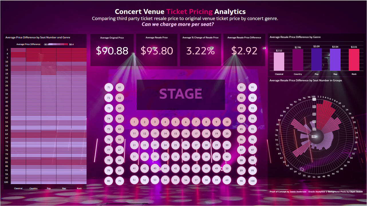
Can a concert venue realize the revenue currently captured by ticket-resellers by raising ticket prices? By how much, for which seats, and for which concert genres? With the visualization capabilities within Oracle Analytics Cloud (OAC), it’s easy to take the analyses beyond a table to better understand trends across different attributes. You can explore this analysis in Oracle Analytics here.
In Part 2 of this series, learn how to upload an image to serve as a “map” to enhance the analysis of understanding which seats are resold at a higher price. Check out Part 1 to learn how a grid heat map, bar, and radar bar visualization can aid in analyzing patterns within the data, and Part 3 (upcoming) to learn how to use tiles, text boxes, visualization and canvas formatting, and visualization filtering to guide the dashboard consumer in their analysis.
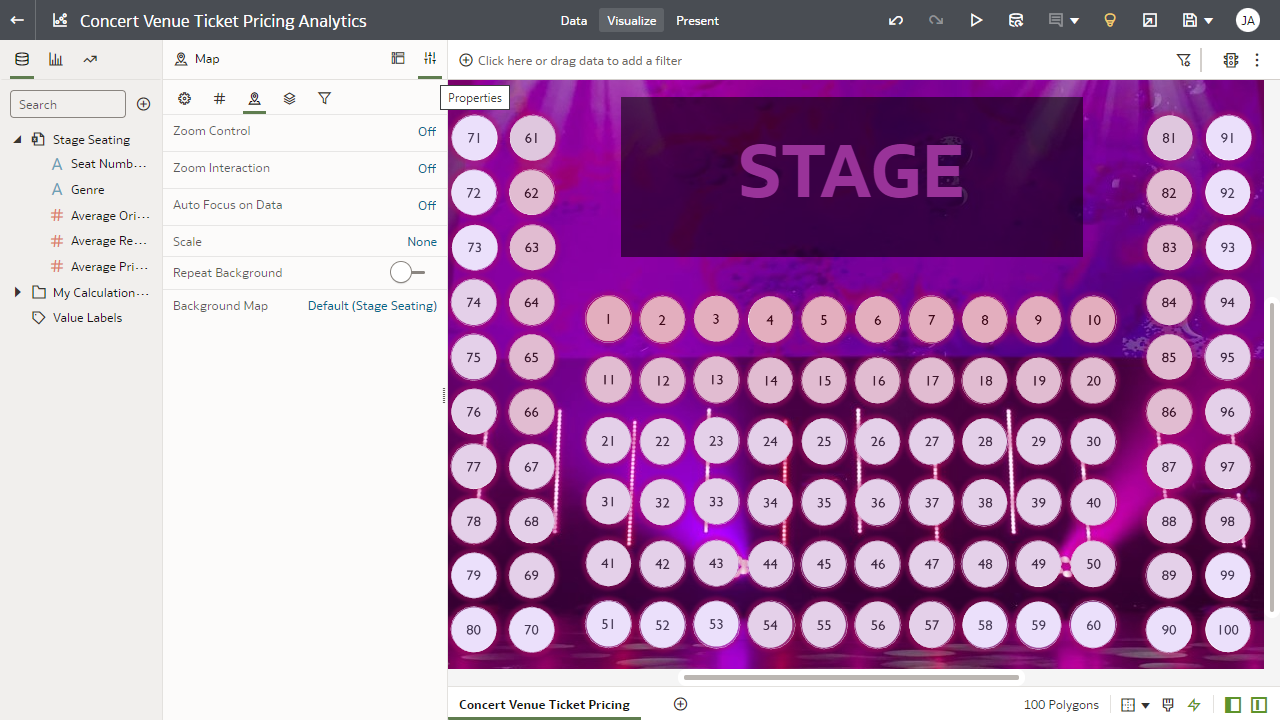
What better way to visualize concert venue ticket pricing than looking at the seat map itself? While the other visualizations covered in Part 1 of this series illustrate which seats are sold at higher prices, it’s not immediately apparent why those seats might fetch higher resale prices based on their physical position in relation to the concert venue stage. However, let’s facilitate this analysis by incorporating an image of the seat map into a map layer and assigning a color assignment to each of those seats based on their Average Price Difference.
Map – Upload Image Background
First, take an image (the seat map) from the desktop and add it to the Console in Oracle Analytics. Select an image with a .png format that has a transparent background to make the seats look as if they’re floating on the dashboard.
The task of uploading an image background requires administrative permissions via the BI Service Admin Role. Once it’s uploaded, the image background is accessible across an Oracle Analytics environment for users to select.
Follow these steps:
- From the Home page in Oracle Analytics, click the hamburger icon in the top left and select Console.
Accessing the console requires having the BI Service Admin Role (or, in other words, being the the system administrator). - From the Console page, select Maps.
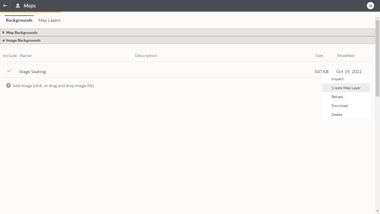
Select Maps in the Console (need BI Service Admin Role) - On the Maps page, click Backgrounds, expand the Image Backgrounds field, and select Add Image.
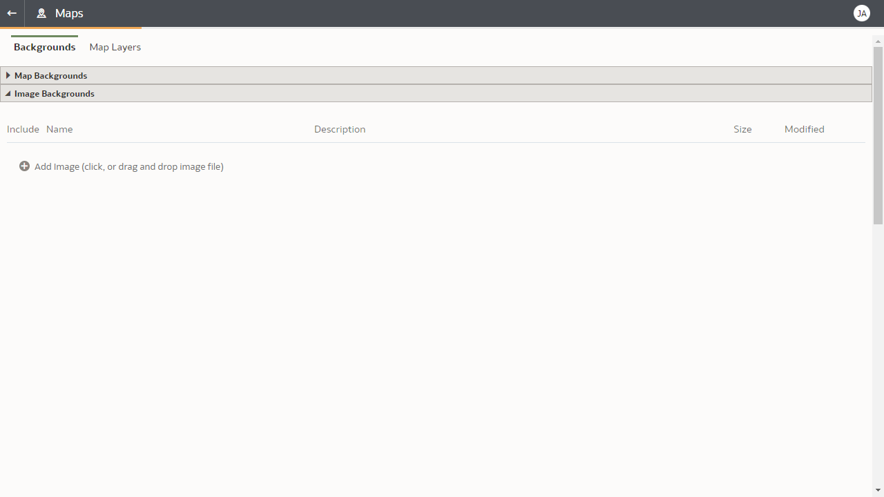
Add the Map Image Background - Click Add Image, select the image, and click Open.
- Adjust the name and description as needed for the uploaded image and click Save.
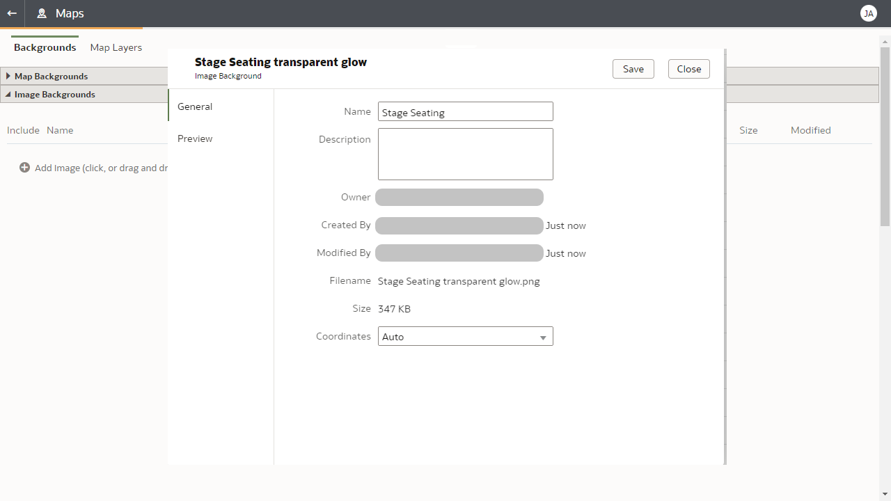
Edit the name and description of the map image background
Map – Create Map Layer
The next step is to take the image background and use it to create a map layer. Then, within the map layer, identify each seat as a shape on the map. These shapes will ultimately be related to the Seat Number attribute in the visualization.
The task of creating the map layer requires administrative permissions via the BI Service Admin Role. The map layer is accessible across the OAC environment.
Follow these steps:
- Within Image Backgrounds, select the image Options by hovering over the far right side of the screen, and select Create Map Layer.
Create a map layer from the map image background - You see a page that creates a map layer from the background image. Save the map layer using the Save icon in the top right. If you need to get back to this page, navigate to Map Layers (see prior image).
- Rename the map layer if desired.
- To start adding shapes to each seat, navigate to the top middle of the page, and ensure that Draw is selected. Select Circles from the drop-down list.
- Hover over the middle of Seat 1. Click and drag to create a circular shape.
- Name the shape to the attribute that the seat is associated with (1).
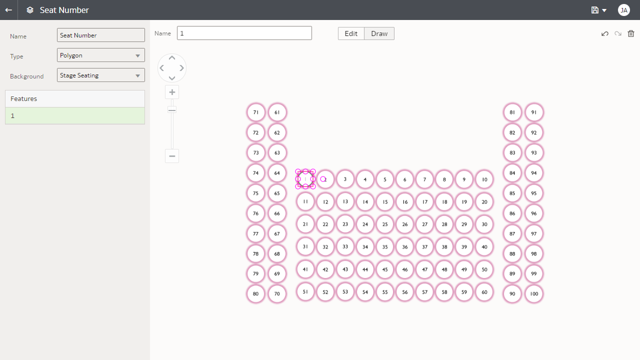
Draw a shape on the map layer - If you need to edit the shape, toggle to the Edit area. Click to resize, or right-click to Duplicate and Delete.
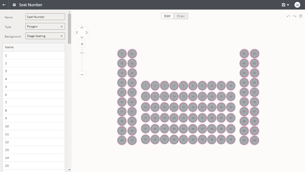
- After finalizing the shape for Seat 1 with the appropriate size, duplicate the shape so the sizing remains consistent. Once you’ve created all shapes, click Save to maintain your changes to the map layer before navigating from the page.
Duplicate shapes and save the map layer
Map – Create a Map Visualization
After the map layer has been created by a user with a BI Service Admin role, any user can reference the map layer in a map visualization in a workbook.
Tip: You might need to log out and back in again to select the map layer after it’s been created or edited.
Suppose that within the seat map, you want the seat color to change based on the Average Seat Price Difference, similar to the radar bar visualization in Part 1 of this series. To do this, add Average Seat Price Difference to Color in the Grammar panel and update the colors In Manage Color Assignments as needed. Change the transparency setting to see the colors better and disable zooming in the map because the seat map can easily fit in one screen.
Follow these steps:
- In a workbook within Oracle Analytics, drag and drop the Map option under Visualizations on the canvas.
- Drag and drop the attribute of Seat Number into Category (Location). Adding an attribute into Category (Location) is a necessary step to start working on the map visualization.
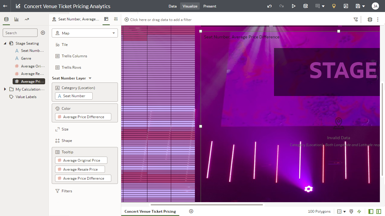
Add a map visualization and choose the attribute (required step) and measures - With the map visualization selected, navigate to Data Layers in the Properties panel. Using the drop-down menu, change the map layer from Auto to the map layer created in the steps above.
- Update the data layer transparency by navigating to the Data Layers icon within Properties. You can type or use the slider bar to change the transparency on a scale of 0 to 100.

Change the map layer and update the transparency to view the Average Price Difference by color by seat - Oracle Analytics allows you to adjust the zoom interactivity within a map. Disable Zoom Control and Zoom Interaction by navigating to the Map icon within Properties.
Adjust the map zoom interactivity - Oracle Analytics provides the option to change the colors that are associated with a measure or attribute in a visualization. To change the color spectrum used in the map, right-click the visualization, click Color and Manage Assignments to see the Manage Color Assignments window.
- Hover over the measure used in the visualization (for example, Average Price Difference), and an Edit icon is displayed. You can change the number of color steps and the colors used in the respective steps. Select Done when you’re finished.
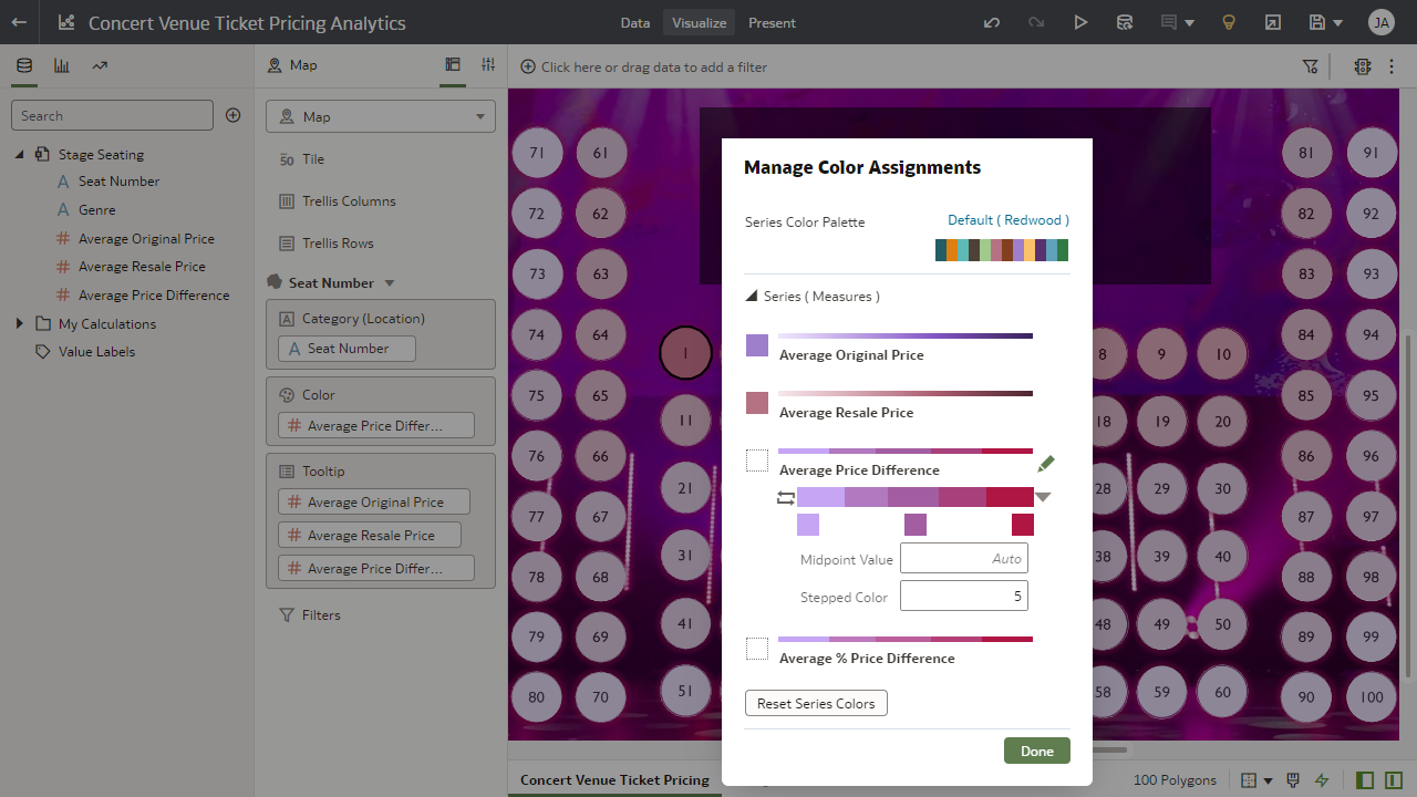
Manage Color Assignments for the data points in the map visualization
This concludes Part 2 of this series. Be sure to try a map visualization in your workbooks!
Check out Part 1 to learn how to create grid heat map, bar, and radar bar visualizations, and look out for Part 3 to learn how to use tiles, text boxes, formatting, and filtering.
For more information, check Oracle Analytics documentation in the Oracle Help Center.
Find out more about Oracle Analytics products at www.oracle.com/analytics.