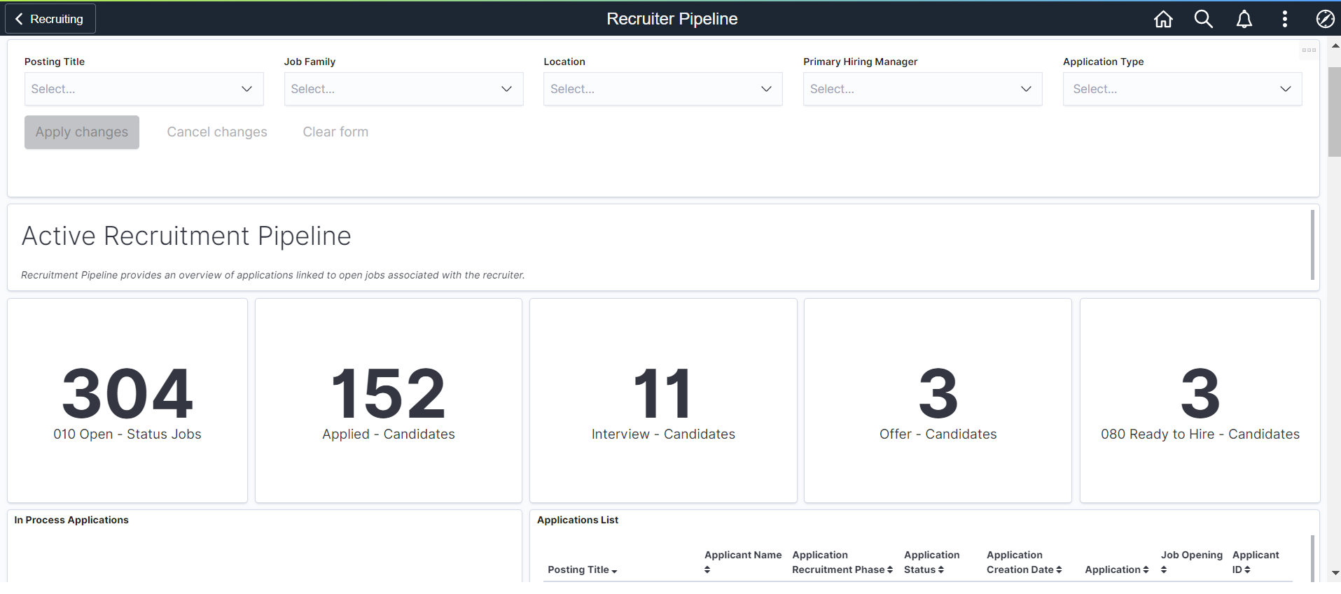
The Recruiter has many tasks to juggle as they work to fill vacancies efficiently, and most important effectively. The Recruiter Pipeline Dashboard was built to aid the Recruiter in understanding their active tasks and processes. Because the analytics are based on the individual Recruiters workload, Recruiters will only see their job openings.
Every job vacancy means there is a business need not being completed affecting your organizations bottom line, impacting your customers, and even employees’ morale. Providing the Recruiter with metrics is essential to keeping the Recruiter up to date about the pipeline of applicants, where applicants are in the hiring process, and prioritizing the workload.
The Recruiter can easily see the number of job openings currently assigned to them and the number of applications that are waiting for review. The Pipeline Analytic can prompt the Recruiter to get those interviews scheduled, job offers completed, and complete the final step of preparing that applicant for hire. In today’s hot job market, time is of the essence in getting that applicant committed and in the virtual door.
Use the Filters to drill down to see the data differently. Here I have filtered by Location to understand if there are recruiting roadblocks at this work site.
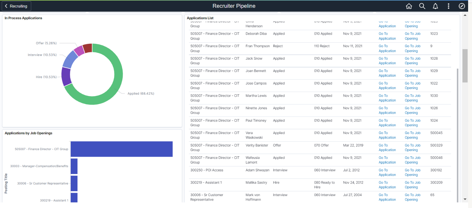
The Applications List allows the Recruiter to link directly to the individual job application or the job opening without having to do a search.
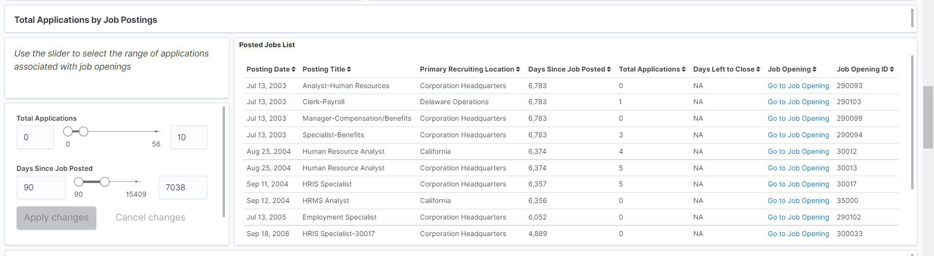
The Recruiter Pipeline also introduced a new visualization using a slider to filter data. With this visualization, Recruiters can quickly see those openings without any applications and compare the number of days since the job was posted. The grid also provides the ability to see the number of days left before the posting is scheduled to close providing useful information for the Recruiter to determine if the job closing date should be extended.
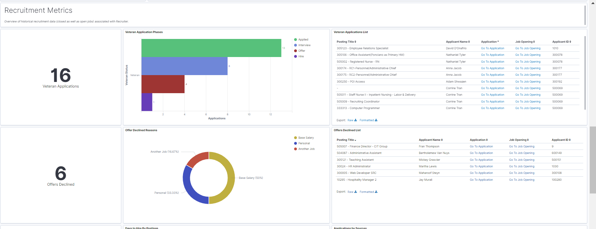
The visualizations discussed above are based only on open jobs regardless of the date range. While this assist the Recruiters in understanding their current workload, understanding historical data is also helpful in creating strategic approaches to recruitment challenges and metrics that may influence future hiring.
Like all of our delivered visualizations, we are showing you the “art of the possible” and anticipate that you may want to build analytics that are also pertinent to your organization. Many organizations have initiatives to increase the number of candidates that self-identify themselves as Veteran applicants and then to understand how those applications filter through the process. This is just an example of how you could use that information to answer specific questions about the number of Veterans interviewed and eventually hired. We all know that it is not just the number of applications that are important but how these applications are turned into new hires.
Many of you also track why job offers are declined but have not had a good way to view the trends in the past. Using data that you have collected in your elastic index, this donut chart is an example of how a quick and easy view was created to give you information that is useful in understanding trends in your recruiting process. This is the beauty of a visualization instead of just rows of data in an excel spreadsheet.
We know that not all jobs are filled at that same rate due to many different reasons. This could range from finding qualified applicants, Hiring Managers dragging their feet, and even workload. The Recruiters can track their days to hire by posting and and realize the average days through a visualization.

I am sure you have wondered which of your recruitment sources are providing you with the best candidates. When you collect the source data during the application process, you can then match it to your interviews and hires. Just getting a large number of applications from a source does not always mean your hires are coming from that pool. How you spend your money and time is very important to efficiency.

In our first delivered recruiting dashboard, we offered a map to indicate where applicants are located based on state or country. A number of our focus group members inquired about regional data so we have provided an example of viewing data by postal code. Again, the goal is to show you the flexibility in creating your own visualizations that answer those questions that have been hard to get from just the raw data.

To provide quick and easy access, the Recruiter Pipeline can be accessed from a tile or directly from the My Job Opening page to keep the information at the Recruiter’s finger tips.

I am sure you notice some changes to the My Job Opening page in the screen shot above. A blog will be coming soon to talk about this much requested enhancements for better searching. And there is more! A visualization for the Recruiting Administrator was also released and will be discussed in an upcoming blog.
Until then, check out the Image 41 Highlights Video and Robbin’s blog on PeopleSoft HCM Image 41 is now Generally Available!
