Benefits Administrators have depended upon queries over the years to gain an understanding of how benefits are being utilized in their organization. Of course, with queries the Benefits Admin only receives the raw numbers and then must complete two more steps to combine the data and create meaningful charts. Now with Kibana, the data in the Elasticsearch can easily be turned into visualizations and filtered in a number of different ways. “Seeing” the data can be much more impactful.
The Benefits Utilization tile on the Workforce Administrator home page provides a quick glance of enrolled versus waived benefits and an easy way to drill down into the dashboard.

Filters give you the ability to select multiple fields. For instance, you can view both the Health Benefits and Spending Account plan categories together and visualize the utilization relationship between the two.
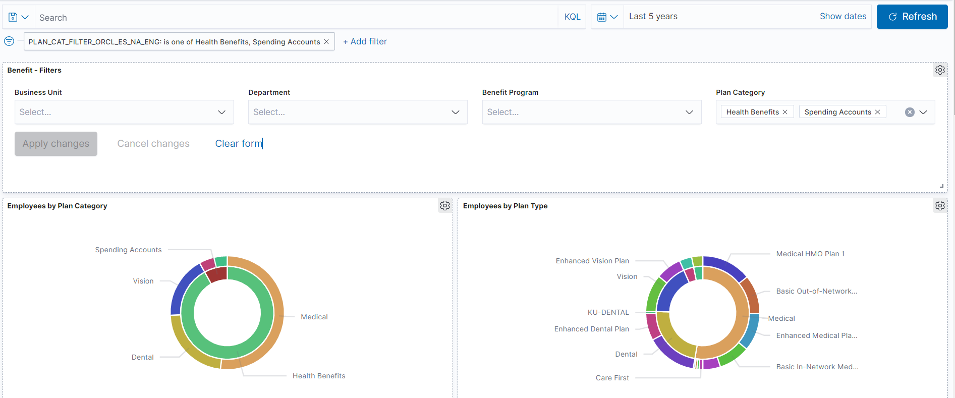
Or you can select one of the plan categories inside the visualization to drill down into a more narrow view.
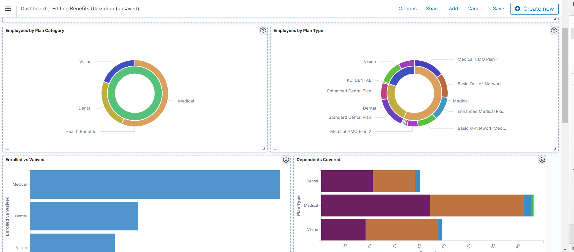
When building the Benefits Utilization dashboard, we focused on some of the more difficult query reporting options that are quite simple in Kibana. The Enrolled vs Waived visualization provides a simple side by side comparison of employees who enrolled or waived enrollment in a benefit type. In most organizations, it is pretty intuitive to know that Medical is the most elected benefit but a little more difficult to quantify that, as in this example, that Dependent Life is one of the most waived plan.
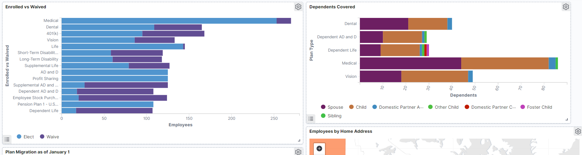
The Dependents Covered visualization provides you with an understanding of how many dependent lives are covered by your plans. Instead of creating a complex query or SQR to give you the data or hobbling a number of queries together, this visualization can provide the data easily.
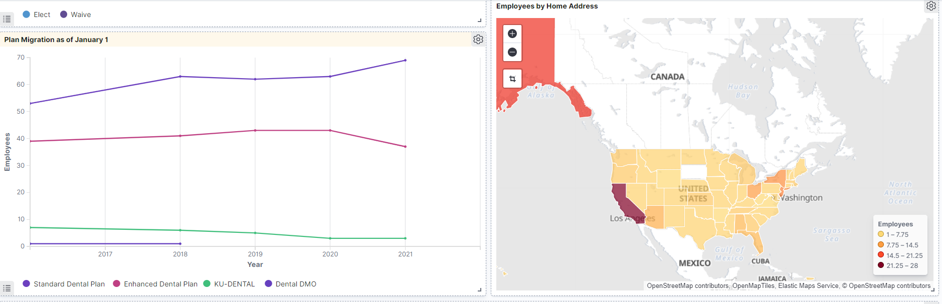
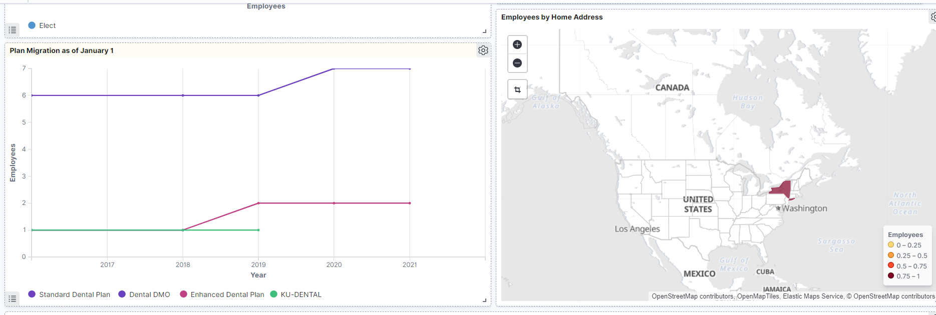
One of the most requested visualizations from the focus group was the ability to see migration trends of plans over a period of time. Understanding how plan changes, rate increases, and even health trends affect the utilization of the individual benefit plans is very important to Benefits Administrators as they plan their benefits strategies for the organization.
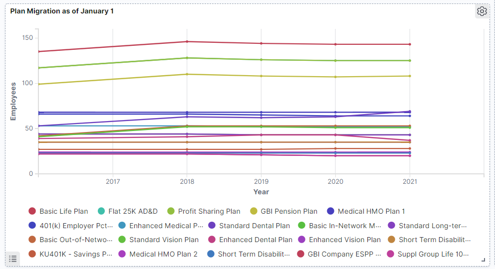
Of course this may look like a plate of spaghetti when you view all plans, but the ability to drill down can provide a completely different picture.
 So maybe the additional benefits in the Enhanced Dental plan was not as important as the overall cost. Thus the utilization dropped due to the premium increase.
Depending upon the reach of your organization, mapping the data can also provide you with unique insight into the value of benefits by region or state.
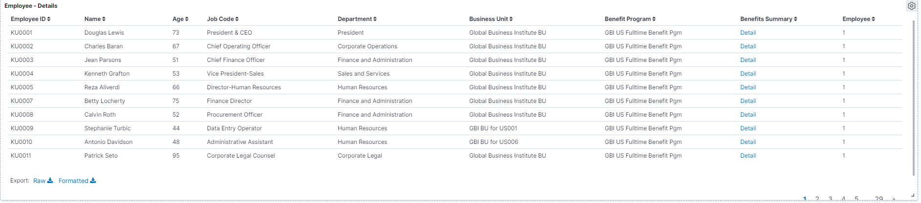
Individual Employee details are also available with a direct link to the Benefits Summary data to make review quick and simple.
 For more information about the Benefits Utilization review the PeopleSoft Kibana Benefits Utilization Video Feature Overview and the Image 39 Highlights Video.
Check out all of our blogs at PeopleSoft Blogs.
