My first blog, Remote Working. Have you heard of it? PeopleSoft has! Part 1 was a general overview of the new Remote Worker feature. Get Rolling with Fluid Remote Worker, Part 2 discussed configuration and set up steps.
This blog, Part 3, will talk about the Visualizations that have been delivered to help Administrators see employees who are working remotely, where they are working remotely, and when they are working remotely.
The Administrator can easily access the Remote Worker Insights from the tile.
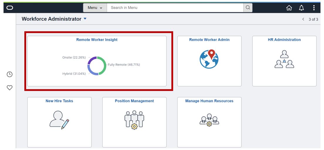
Remote Worker Insights, like all of our visualizations, provides you with the ability to filter, slice, and dice the data. When we created the index, HC_HR_RWORK_INDEX, we intentionally broadened the scope of the index to include not only remote worker fields but many HR fields. This allows us to deliver future visualizations without changing the index and also provides you with capabilities to create your own unique visualizations. There are so many possibilities that it would be impossible for us to deliver every combination. This ability to create your own visualizations is one of the most exciting concepts around Kibana.
We all know that you can select one element in a visualization and that will change all of the other visualizations. For example, if I select Home on the Remote Worker Location bar chart, all of the other visualizations will change to only show data related to Home location.
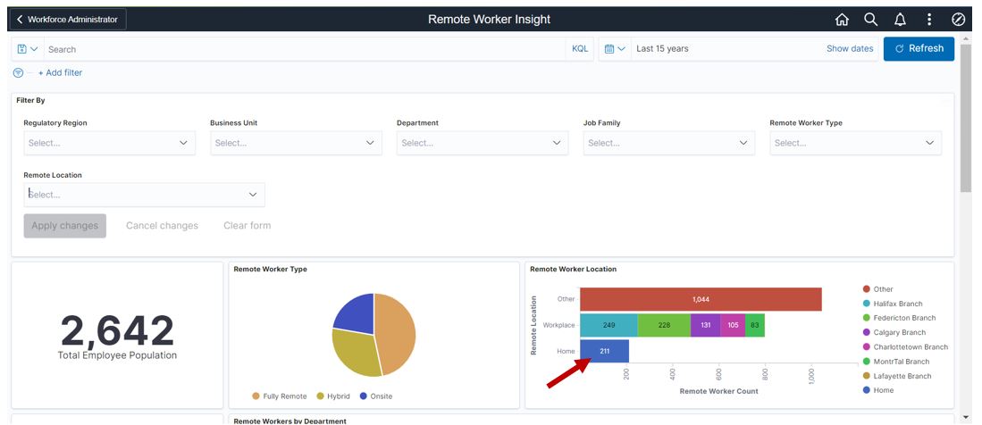
Here is what it now looks like.

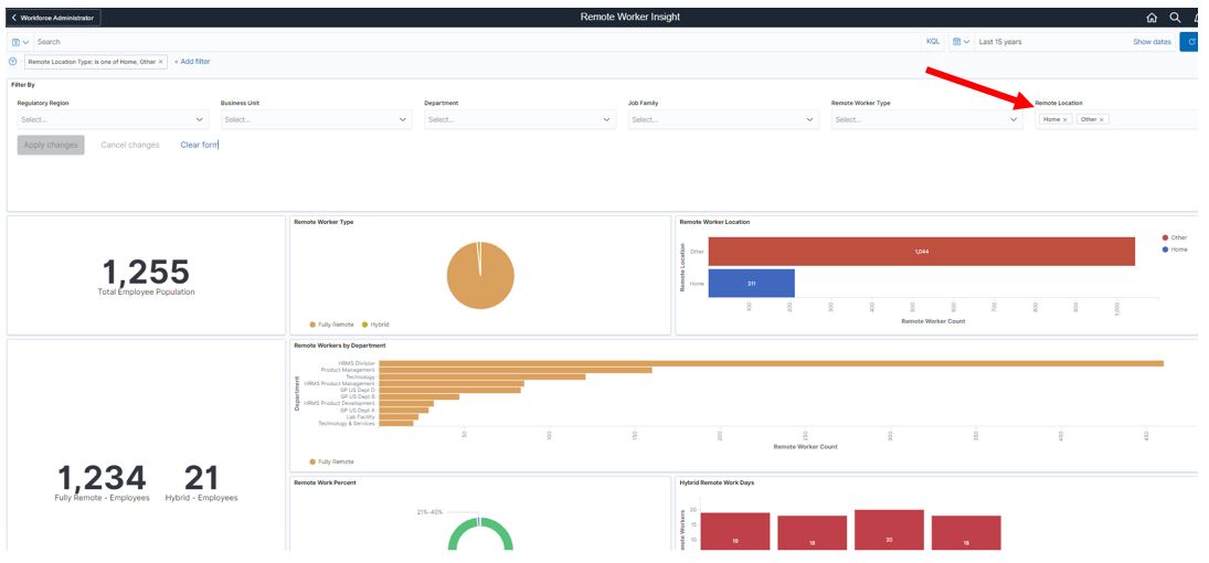
But using the filters for my slicing and dicing will give me a completely different look. Maybe what I’m searching for is information about users that are working from Home and Other locations. I can do that by selecting both Other and Home in the Location Filter. Now I see a completely different view of the data. It is all a personal preference and also how you want to view the data.
Another personal preference for me is seeing the data graphically. Yes, it’s great to see the numbers like total population and the breakdown of fully remote, hybrid, and on-site. But the Remote Worker Type pie chart gives me that view instantaneously. Without having to calculate the raw numbers into percentages (which would require a calculator for me), I can see almost half of my staff are fully remote, a little more than a quarter are hybrid remote and less than a quarter are on-site.

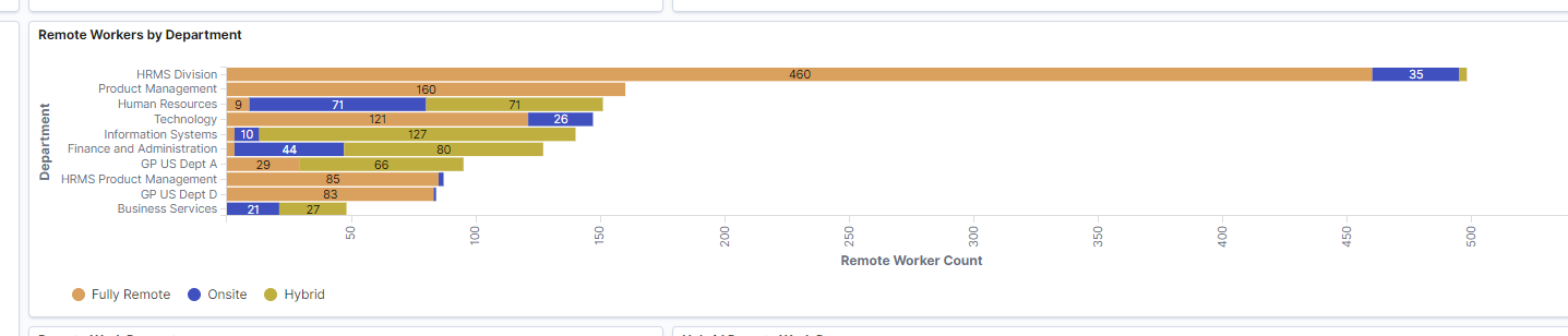
Administrators also want to understand the breakdown of remote workers by Departments. Some of what you might determine from this visualization is:
- who’s working fully remote, hybrid or onsite
- how staffing may impact customers coming into your operations
- are there additional technology needs in some departments to ensure employees have the equipment needed to operate while remote
- what areas may not be embracing remote working
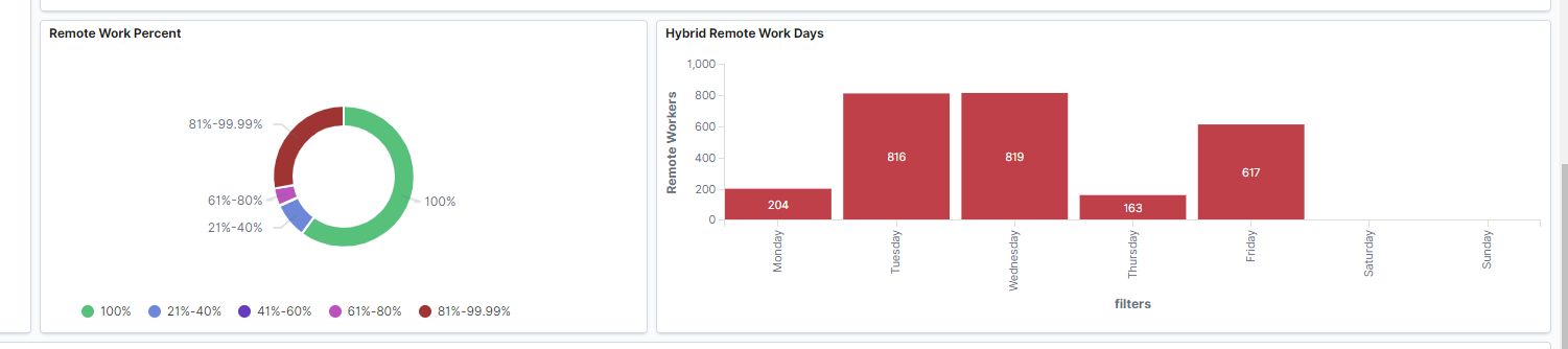
Hybrid Remote Working could be from 1 % to 99% of an employee’s work schedule. The Remote Work Percent donut chart provides the administrator with important data about the remote process. While many organizations may allow fully remote working, surveys indicate that hybrid models are still the most popular concept.
For customers that encourage employees to designate a specific set of days, the Hybrid Remote Work Days gives the Administrator a glimpse of what the on-site work force may look like. Of course, remote worker is not a scheduling or resource planning system so this would only be an estimate of what your on-site staffing trends may appear to be.
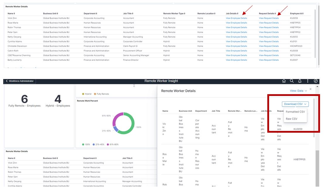
The Remote Worker Details provides employee information based on the filters that are applied. From here you can view some important employee data or link directly to employee job data or the remote worker data if you need to see more specifics. You can also download this data to a csv file if needed.
Many of the new HR surveys are indicating that employees not only expect to be able to remote work in some capacity but are leaving their jobs in favor of organizations that allow at least some remote working options. Here are a couple of articles that you might find interesting – 2021 Remote Work Statistics and Why the big quit is happening and why every boss should embrace it. How will your organizations stack up to these trends? Use the Remote Worker Kibana visualizations to help you see a bigger picture.
Checkout the PeopleSoft Remote Worker Feature Video for more information about the feature.
If you have questions about using Kibana, here are a few quick resources to assist you. You have questions about Kibana? We have Blogs and Videos for that, PeopleSoft Spotlight Series: Working with Kibana Using PT 8.58, and PeopleSoft Spotlight Series: Working with Kibana Using PeopleTools 8.59
