Contributing Authors: APM Observability and Management Product Management Team
Oracle Application Performance Monitoring (APM) provides predefined widgets that enable the creation of detailed, informative dashboards and has customizable widgets (APM trace table, APM Service Topology, and APM Geomap) that can be configured by a Trace Query Language (TQL) expression. This blog provides a predefined JSON file and details on how to import additional sets of configurable widgets (bar charts, line charts, single value panels, and more) that accept a customizable TQL expression.
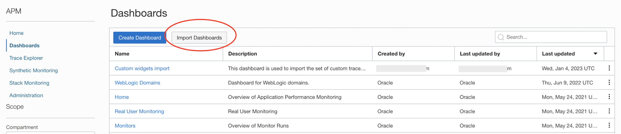
To add the widgets to a tenant, simply download this JSON zip file (save and unzip the content) and import it using the Import Dashboards button from the APM Dashboard page:
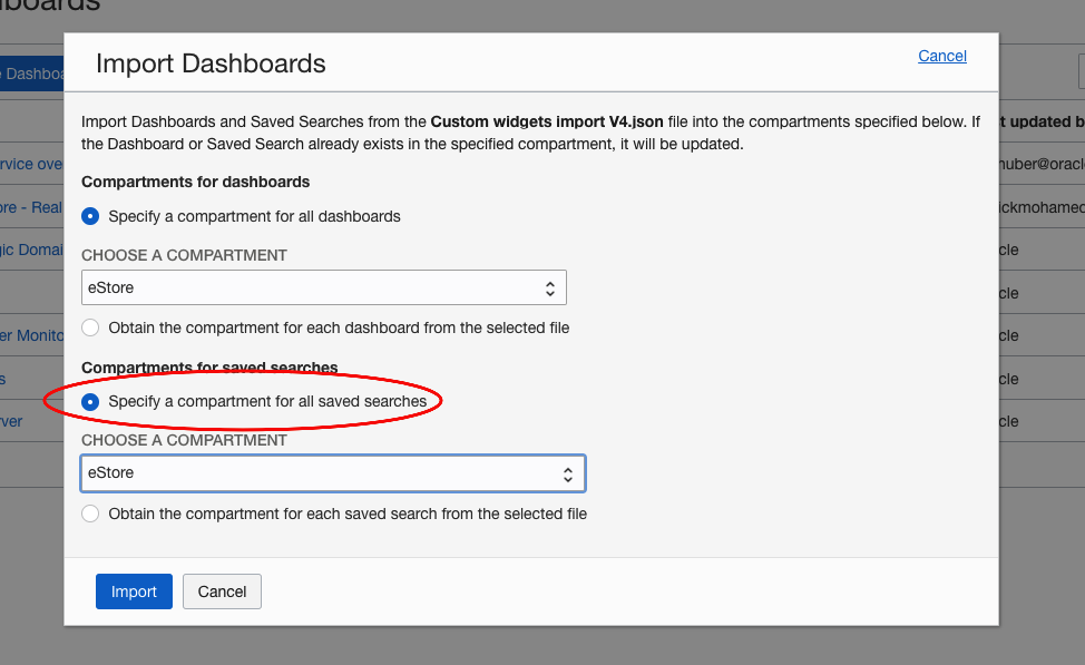
Select the option to Specify a compartment for all saved searches, as shown below, and click Import.
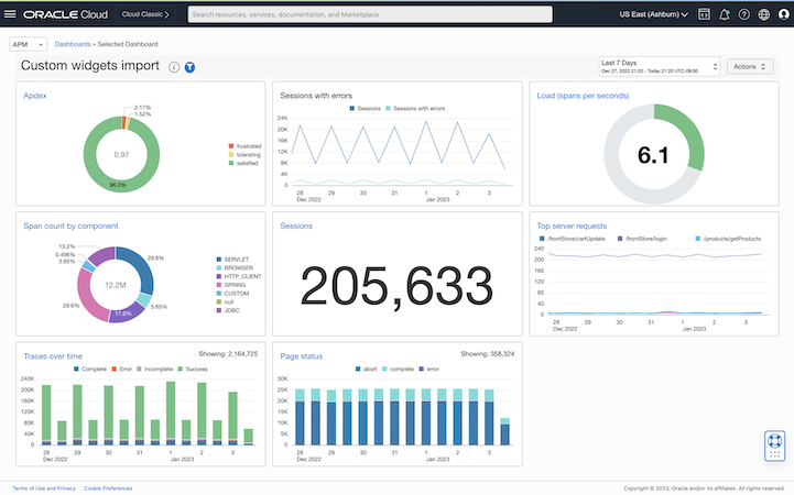
Once the dashboard is imported into the desired compartment, the following eight widgets will be available when creating or editing dashboards. Each of the widgets comes with a default TQL statement that can be used as an example of what the expected TQL should look like. In general, widgets will use a metric titled “value” and, for multi-series presentations, will group it by a dimension named “series”. The imported dashboard itself is not needed anymore but can be useful as a reference to how the widgets can be configured.
Here’s a short description of each of the widgets (all names start with CTDW – Custom Trace Data Widget):
- CTDW Line chart – Visualize a set of values over time as lines. Use the “first X rows” TQL clause to control the max number of lines
- CTDW Compare metrics – This chart accepts two independent TQLs, each returning one data series. It can be used to compare two metrics over time.
- CTDW Bar chart – Visualize a set of values over time as a stacked bar chart.
- CTDW Traces over time – Same as the above, configured specifically for Trace status presentation. It includes specific color setting for the four (Complete, Error, Incomplete, and Success) possible trace statuses.
- CTDW Pie chart – Displays a set of values as a donut. It accepts a second TQL for the value in the center of the donut.
- CTDW Apdex – Same as the above, specifically configured for Apdex presentation, using Red, Yellow, and Green for frustrated, tolerating, and satisfied levels.
- CTDW Single value – A single value panel.
- CTDW Gauge chart – A circle gauge presentation of a single value. the max and min are provided by the TQL. These can be fixed values (as demonstrated in the default TQL) or calculated (e.g.: max(spanDuration) and min (spanDuration)). The widget has two parameters that can be used to set thresholds.
Notes:
- Each of the widget titles (except the CTDW Compare metrics) is set as drill-down links to Trace Explorer with the configured TQL. A different drill-down can be provided using a widget parameter.
- The widget can be configured to use trace filters. Add the Trace Dimension Filter and Span Dimension Filter to a dashboard and connect them to the widget using the Add Input button on the Edit Widget panel.
- Further configure the widgets, or create a new one, by editing the JSON file (each widget is represented in the json as a “savedSearch”).
- To update an existing custom widget, create a new dashboard with that widget and export it to a file. After changing the file, import the dashboard to the same compartment.
Here is what this dashboard looks like with the eight widgets:
To learn more about Application Performance Monitoring capabilities visit:
- Oracle Cloud Observability and Management Platform
- Application Performance Monitoring Technical Content
- Hands-on APM Oracle LiveLabs Workshops
For more blogs on Oracle APM, visit the Observability and Management – Application Performance Monitoring blog space.