This blog entry was contributed by: Ruud van der Pas, Kurt Goebel, and Vladimir Mezentsev. They work in the Oracle Linux Toolchain Team and are involved with gprofng on a daily basis.
Introduction
We are very pleased to announce the availability of a Graphical User Interface for gprofng. This tool not only makes it easier to navigate through the performance results generated with gprofng, but it also provides several views that allow to gain more insight into the dynamic behavior of the application that has been profiled. This makes it much easier to quickly and visually identify performance anomalies.
In this blog it is explained how to install and use the GUI. Several screenshots of some of the views that are available are shown and discussed.
While the focus of this blog is on the GUI, it is recommended to have some understanding of the gprofng tool itself. For those readers not already familiar with the gprofng tool, there are several resources available, among which:
- This brief video introduction into gprofng is a good starting point.
- For more details and examples, it is recommended to read this blog as well: gprofng: The Next Generation GNU Profiling Tool.
- Java developers interested in using gprofng may also want to read the following blog: gprofng: Java Profiling. It explains how gprofng can be used to profile Java applications.
The gprofng GUI – Logistics
The gprofng GUI, also referred to as “the GUI” in this blog, is a tool that can be used to graphically view the performance results generated with the “gprofng collect app” tool that is part of the gprofng profiling tools suite.
Installing the GUI
The easiest way to use the GUI is by installing the gprofng-gui package that is available for Oracle Linux 8 and 9. Just as the binutils-gprofng package, this package is part of the ol9_addons repository that is available for Oracle Linux 9. On Oracle Linux 8, gprofng and the GUI are included in the ol8_addons repository.
Below are the steps needed to install the GUI on Oracle Linux 9. The commands for Oracle Linux 8 are identical, other than that, in the first step, the ol8_addons repository needs to be enabled.
-
Use the dnf command to enable the ol9_addons repository and verify that the gprofng-gui package can be found:
$ sudo dnf config-manager --enable ol9_addons
$ dnf search gprofng-gui
-
Use the dnf command to install the package:
$ sudo dnf install -y gprofng-gui
-
Verify that the gprofng-gui package has been installed successfully and that the command to invoke it, works:
$ gprofng display gui --version
GNU gp-display-gui: 1.1
$
Note that the details of the message printed may be different. The important thing is that the command does not report an error.
In addition to install the GUI package from the repository, it is also possible to download the source code. How to build and install the GUI from the source code, plus many more details on installing gprofng and the GUI, are covered in the blog titled gprofng: How to Get the Latest Features and Improvements
Using the gprofng GUI
Now that the GUI has been installed, it is time to start using it. In this section it is explained how to start the GUI and how to use it to collect performance data, as well as to analyze the performance data.
Start the GUI
The GUI may be started without any additional options:
$ gprofng display gui
This will show the Welcome screen that can be used to select the desired functionality. For example, to record a new performance experiment, or to start with the analysis of a previously recorded experiment.
Note that the functionality displayed on this screen is also accessible through the File menu in the top left corner. For example, to profile an application, or to open an existing experiment.
Collect the Performance Data
This step is optional. As explained below, earlier recorded performance experiment(s) may be loaded into the GUI for subsequent analysis.
The screen to record a new experiment is fairly straightforward. It is enabled by selecting the Profile Application item under the “Create Experiments” entry on the Welcome screen. A form is displayed that needs to be filled out to specify the application name, working directory, environment variables (if any), plus the other settings needed to execute the application. On this form, one can also define some settings for the profile experiment. In many cases there are defaults, so it should be quite straightforward to set things up using this form. Additional gprofng options may be set on the tab titled “Data to Collect”.
When finished with defining the set up and profiling options, the data collection process is started by clicking on the “Run” button. This switches the view to the tab titled “Output”. It has a window for the output of the gprofng data collection process and a separate window with the application output.
Once completed, a dialog window to load a (new) experiment is opened. If the user clicks on the “OK” button, both dialogs are closed and the experiment is opened. In case the “Cancel” button is selected, control returns to the Profile Application dialog, where the “Close” button causes the Welcome screen to be displayed.
Analyze the Performance Data
This step applies to any earlier recorded performance experiment.
Select the Open Experiment menu item under “View Experiments”. This opens a window that can be used to navigate through the file system to select the experiment directory that needs to be loaded for the analysis. This can either be an earlier recorded experiment, or one just generated from within the GUI.
Upon selecting an experiment, some statistics for the experiment are shown. By clicking on the “Open” button, the experiment is loaded into the GUI and a summary of the results is shown.
If there is no need to generate a new experiment first, it is possible to directly load one or more experiment directories into the GUI. The Welcome screen is bypassed and a summary of the results is shown. To do this, add the name, or names, of the experiment(s) on the command line. For example, this command loads an experiment with the name demo.2.thr.er directly into the GUI:
$ gprofng display gui demo.2.thr.er
The GUI starts up and displays the following overview window:
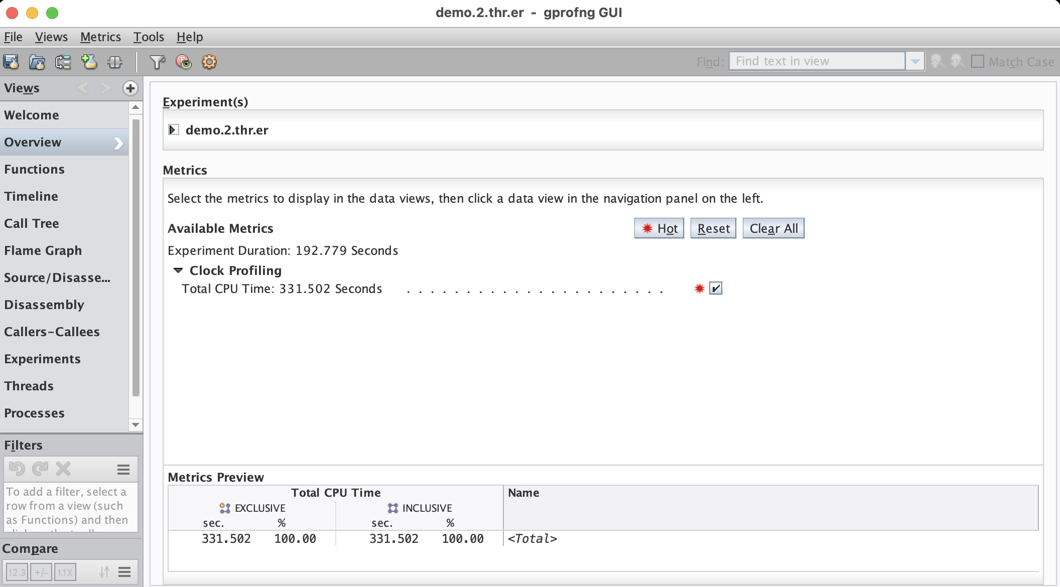
The main window shows a high level overview of the experiment(s) that have been loaded. This is the starting point for the analysis. At the top, the name of the experiment(s) are shown. More details may be seen by clicking on the little black arrow shown to the left of the experiment name. The list with the experiment names is followed by a summary of all the metrics that have been collected.
For example, in this case it is seen that the duration of the experiment was 192.779 seconds and the total CPU time the application took was 331.502 seconds. The reason that these times are not the same is because this is a multithreaded application that used 2 threads. From these two timings we learn that the program actually successfully executed in parallel, since the elapsed time is less than the total CPU time used.
On the left hand side there is a panel titled Views. It displays a list of the views that are available by default. The last entry in this list is titled “More …”. If selected, a list with additional views that are available is shown. Once a view from this list has been selected, it is added to the main list displayed under Views.
Example Views
The GUI provides many views. Here we show and discuss some of the main views. This is only a small percentage of what is available and we recommend to explore the other views that are available.
Functions View
This is probably one of the first views to look at. It shows at the function, or method, level where the application has spent the time. Both the timings in seconds and the percentages of the total CPU time are displayed. By default, the data is sorted with respect to the exclusive CPU time. This is why this view immediately shows the most time consuming functions in the program. They are at the top of the list:
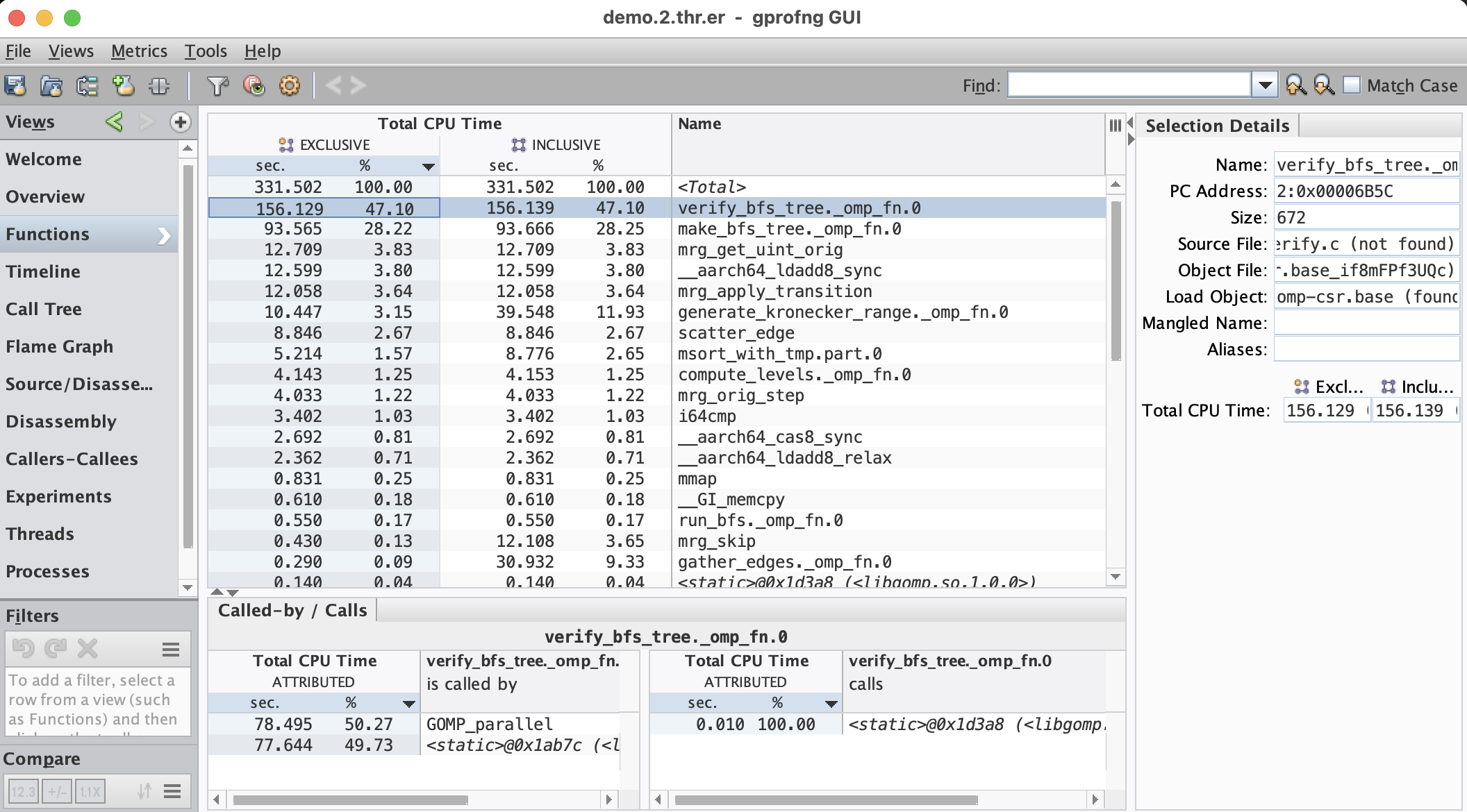
The main window has five columns, but that could be more if additional metrics like hardware event counters have been recorded.
The last column shows the names of the functions, or methods. Probably the first thing to note is a function called <Total> at the top of the list. This is a pseudo function that has been created by gprofng to include the total value for the specific metric. For example, the total exclusive CPU time for this job was 331.502 seconds. All percentages in a column are relative to the total value for the particular metric.
The first two columns show the results for the exclusive total CPU time. Both the timings (in seconds) and the percentages are given. The exclusive time is the time spent in a function, or method, outside of calling other functions, or methods. This is in contrast with the inclusive timings that are shown in the third column, with the percentages displayed in the fourth column. The inclusive time includes the total time spent in the caller, while possibly executing other functions, or methods. It is the total time spent in the sub-branch of the application.
In case the exclusive and inclusive metrics are the same, the function is called a leaf function, or method. It is not calling any other function(s).
As an example how to interpret the inclusive time, consider function mgr_skip near the bottom of the list. The inclusive time is 12.108 seconds, whereas the exclusive time is 0.430 seconds only. This means that this function by itself hardly takes any time, but it is calling other functions that collectively take 12.108-0.430=11.678 seconds.
By clicking on the header of a column, the data is sorted according to the metric shown. This includes the column with the name. By simply clicking in the part of the header titled “Name”, the function list is sorted alphabetically.
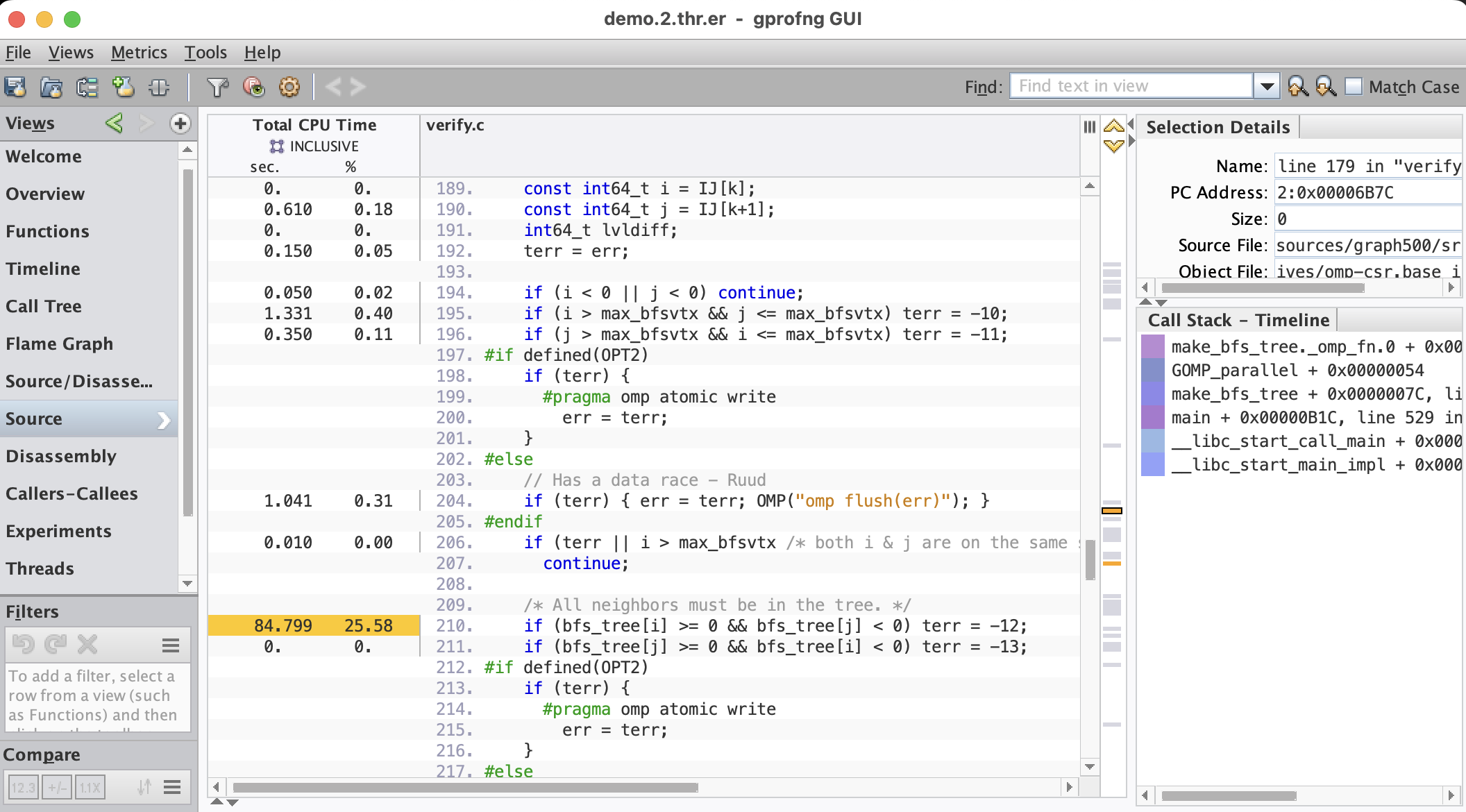
A double click on the name of a function, or method, transfers control to the Source view. It lists the annotated source code for that function, or method. The most time consuming metrics are highlighted in yellow and through a marker in the side bar, the source lines can easily be identified and selected. This is an example for the most timing consuming function in the Functions view shown above:
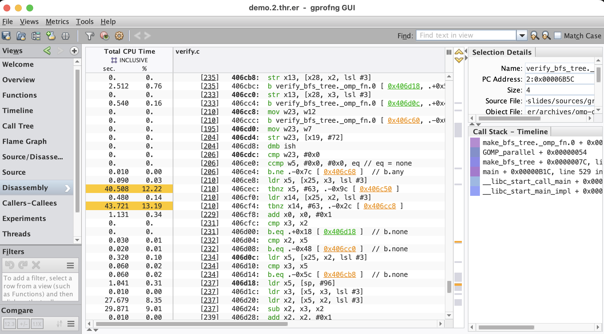
Usually, this gives sufficient insight into where the time is spent, but in case more details are needed, the Disassembly view may be selected to see the metrics at the instruction level:
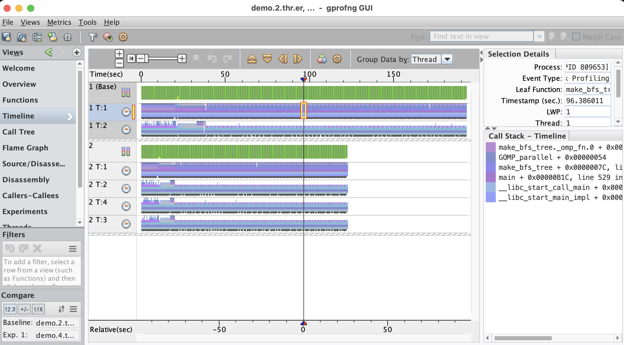
The Timeline
The Timeline view is ideally suited to better understand the dynamics of the program. Each function, or method, gets assigned a different color. The call stacks are displayed as a function of time. By simply looking at the patterns and colors, it is easier to understand how the application behaves as it executes. For example, in a multithreaded program, the threads may not be synchronized very well, resulting in a delay.
Below an example is shown. This is the Timeline for a multithreaded program that has used two threads for the execution:
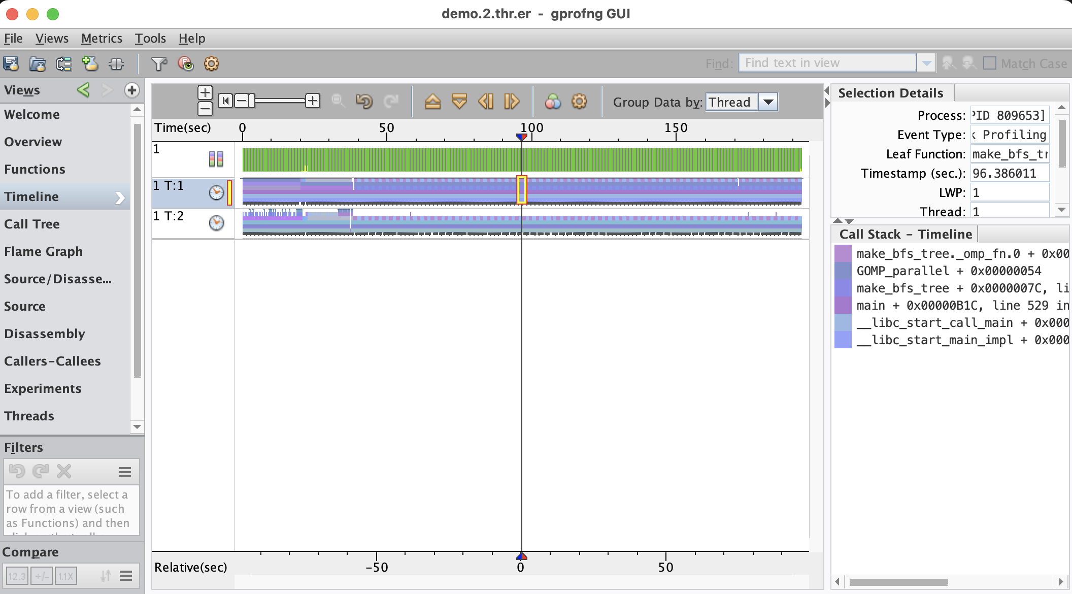
The vertical line selects a point in time. The statistics and the call stack shown on the right are for that point. This point may be moved to select a different time.
There are three, not two, horizontal bars. The top bar displays the state of the OS and uses color coding for the various states. The state is sampled every second. In this example, there are green bars only. This means that the application is executing in user mode, which is good news from an OS point of view.
Each thread has its own horizontal bar and the colors show the various functions that are executed. As can be seen, there are different phases the program goes through as it executes.
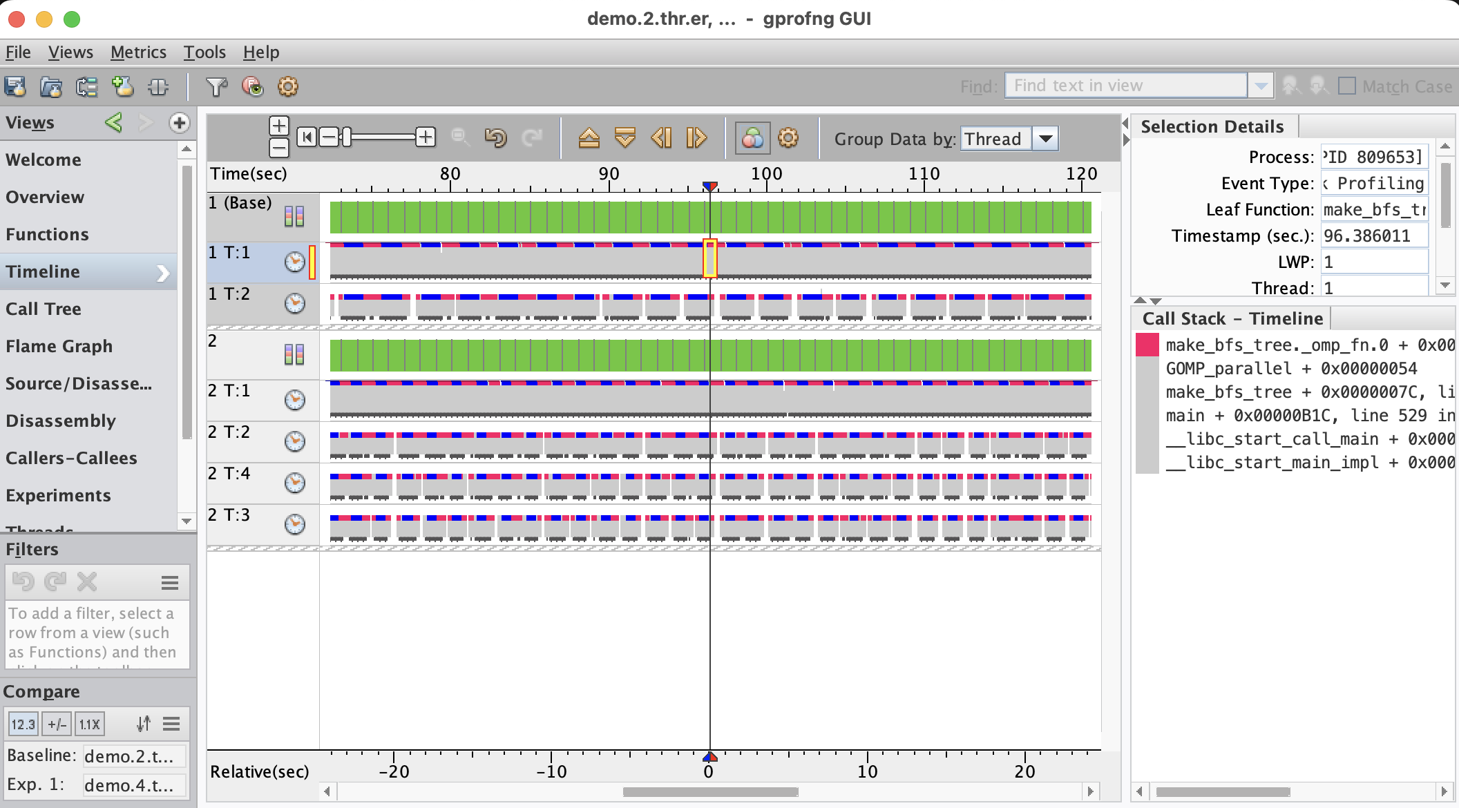
By the default, the call stacks are truncated, but this can be changed. The vertical scale may be adjusted, showing more, or less functions. In the example below, this has been used to reveal a spike that occurs in the earlier part of the execution:
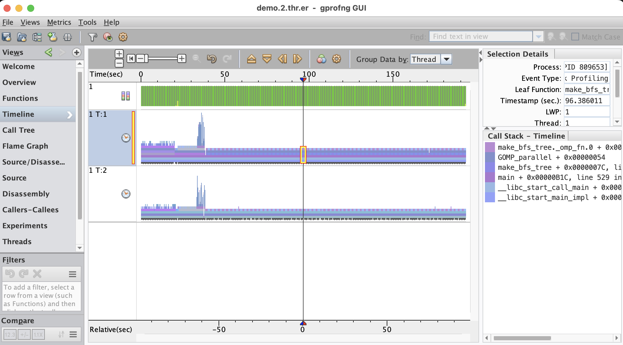
Further analysis showed that these spikes are from a recursive function that performs a sorting operation.
In case many functions are used, it may not be so easy to distinguish them in the Timeline. This is where the Function Colors feature comes in very handy. With this, the mapping of colors to functions, or methods, may be changed.
In this case it has been used to gray out all functions, other than the two most important functions from the Functions view shown above. Together, these two functions are responsible for about 75% of the total CPU time and they have been color coded blue and red:
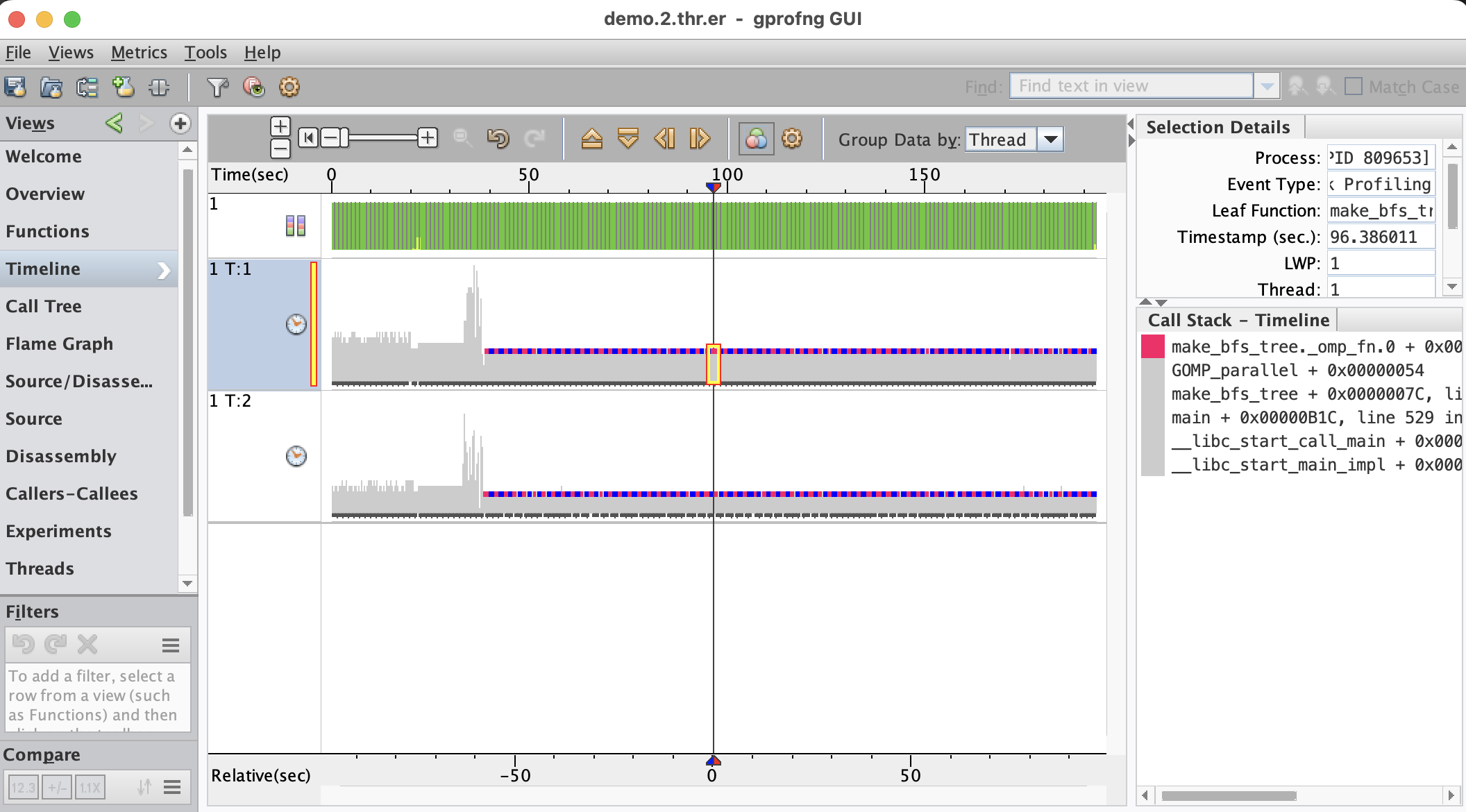
What is shown here is that these functions dominate the performance and collectively take about 75% of the time. This is consistent with what was learned from the Functions view. The new insight is that they are executed in an alternating manner. It is also seen that they start after the recursive sort, indicating that there are two distinct phases in this application.
Another powerful feature is the ability to control the horizontal zoom. This has been applied to the display shown above. This is a fragment of the Timeline:
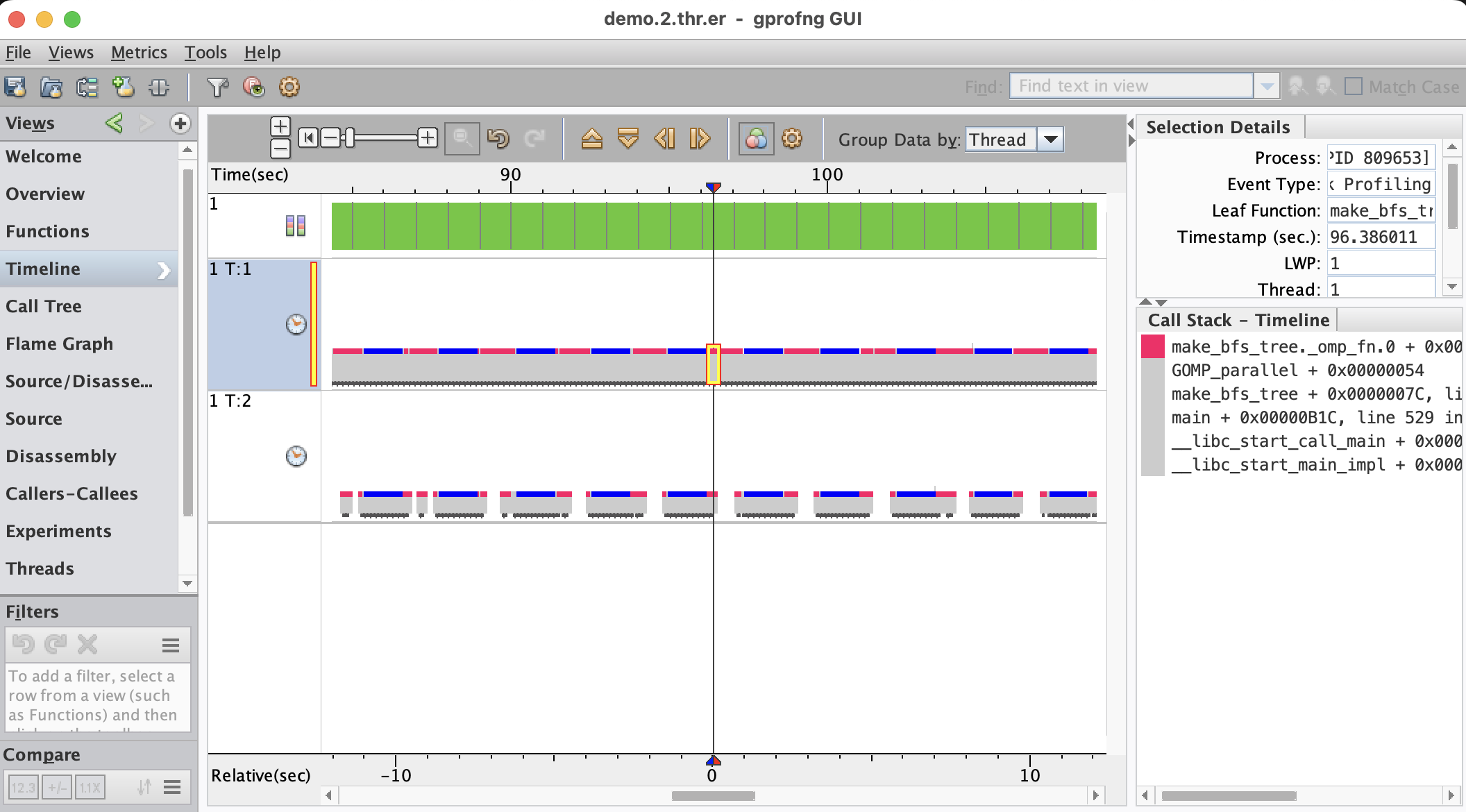
This is quite interesting, because it shows that the second thread has gaps in the execution. The first thread does not have such gaps. It is also clear that all the gaps visible here, occur in the function with the red color. Apparently there is something that causes this second thread to frequently stall, which is not good for the performance.
Since this is a multithreaded application, it will be good to verify what happens as we increase the number of threads. Below we show the comparison of profiles feature using two and four threads:
The first observation is that the execution time is reduced when increasing the number of threads. It is also seen that both phases benefit from adding threads and that is good news.
The question is what happens with those gaps as threads are added. To find out, both the horizontal zoom and color coding feature are used to provide sufficient detail:
The Timeline shows that the gaps are persistent as threads are added. It seems to be a generic issue that the performance of this application suffers from.
Additional Reading
Those readers that like to learn more about the gprofng GUI may want to read the Oracle Linux documentation for the GUI. The version for Oracle Linux 8 can be found here. This is the link to the version for Oracle Linux 9.
Summary
The gprofng GUI makes it easier to collect the performance data, but the real power lies in the analysis capabilities.
It is not only easy to navigate through the various views, but there is much more to explore. For example, filters have not been discussed here, but they are easy to apply and restrict the views to a subset of the data.
Features like the Flame Chart and the dynamic Call Tree are also not covered in this blog, but they are available. They help to better understand the structure of the application and find the most expensive paths in the code.
The Timeline is ideally suited to literally see the dynamics of the program. It is easy to spot any anomalies that occur during the execution. For example, a gap in the execution, where the application waits for something to happen. For multithreaded applications, the behavior of the various threads is made visible.