Complete reference to all seven widget types — Chart, Card, Message List, Change List, Multi Record, Record, and Sankey — with full JSON schemas, property tables, and best practices
Introduction
Widgets are the visual building blocks of Information Displays. When an agent produces an <oraInfoDisplay> tag, the patternId tells the framework which widget to render, and the properties object provides the widget-specific data. This post is the definitive reference for all seven widgets: full JSON schemas, property tables, when-to-use guidance, and best practices.
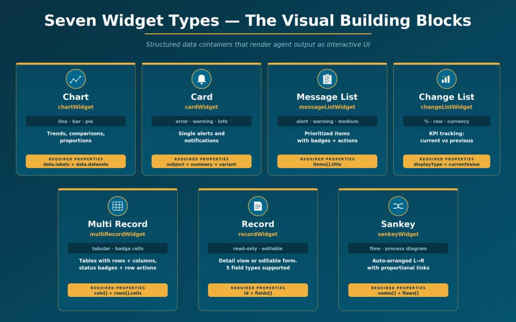
1. Chart Widget
A data visualization widget supports three chart types:
- line (trends over time)
- bar (category comparisons)
- pie (proportions of a whole)
Supports multiple datasets for overlay comparisons.
The framework automatically renders axes, legends, and data points.
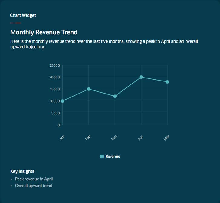
Sample JSON
{
  "title": "Monthly Revenue Trend",
  "patternId": "chartWidget",
  "description": "Revenue over last 5 months",
  "properties": {
    "type": "line",
    "data": {
      "labels": ["Jan", "Feb", "Mar", "Apr", "May"],
      "datasets": [{
          "label": "Revenue",
          "data": [10000, 15000, 12000, 20000, 18000]
        }
      ]
    },
    "insights": [
      "Peak revenue in April",
      "Overall upward trend"
    ]
  }
}
Property Reference
| Property | Required | Type | Description |
| type | Yes | String | Chart type: “line” for time-series, “bar” for comparisons, “pie” for proportions |
| data.labels | Yes | Array<String> | X-axis labels or category names. For pie, these are slice names. |
| data.datasets | Yes | Array<Object> | Data series. Each: {label (legend name), data[] (numeric values)} |
| data.datasets[].label | Yes | String | Name of data series |
| data.datasets[].data | Yes | Array<Number> | Numeric values. MUST match labels array length exactly. |
| insights | No | Array<String> | 1–3 key takeaways below chart. Highlight anomalies, not restate numbers. |
| Chart Pitfall If the data array has a different number of entries than the labels array, the chart renders incorrectly. Always ensure they match. For pie charts, keep to 5–7 slices max. Use line for time-series, bar for categories, pie for proportions. |
2. Card Widget
Shows a single important alert or notification.
Supports severity variants: error (red), warning (orange), info (blue), or neutral.
For multiple items, use messageListWidget instead.
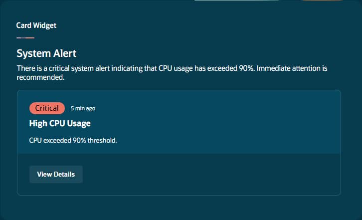
Sample JSON
{
  "title": "System Alert",
  "patternId": "cardWidget",
  "description": "Infrastructure alert",
  "properties": {
    "subject": "High CPU Usage",
    "summary": "CPU exceeded 90% threshold.",
    "timestamp": "5 min ago",
    "badgeText": "CRITICAL",
    "variant": "error",
    "link": {
      "text": "View Details",
      "action": "ora.App.openMonitoring()"
    }
  }
}
Property Reference
| Property | Required | Type | Description |
| subject | Yes | String | Clear title, 2–6 words in title case: “System Alert” |
| summary | Yes | String | 1–2 sentences: what happened and why it matters. Under 100 chars. |
| timestamp | No | String | Relative time: “5 min ago”, “Yesterday” |
| badgeText | No | String | ALL CAPS label: “CRITICAL”, “HIGH”, “INFO” |
| variant | No | String | “error” (red), “warning” (orange), “info” (blue), null (neutral) |
| link.text | No | String | Action button label: “View Details”, “Investigate” |
| link.action | No | String | Command on click: ora.Invoke(), ora.Agent(), ora.App.*() |
3. Message List Widget
Displays a scrollable list of prioritized messages, alerts, or items, each with its own priority level, badge, timestamp, and optional click action. The workhorse widget for notification queues and pending-item lists.
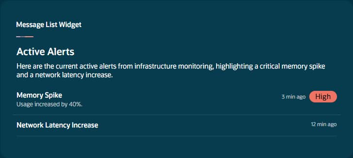
Sample JSON
{
  "title": "Active Alerts",
  "patternId": "messageListWidget",
  "description": "Real-time monitoring alerts",
  "properties": {
    "subtitle": "Infrastructure Monitoring",
    "items": [{
        "title": "Memory Spike",
        "summary": "Usage increased by 40%.",
        "badgeText": "HIGH",
        "priority": "alert",
        "timestamp": "3 min ago",
        "action": "ora.Invoke(\"investigateMemory\")"
      }, {
        "title": "Network Latency Increase",
        "priority": "warning",
        "timestamp": "12 min ago"
      }
    ]
  }
}
Property Reference
| Property | Required | Type | Description |
| subtitle | No | String | Context or description of list |
| items[].title | Yes | String | Main message heading — the most prominent text |
| items[].subtitle | No | String | Secondary context: confidence levels, categories |
| items[].summary | No | String | Detailed description with specific metrics |
| items[].badgeText | No | String | ALL CAPS label: “HIGH”, “CRITICAL”, “LOW” |
| items[].priority | No | String | “alert” (red), “warning” (orange), “medium” (gray/default) |
| items[].timestamp | No | String | Relative time: “3 min ago” |
| items[].action | No | String | Makes item clickable. ora.Invoke(“name”, “context”) |
| items[].image | No | String | Avatar/icon URL at 48px width |
| Message List Rule Use “alert” priority sparingly for truly critical items. For a single alert, use cardWidget instead. Be consistent with badge formatting across items. Include specific metrics in summaries. |
4. Change List Widget
Shows trackable metrics with current vs. previous values and automatic change indicators (direction arrows, percentage change). Ideal for KPI dashboards and period-over-period comparisons.
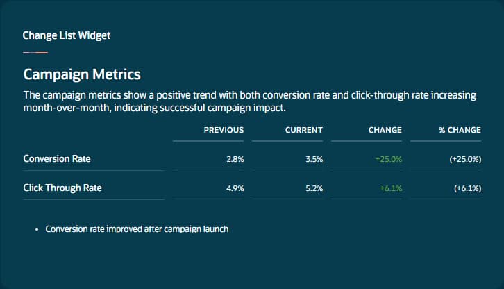
Sample JSON
{
  "title": "Campaign Metrics",
  "patternId": "changeListWidget",
  "description": "Month-over-month comparison",
  "properties": {
    "displayType": "percentage",
    "items": [{
        "title": "Conversion Rate",
        "currentValue": 3.5,
        "previousValue": 2.8
      }, {
        "title": "Click Through Rate",
        "currentValue": 5.2,
        "previousValue": 4.9
      }
    ],
    "messages": [
      "Conversion rate improved after campaign launch"
    ]
  }
}
Property Reference
| Property | Required | Type | Description |
| displayType | Yes | String | “percentage” for rates, “raw” for numbers, “currency” for money |
| items[].title | Yes | String | Metric name: “Email Open Rate”, “Revenue” |
| items[].currentValue | Yes | Number | Latest measurement. NUMERIC ONLY — no %, $, symbols. |
| items[].previousValue | Yes | Number | Baseline measurement. NUMERIC ONLY. |
| subtitle | No | String | Widget header context: “Q4 vs Q3” |
| messages | No | Array<String> | Actionable insights about anomalies. Don’t restate obvious data. |
| Change List Pitfall Values must be NUMERIC ONLY. Do not include %, $, or any formatting symbols in currentValue or previousValue. The displayType controls rendering. Messages should be actionable analysis, not number restating. |
5. Multi Record Widget
A full table widget for displaying multiple records with rows, columns, badge-styled status cells, and optional per-row action buttons. Use for transactions, employee lists, inventory, orders—any entity with consistent columns.
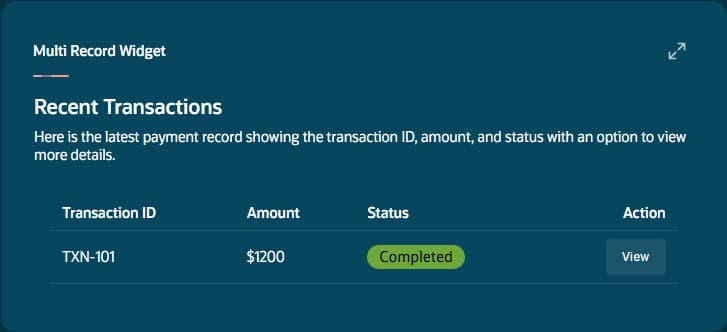
Sample JSON
{
  "title": "Recent Transactions",
  "patternId": "multiRecordWidget",
  "description": "Latest payment records",
  "properties": {
    "cols": ["Transaction ID", "Amount", "Status"],
    "rows": [{
        "cells": [
          "TXN-101",
          "$1200", {
            "type": "badge",
            "text": "COMPLETED",
            "priority": "success"
          }
        ],
        "action": {
          "text": "View",
          "command": "ora.App.viewTransaction(\"TXN-101\")"
        }
      }
    ]
  }
}
Property Reference
| Property | Required | Type | Description |
| cols | Yes | Array<String> | Column header names |
| rows | Yes | Array<Object> | Row objects with cells arrays |
| rows[].cells | Yes | Array<Object> | Cell values. MUST match cols count. Strings or badge objects. |
| String cell | N/A | String | Simple text value |
| Badge cell | N/A | Object | {“type”:”badge”, “text”:”ACTIVE”, “priority”:”success”} |
| rows[].action | No | Object | {“text”:”View”, “command”:”ora.Invoke(…)”} |
| subtitle | No | String | Table description for accessibility |
Badge priority values: alert (red), warning (orange), medium (gray), success (green).
6. Record Widget
Displays or enables editing of structured data through typed field elements.
Two modes:
- readOnly: true for display
- readOnly: false for editable forms
Five field types: text, textarea, number, date, select.
Sample JSON — Editable Form
{
  "title": "Employee Profile",
  "patternId": "recordWidget",
  "description": "Employee information form",
  "properties": {
    "id": "employee_form",
    "readOnly": false,
    "fields": [{
        "id": "full_name",
        "type": "text",
        "label": "Full Name",
        "value": "John Doe"
      }, {
        "id": "hire_date",
        "type": "date",
        "label": "Hire Date",
        "value": "2023-06-15"
      }, {
        "id": "department",
        "type": "select",
        "label": "Department",
        "value": "engineering",
        "options": [{
            "value": "engineering",
            "label": "Engineering"
          }, {
            "value": "sales",
            "label": "Sales"
          }
        ]
      }
    ]
  }
}
Property Reference
| Property | Required | Type | Description |
| id | Yes | String | Unique form identifier. Returned in oraFormSubmit. |
| readOnly | No | Boolean | true = display only, false = editable form (default: false) |
| fields[].id | Yes | String | Unique field identifier (snake_case) |
| fields[].type | Yes | String | “text”, “textarea”, “number”, “date”, “select” |
| fields[].label | Yes | String | Human-readable label (title case) |
| fields[].value | Yes | Varies | Initial value. Type depends on field type. |
| fields[].options | Conditional | Array | Required for “select” when readOnly:false. {value, label} pairs. |
Submit button appears when readOnly:false. On submit, app produces <oraFormSubmit id=”formId”> with field values as JSON for your agent to process.
7. Sankey Widget — sankeyWidget
A flow diagram showing how quantities move through stages with proportional link widths. Nodes are auto-arranged left-to-right. Colors assigned automatically. Ideal for ticket routing, funnel analysis, budget allocation, or process pipelines.
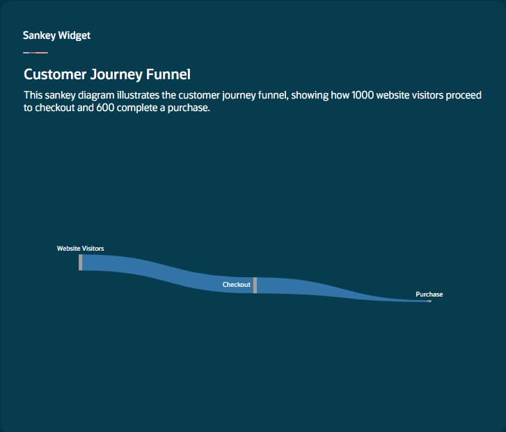
Sample JSON
{
  "title": "Customer Journey Funnel",
  "patternId": "sankeyWidget",
  "description": "Visitor to purchase flow",
  "properties": {
    "nodes": [{
        "id": 0,
        "name": "Website Visitors"
      }, {
        "id": 1,
        "name": "Checkout"
      }, {
        "id": 2,
        "name": "Purchase"
      }
    ],
    "edges": [{
        "source": 0,
        "target": 1,
        "value": 1000
      }, {
        "source": 1,
        "target": 2,
        "value": 600
      }
    ]
  }
}
Property Reference
| Property | Required | Type | Description |
| nodes | Yes | Array<Object> | Stage/entity objects |
| nodes[].id | Yes | Number | Unique numeric identifier |
| nodes[].name | Yes | String | Display label for the node |
| edges | Yes | Array<Object> | Flow connections between nodes |
| edges[].source | Yes | Number | Source node ID (must reference valid node) |
| edges[].target | Yes | Number | Target node ID (must reference valid node) |
| edges[].value | Yes | Number | Flow quantity. Positive number. Determines link width. |
Nodes with no incoming edges become source nodes (leftmost). Nodes with no outgoing edges become sinks (rightmost). All source/target values must reference valid node IDs.
Widget Selection Decision Guide
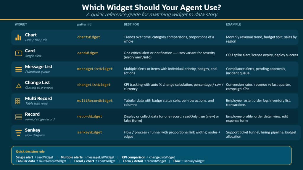
Example Display Prompt
- Display critical alerts using the cardWidget with variant “error”
- Display lists of notifications using messageListWidget with appropriate priority levels
- Display performance comparisons using changeListWidget with displayType “percentage”
- Display tabular data using multiRecordWidget with badge cells for status columns
- Use chartWidget with type “line” for time-series trends
- Do not use messageListWidget for a single item — use cardWidget instead.
Common Mistakes Across All Widgets
- No widgets selected in Output Tab: Without at least one widget selected, <oraInfoDisplay> tags are silently ignored.
- Array length mismatches: Chart data[] must match labels[]. Table cells[] must match cols[]. Mismatches cause rendering errors.
- Formatting symbols in numeric values: changeListWidget values must be numeric only—no %, $, or other symbols.
- Using cardWidget for lists: Card is for a single alert. For multiple items, use messageListWidget.
- Missing badge cell format: In multiRecordWidget, badge cells require {“type”:”badge”, “text”:”STATUS”, “priority”:”success”}.
- Invalid node references in Sankey: Every source and target must reference a valid node ID.
- Vague display prompts: “Display the data” produces unpredictable results. Be specific about widget type and properties.
| The Widget Principle Widgets are the visual vocabulary of your agentic app. Charts show trends, cards announce alerts, message lists prioritize queues, change lists track KPIs, tables organize records, record forms collect input, and Sankey diagrams map flows. Choose the right widget for the data story, and the display will be clear, actionable, and professional. |
New to Oracle Fusion AI Agents?
Explore AI Agent Studio Learning Path — blog series to help build from zero to production-grade AI agents, with deep dives on every agent pattern, node type, and tool integration.
Explore AI Agentic Apps Learning Path — blog series on everything you need to build Oracle Fusion AI Agentic Apps using AI Agent Studio.