We’re excited to introduce ShapeBarChart, a dynamic and visually expressive custom extension for Oracle Analytics Cloud that brings a new dimension to how your data is presented.
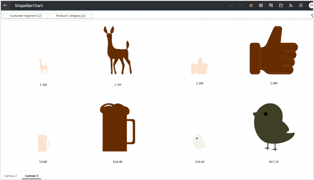
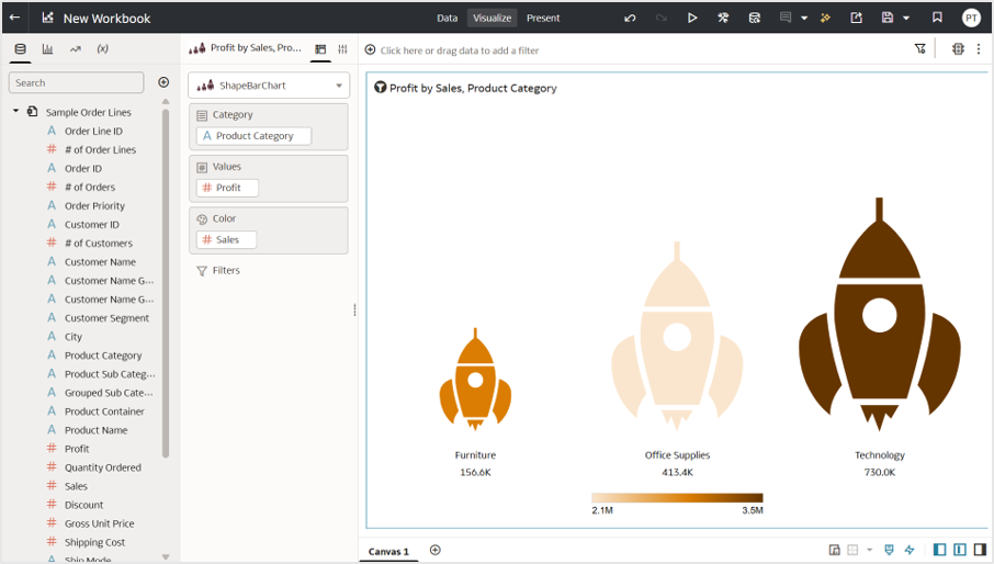
ShapeBarChart turns numeric values into scaled SVGs – whether it’s rocket , bulbs, cars, people or any shape that represents your business context. Each icon adjusts its size based on the underlying value, offering a clear and intuitive way to present differences across categories.
This extension blends visual meaning with analytical insight, letting your dashboards tell stories through shapes that resonate with your data.
Getting Started is Simple
- Download the extension ZIP file and sample SVGs from the Oracle Analytics Community.
- Deploy the extension on your Oracle Analytics instance.
- Drag it onto your canvas and watch your data transform into icons.
Tip: Keep your SVG files reasonably simple for the best results.
How to Use ShapeBarChart in Oracle Analytics
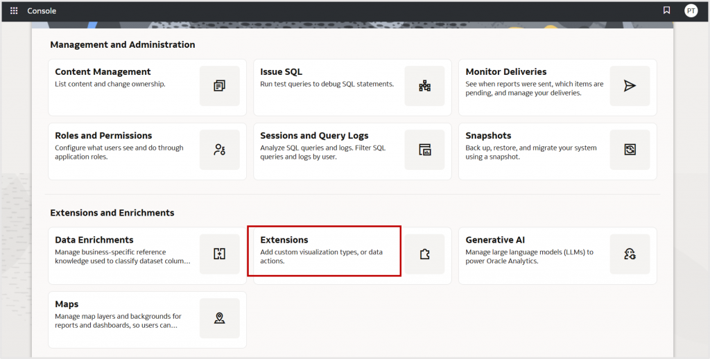
1. Upload the extension.
In Oracle Analytics, navigate to Console, and then Extensions, and upload the customviz_com-company-shapebarchart.zip file.
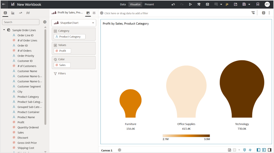
2. Add ShapeBarChart to a workbook.
Create a workbook and drag the ShapeBarChart extension to your canvas.
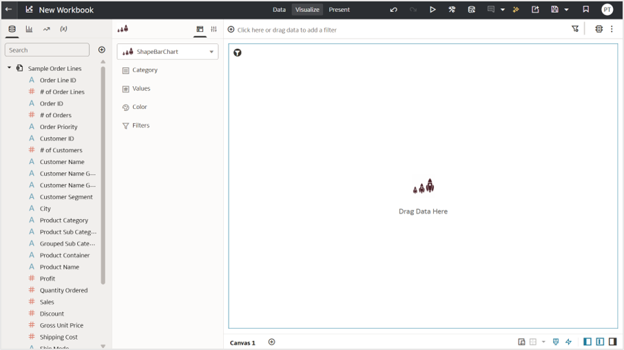
3. Bind your data.
Drag and drop fields on to the Grammar pane.
(You’ll see default light-bulb icons until you load your own SVGs.)
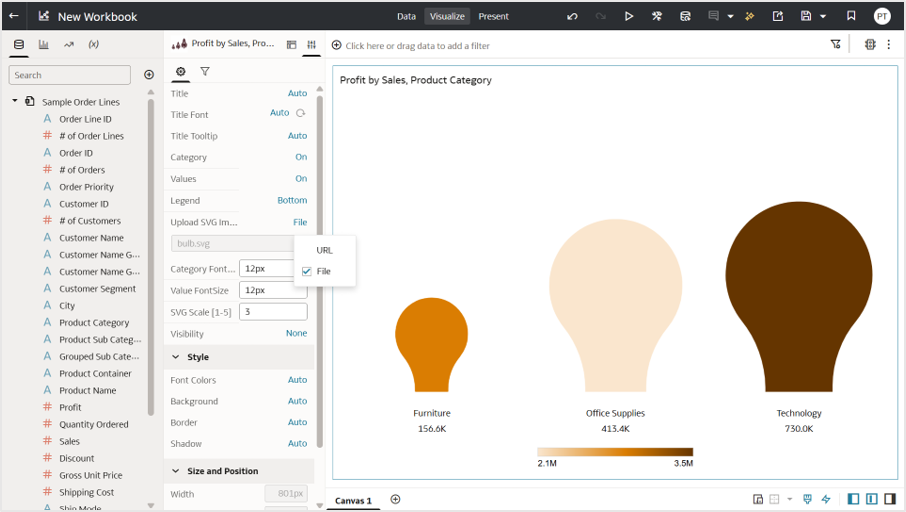
4. Load your SVGs.
In Extension Properties, choose how to supply SVGs:
a. File: Upload SVGs from your system.
b. URL: Fetch SVGs from OCI object storage.
Make sure your domain is added to Safe Domains if you’re using URLs.
For details, see the Safe Domains documentation and blog article on enabling CORS.
5. Customize and explore.
ShapeBarChart offers flexible customization options, allowing you to fine-tune every detail to match your dashboard’s style:
a. Icon colors using the OAC DV color palette
b. Value labels with options to show/hide and adjust font size
c. Category names with configurable visibility and font size
d. Legend controls to enable or disable, along with adjustable positioning
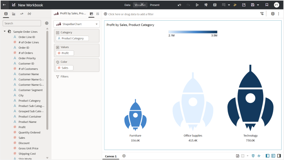
6. Adjust the SVG Scale parameter.
This parameter determines how the icons scale, especially when working with larger number of categories.
a. Range: 1 to 5
b. Increase the scale when the chart contains many categories or when the icons appear smaller than expected.
With just a few adjustments, your data transforms into engaging visuals that feel expressive, meaningful, and memorable.
Try it. Shape it.
Give ShapeBarChart a spin in your next your dashboard and explore how data looks when it takes shape.
We’d love to see your most creative uses!
Share your SVG experiments and dashboards with the Oracle Analytics Community.
Learn more about Oracle Analytics in Oracle Help Center.