You may not know that the Premier League and Oracle are sports partners. But if you’re a soccer fan (or football, as the world outside the U.S. knows it), you probably do know that on Sunday, February 5th, Harry Kane scored his 200th Premier League goal! He is only the third person in the league’s storied history to achieve this incredible milestone. To celebrate that achievement and deliver on Oracle’s mission of helping the world see data in new ways, we have used the power of Oracle Cloud Infrastructure (OCI) and Oracle Analytics Cloud (OAC) to highlight his career in the Oracle Milestone Insight dashboard series.
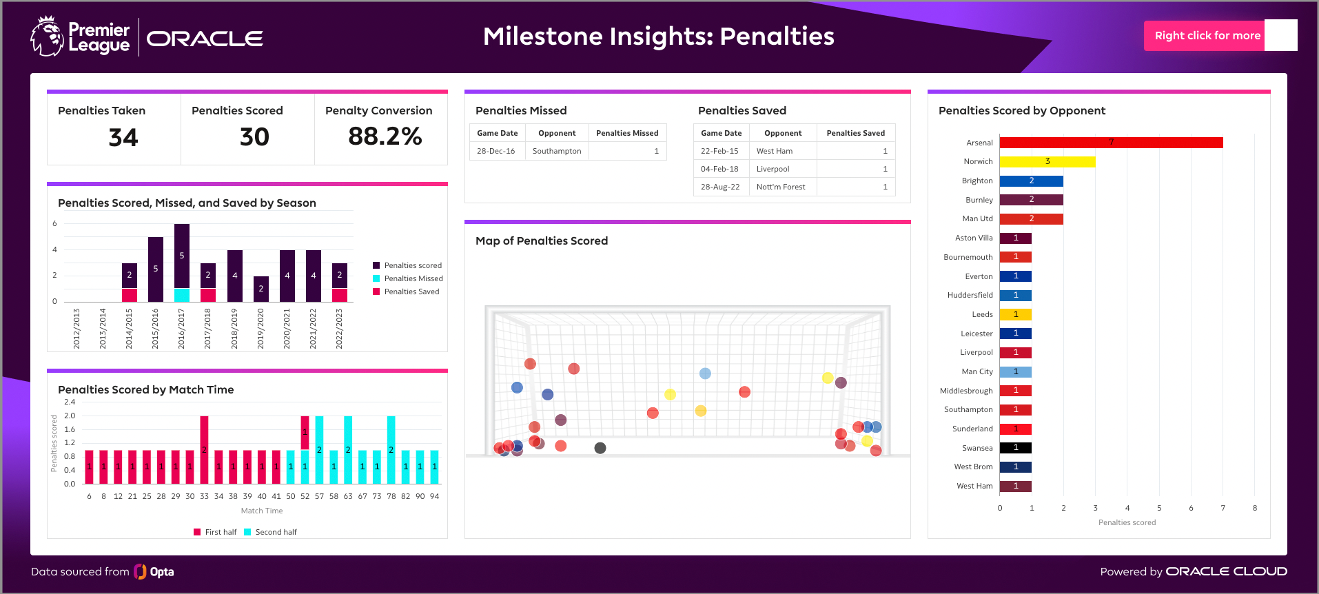
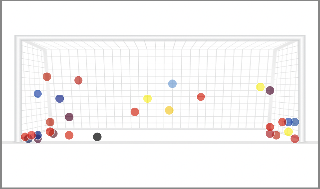
Throughout his career, Kane has been remarkable from the penalty spot, with an over 88% penalty conversion rate. The best way to highlight this and show both his penalty expertise and the flexibility of OAC map customization is with a custom map. This goalmouth map allows you to filter by season and team, so you can see exactly where his penalties entered the goal. You can determine if his strategy stayed consistent against each team, or if he had a unique placement in mind against different teams.
First, maps – why are they so important?
Maps offer you at-a-glance decision making. Whether you’re selecting a restaurant, trying to find a bike share, or analyzing sports performance, maps are invaluable tools. Maps help you answer questions. Which bike share location sees the most frequent use or where should taxis be positioned based on the volume of historic ride start locations? Or this example – does Harry Kane favor a corner of the goalmouth during penalty kicks?
The at-a-glance usability of maps makes them one of the most powerful tools for rapidly uncovering insights. In sports, maps can be used by team strategists, coaching staffs, and players to study opposition or their own performance. As a fun visual element, they are also appealing for sports journalists to present, and they give eager fans an easy way to highlight memorable moments of their favorite athletes and games.
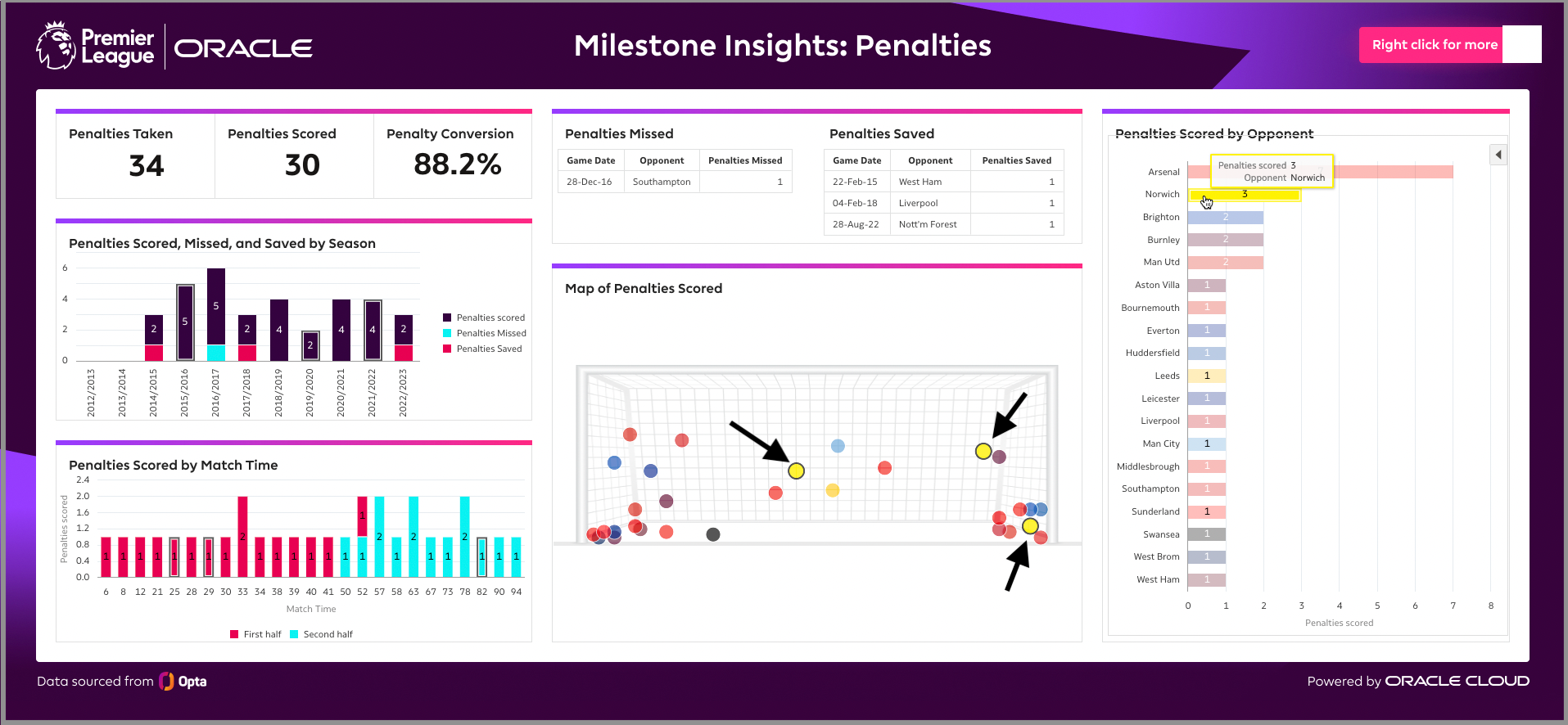
Athletes and team strategists study game footage. They analyze and prepare tactics based on data from previous matchups. OAC allows users to explore seamless interactivity between map and graph visualizations. In the above example, I used the Penalties Scored by Opponent bar chart to select the penalties that Harry Kane scored against Norwich. Those three penalties then become bolded on the map layer allowing a strategist to make decisions based on previous performance. Two of the three penalties were scored near the goal’s right post and the other was scored almost directly in the middle of the goal. Based on this historic data, would you agree that the recommendation should be for the goalkeeper to dive towards the right post?
So, how does it work?
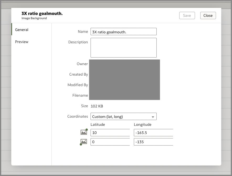
Any dataset with geographic coordinates can be transformed through mapping. You can use a traditional global or city map, or a custom map image background. This could be a birds-eye image of a physical location – or, as with Harry Kane, it could be an image of a soccer goalmouth showing the locations where the ball entered the net. Any image relevant to your analysis can be used in OAC to create a background map layer.
Here are the steps to follow to align your coordinates with the custom background image:
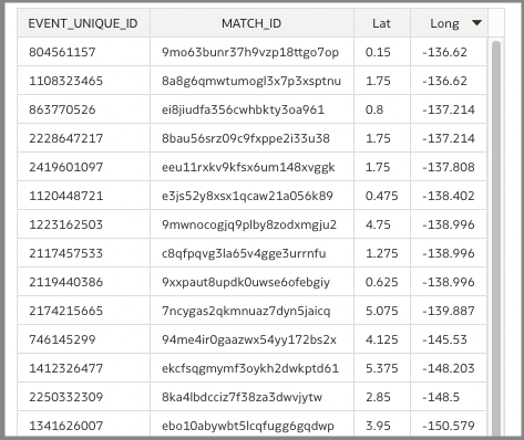
Find your bottom left and upper right corners. To do that, pull your coordinates into a table and find the lower and upper limits of both your longitude and latitude.
- Once you have your corners, save your workbook and navigate into the OAC console. Click maps, then backgrounds, then image backgrounds. Use the Add Image link at the bottom of the page to upload your image.
- In the coordinates box, make sure you select to change from “Auto” to “Custom”, then fill in your upper right corner on the top line and bottom left corner on the lower line. Click save and close.
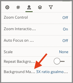
- Navigate back to your OAC workbook and load your map layer into a map visualization to display your data.
For the past few months, the OA team has been exploring and analyzing Harry Kane’s career data, on the edge of our seats waiting for his historic 200th Premier League goal. The publication of this dashboard marks the first release in the co-branded Premier League and Oracle Milestone Insight series. This project will continue to highlight great achievements and celebrates players in the Premier League, and to share ways you can make the almost limitless flexibility of OAC mapping work for you.
Below are a few ways for you to see how you can use maps for quick insights. And keep an eye out for more dashboards and blogs highlighting the Milestone Insights series and partnership!
Links to Documentation –
Map Point Sizing on OAC (Video)