Oracle Analytics Cloud (OAC) is a powerful analytics and data visualization platform with a rich set of ready-to-use visualizations. It also provides an SDK for you to build custom visualization plug-ins. You can either create visualizations or leverage existing custom plug-ins from the public marketplace to use on your canvas.
One such custom plug-in is newly introduced for dumbbell charts, which are an effective interactive visualization for illustrating the change between two data points.
What is a dumbbell chart?
Dumbbell charts get their name from their appearance, resembling a dumbbell or weight with a vertical orientation. The visualization includes two circles connected with a bar in the middle, also known as a connected dot plot. The taller the bar, the higher the variation between the points. With the help of this unique visualization, you can quickly compare two data points from different times, currency values, geographies, and so on, for any dataset with two data points that use the same scale on the axis.
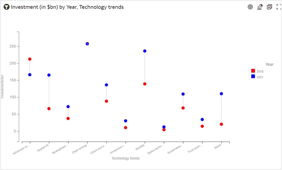
This figure shows a chart comparing the change in investment values between 2018 and 2021 across technology domains. You can see that investment increased from 2018 to 2021 across all technologies except Advanced connectivity and Clean Energy domains. You can see a significant increase in domains such as Applied AI, Mobility, and Web 3.
How can I create a dumbbell chart?
It’s surprisingly easy to create a dumbbell chart in Oracle Analytics Cloud using the plug-in, which you can download for free from the Oracle Analytics Library.
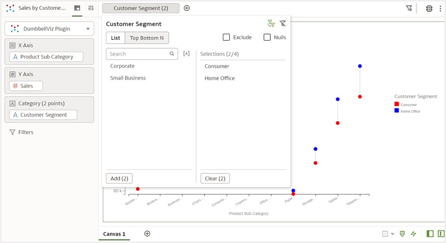
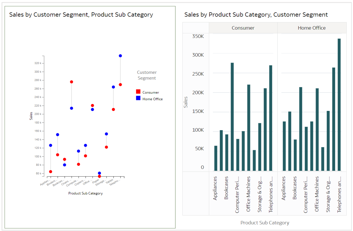
You create a dumbbell chart in OAC in three easy steps. You first need a dataset. This example includes a Sales dataset to compare the sales difference between two customer segments, consumer and home office, across product subcategories. The following table lists the data used for this chart.
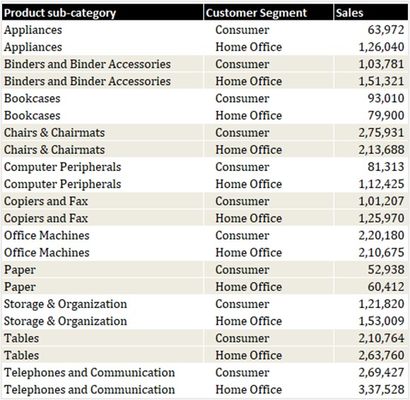
The table has three components:
- X-axis: Product subcategory
- Y-axis: Sales value
- Category points: Consumer and Home-office customer segments
Step 1: Select the dumbbell plug-in icon and drag it to the canvas.
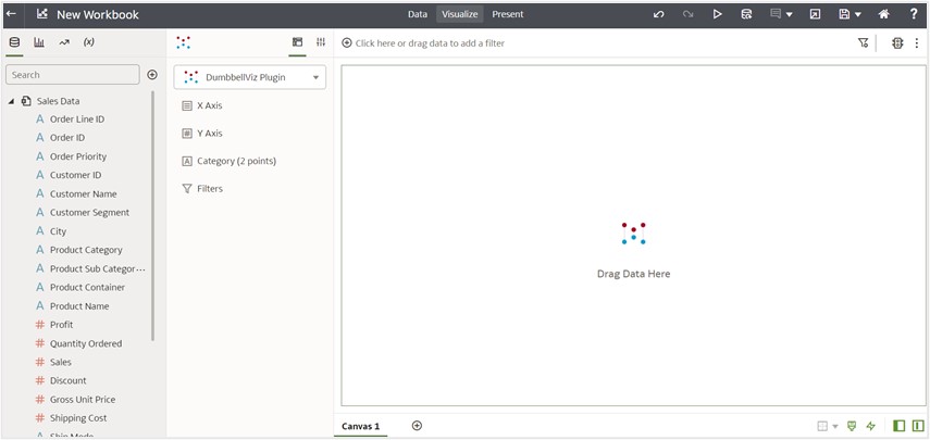
Step 2: Select Sales on the y-axis, product subcategory on the x-axis, and customer segment as category points. The visual grammar in OAC uses the y-axis for measures and the x-axis for attributes and categories.
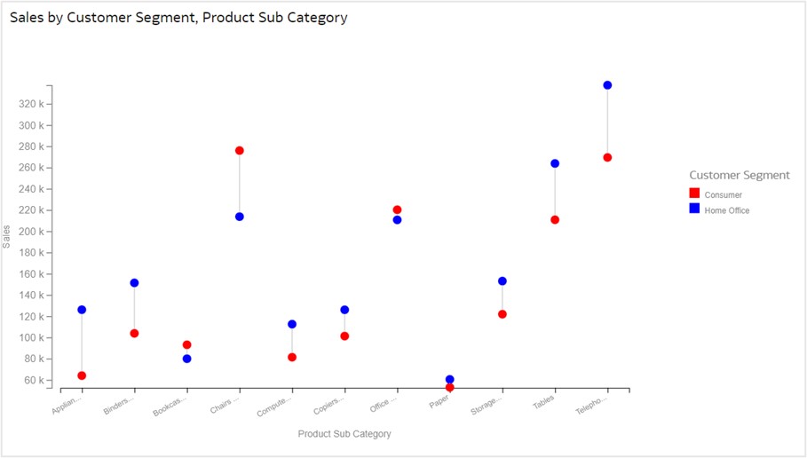
You can see circles with three different colors, because you haven’t set filters for customer segments. In this example, colors are assigned to category points based on alphabetical order: red for consumer, blue for corporate, and grey for other category points.
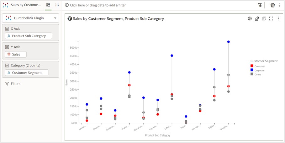
Step 3: Filter two category points and compare the sales difference.
Here, you’re interested in identifying the difference between the consumer and home-office customer segments. Therefore, you select those two customer segments.
The following figure shows the resulting chart:
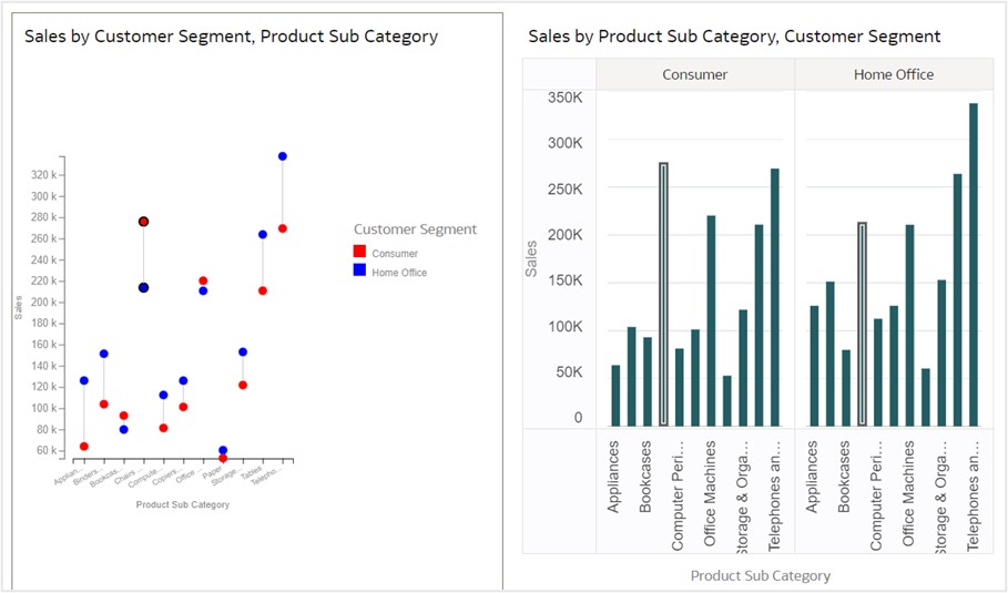
The following figures show the analysis:
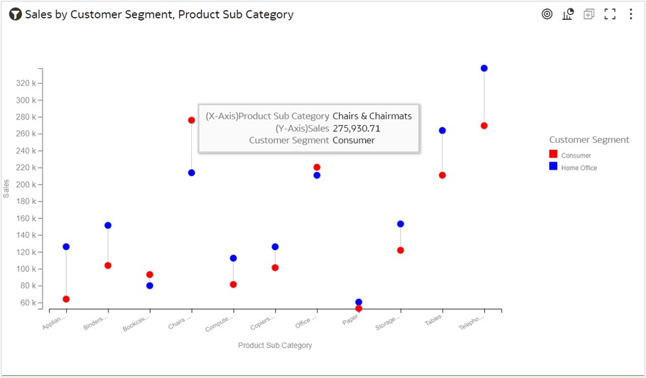
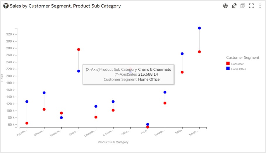
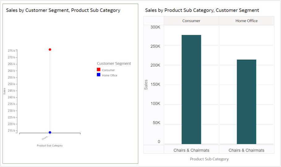
Based on the tooltip values, you can quickly observe that the consumer segment has a higher sales value of $275,930, while the home office segment has a sales value of only $213,668 in the chairs and chairmats product subcategory. In the appliance product subcategory, the home office segment has higher sales than the consumer segment.
What other features can you use?
The dumbbell chart also supports brushing, marking, and keeping selected data features.
Brushing and Marking
When you click the chairs and chairmats product subcategory on the dumbbell chart, the same subcategory gets highlighted in other visualizations on the canvas.
Keep Selected and Remove Selected
You can narrow your focus to explore certain aspects of your data by selecting data using the Keep Selected and Remove Selected options. Suppose that you want to focus on the sales generated only by the chairs and chairmats product subcategory. Right-click that subcategory’s circles to display the drop-down menu shown in this figure:
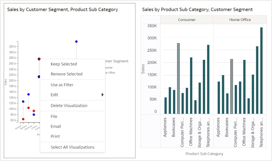
Click Keep Selected to keep only the selected chairs and chairmats product category. All other product subcategories are removed from the visualization and its linked visualizations.
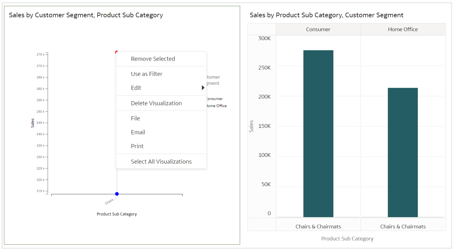
Click Remove Selected to remove selected members from the visualization and return to the original visualization.
Where can you find more information?
Watch this video on building a dumbbell chart in OAC using the custom plug-in. Download the free plug-in from the Oracle Analytics Library, and see documentation about visualizations in the Oracle Help Center.