The new Parameters feature in Oracle Analytics Cloud (OAC) enables dynamic manipulation of the data on a dashboard. Parameters are user-defined variables that hold certain values, and those values can be reused within the dashboard scope.
Parameter Basics
- Parameters’ scope: Whether you use a parameter as a filter control or within an expression, the value of the parameter is global to the dashboard.
- Parameters’ values: The 3 values to be aware of are:
- Initial values: The default value used when the dashboard loads.
- Current values: The value set based on user action.
- Possible values: Tthe list of values the parameter can accept.
- Parameters’ use: They can be used in several ways:
- As a filter control on dashboards and visualization filter bars, as column selectors.
- In expression filters, to filter the data in the dashboard.
- In calculations.
- In logical SQL expressions (nested parameters are supported).
- As visualization properties (such as in visualization titles and axis titles).
- In data actions for workbook navigation use cases.
- Parameters and filters: Parameters differ from filters. Adding a parameter as a filter control on a dashboard or visualization filter isn’t filtering the data but changing the view of the data.
Parameter Anatomy
The definition of a parameter is very simple:
- Name – A mandatory field that holds a user-friendly name that describes the parameter’s intent.
- Description – An optional field for adding more details about the parameter.
- Data Type – A mandatory field that defines the data type for the parameter.
- Allow Multiple values – This option allows you to set the parameter to accept multiple values.
- Alias – This option provides a display override name for the parameter values.
- Possible Values – A list of possible values that the parameter can hold.
- Initial Values – The values used for initializing the parameter when it’s first initiated.
Possible and Initial values can be sourced from a manual input of values or from a logical SQL statement to get data from the data source. Logical SQL allows the users to dynamically fetch a list of values from the data source.
This article describes how to create a date part selector using parameters that allows you to aggregate data based on the grain of the time period.
For this example, assume that you must design a dashboard to show users time period selections such as Year, Quarter, and Month, and that the data is dynamically aggregated based on the selected time period. You can use the Sample Order Lines dataset that has Order Date and Ship Date as columns in addition to other dimensions and measures.
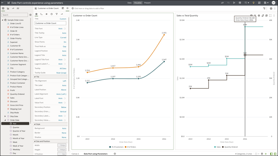
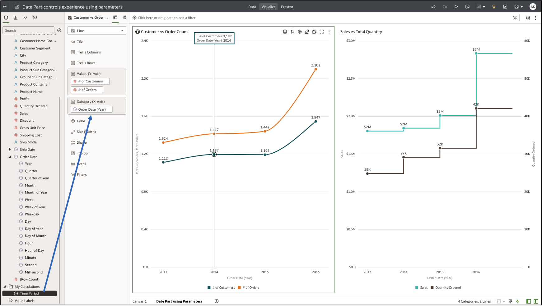
Step 1: Create a Workbook and Create Two Line Charts
Line Chart 1 shows the number of customers and order values (Y-axis) by year (Category X-axis).
Line Chart 2 shows sales and quantity ordered (Y-axis) by year (X-axis).
Additionally, from the visualization properties, turn on the properties for Show Points (General tab) and Data labels (Values tab).
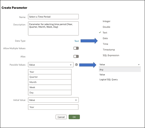
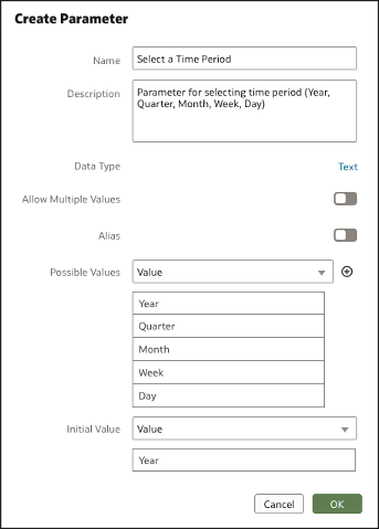
Step 2: Create a Parameter
Navigate to the Parameter panel on the data panel UI and create a parameter of data type text as shown in this figure.
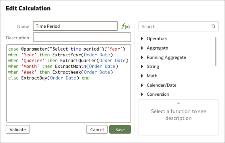
Step 3: Create a Calculation
Create a custom calculation to refer to the parameter and map the possible values to columns in the dataset. Because the dataset has data at the day level, use an ExtractYear function to extract the Year, Quarter, Month and Week granularity from the Order Date column.
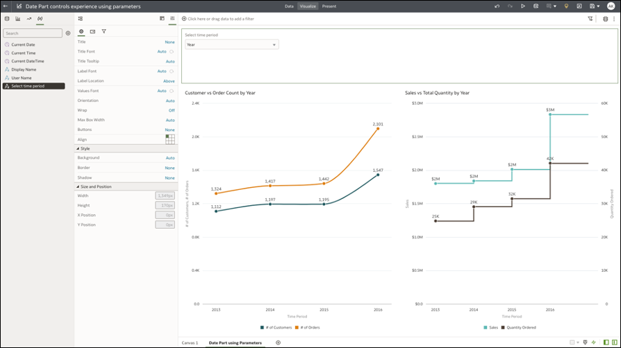
Step 4: Add the Calculation as the Category Axis to the Visualization
Add the calculation as the category axis to the line charts. Because the parameter initial value is Year, the charts display data for the Year period.
Step 5: Show the Parameter as a Selector Control
To display the parameter as an interactive control, add it as a filter control on the dashboard filter. Alternatively, you can parameters to the visualization filter bar.
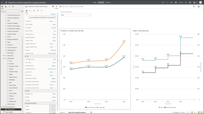
Step 6: Parameterize the Visualization and Category Axis Title
The last step is to provide a custom visualization title and category axis title, by using the parameter syntax to dynamically update the title and axis titles with the selected parameter value.
The syntax for parameter is @parameter(“parameter name“)
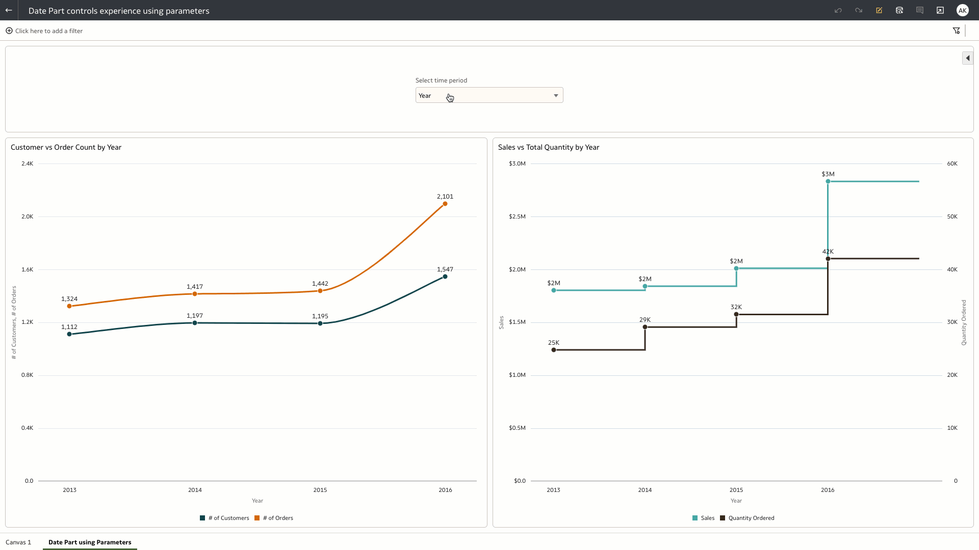
Step 7: Test the Date Part Parameter
Open the dashboard as a user and test the “Select Time Period” parameter control, which acts as a view selector. Your selected value is passed as the current value of the parameter. The calculation maps the parameter value to the column in the dataset and passes the column to the category axis of the line charts.
Parameters in Oracle Analytic Cloud bridge a feature parity gap with Oracle Business Intelligence Enterprise Edition (OBIEE) and enable you to build complex dashboarding use cases, as well as migrating existing content from OBIEE to OAC.
For more details see, Create and Use Parameters, Parameter Introduction Video, Column Selector Use Case, Dynamic Top N Use Case, What-if analysis Use Case implementations using Parameters in Oracle Analytics Cloud.