Oracle Analytics Cloud (OAC) provides powerful slice & dice capabilities using filters. The dashboard filter bar enables you to filter and focus on multiple facets of a dashboard and its underlying data.
To get a sense of how you can use filters, consider a scenario where retail sales managers want to monitor sales across channels and understand performance of various promotional campaigns for their respective categories and subcategories. They might need to:
- Quickly slice and dice data by different Product Categories for in-store sales and online sales at the same time.
- Analyze different aspects of each promotional campaign.
- Focus on specific customer segments.
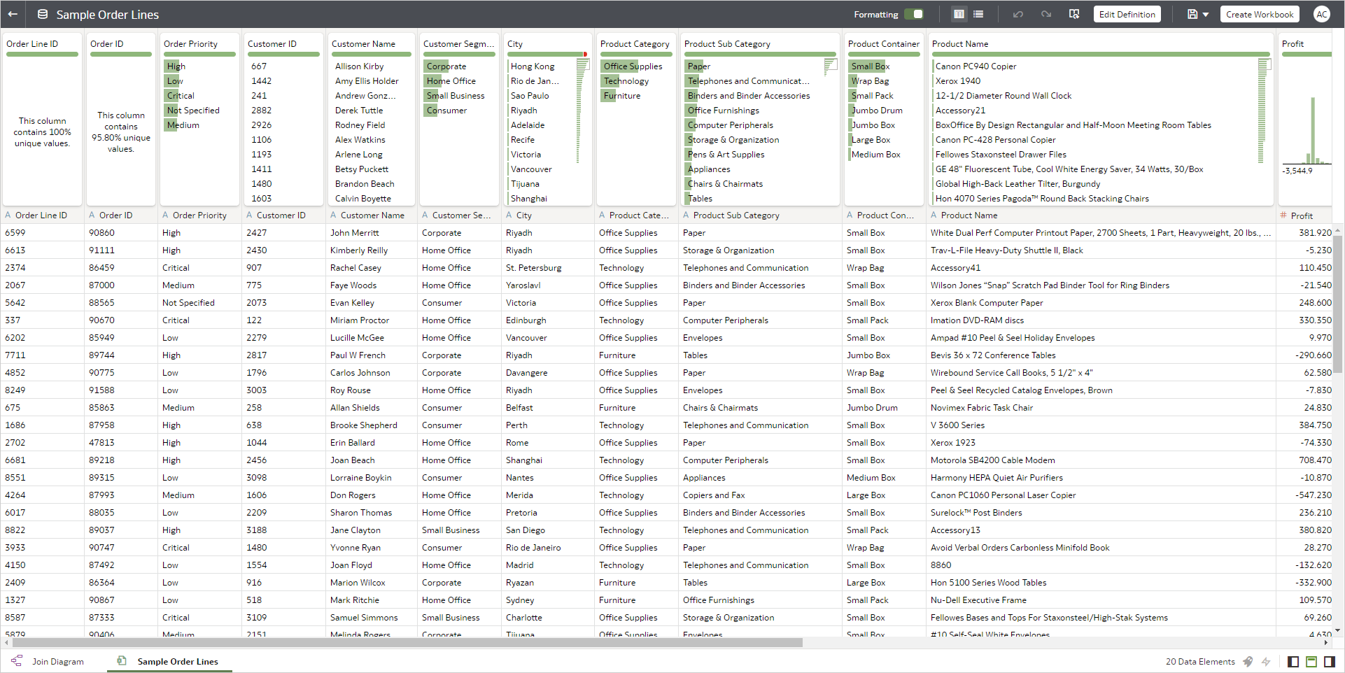
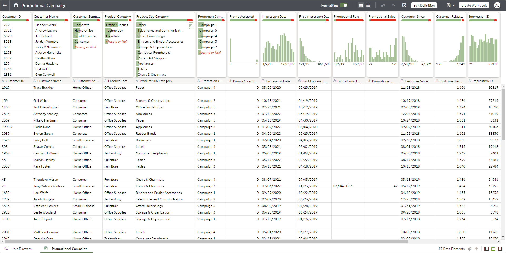
Sales and promotional campaign data are in two different datasets, shown below.
Sales Dataset
Promotional Campaign Dataset
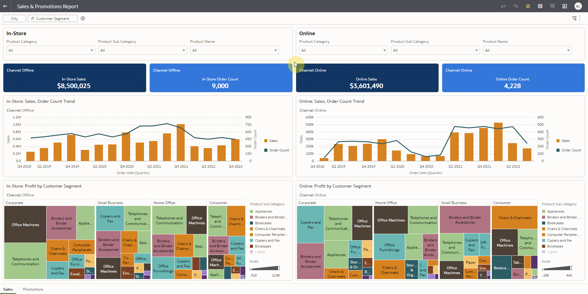
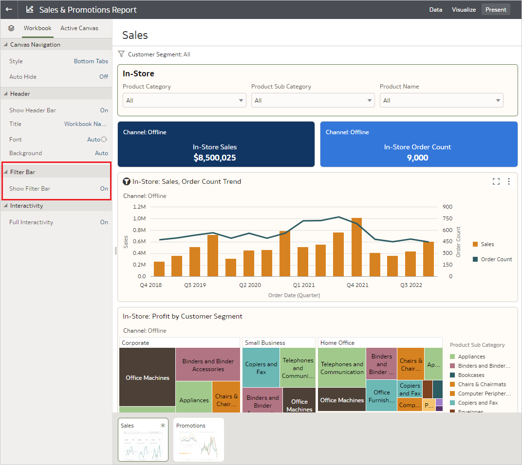
You can help the sales manager in this scenario by creating an interactive and robust dashboard using the dashboard filters in OAC. The image below shows a dashboard to analyze sales data by In-Store and Online sales channels.
Sales Dashboard
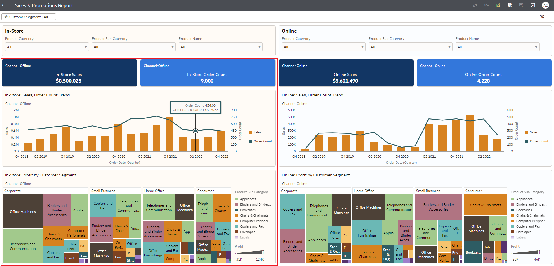
The visualizations highlighted by the red box are federal sales from the In-Store channel. The remaining visualizations show sales data from only the Online channel.
Dashboard filters
Dashboard filters are on-canvas filters with a rich set of properties that enable you to control the placement of the filter bar, add multiple filter bars on a canvas, and perform other actions as described in this blog.
In the Sales dashboard example, the following dashboard filter capabilities enable sales managers to quickly focus on the data of interest.
- Multiple dashboard filters on a canvas
The Sales dashboard has one dashboard filter for In-Store sales and another dashboard filter for Online sales.
- Visualization specific filters
Product Category, Product Subcategory and Product Name fields in the In-Store dashboard filter are configured to limit data only in visualizations that represent In-Store channel sales.
The Online dashboard filter is similarly configured for the Online channel. - Dashboard filter layout and orientation
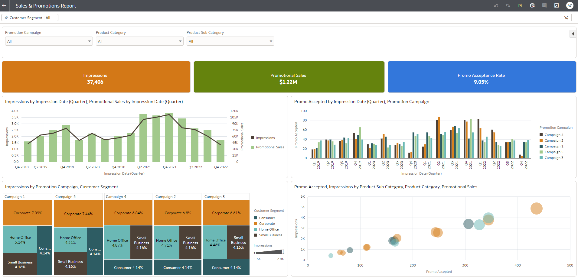
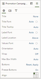
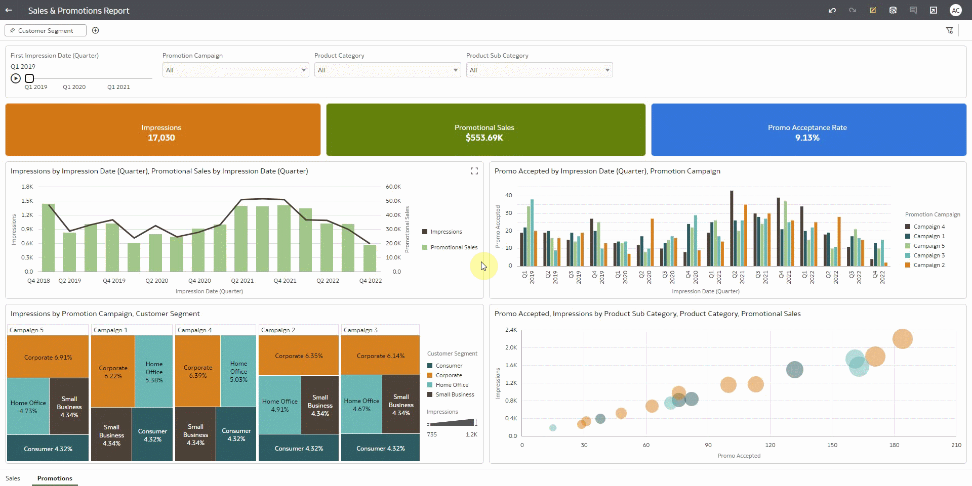
Dashboard filters provide flexible filter bar layout and filter control orientation. Consider the following example of a dashboard created from the Promotional Campaign dataset mentioned earlier. In this example, the dashboard filter is at the top of the canvas, with Promotion Campaign, Product Category and Product Subcategory data fields as the filter controls.
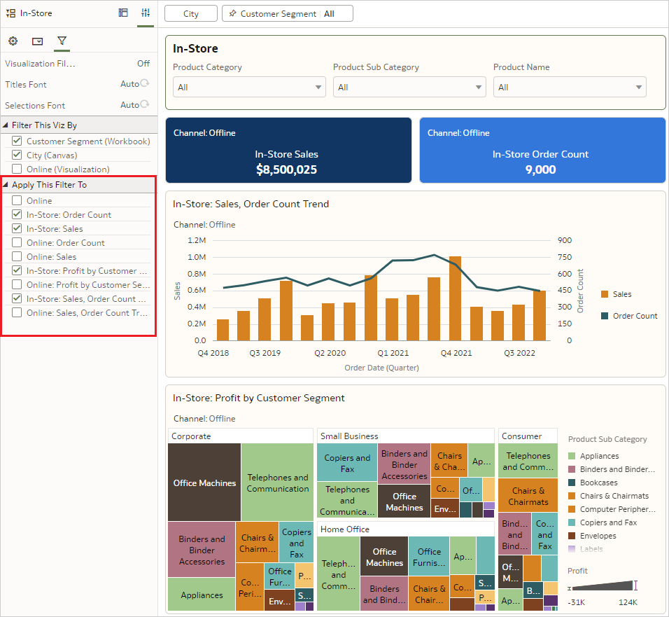
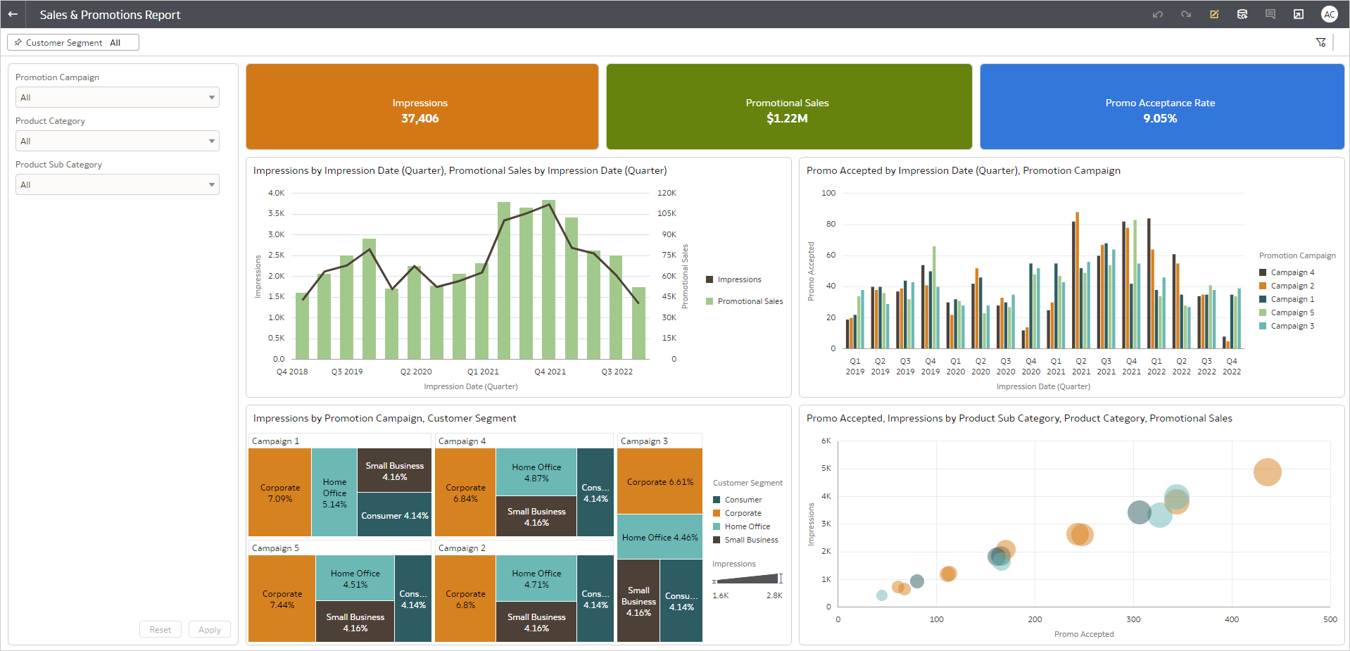
Alternatively, the dashboard filter on the Promotional campaign dashboard can also be placed vertically on the left of the visualizations, as shown in the image below:
Additionally, the dashboard filter properties can be further modified with other configuration options such as Title Font, Label Font, Value Font, add ‘Reset’ button, add ‘Apply’ button, and more.
Another slick way to display filters is using the Slider option. Any attribute used as a filter control can be set as a Slider filter, like the ‘First Impression Date (Quarter)’ filter shown below:

You can move the slider by dragging the mouse pointer along the timeline, and the dashboard will automatically apply the time duration from the slider to the visualizations. You can further enable a play button on the slider so visualizations automatically move when your users click the play button, as shown below:
Workbook filters
The Workbook filter bar enables you to define the scope of data in the Workbook. In the Visualize workspace, you can add data fields to the Workbook filter bar for the canvas. Additionally, you can pin the filter control to filter data for the entire Workbook.
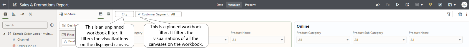
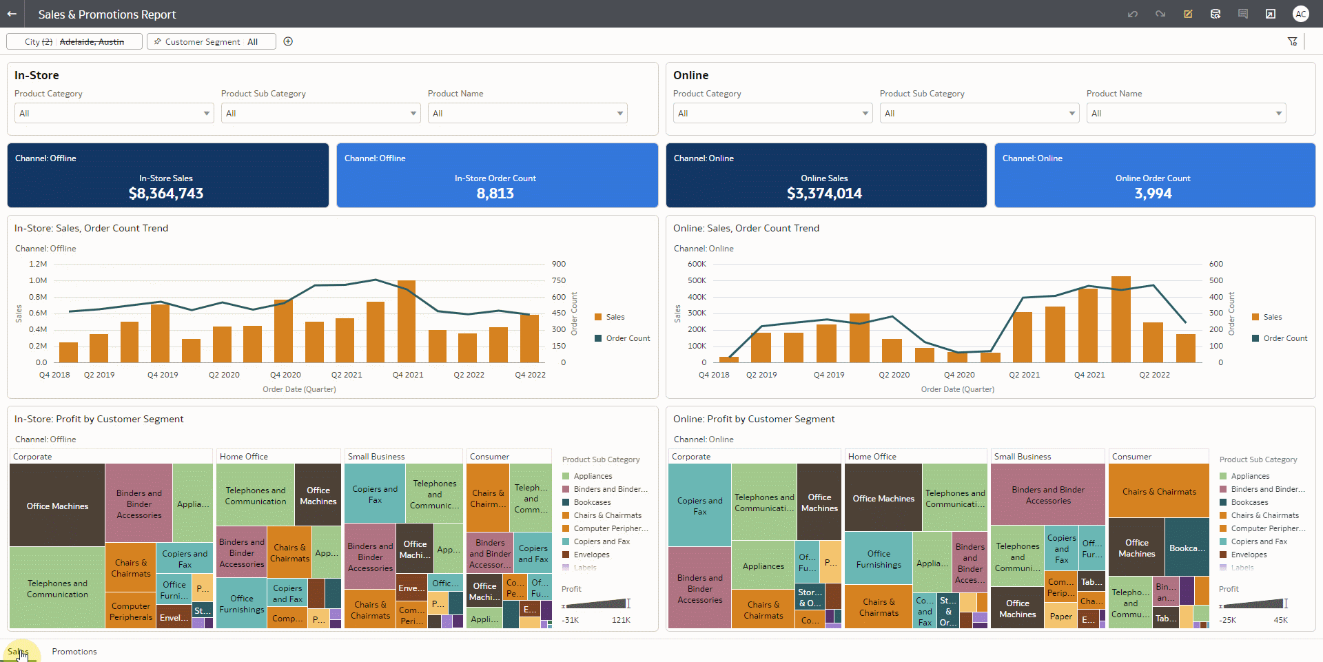
You can create the Sales dashboard and the Promotional Campaign dashboard in a single workbook. Next, you can add the ‘Customer Segment’ data field in the Workbook filter bar and pin it, making the customer segment filter applicable on both the dashboards, as shown below:
In some scenarios, you may want to define the scope of the data by applying filters and not expose the filters for end users. This can be achieved using the Present workspace.
Curate user experiences on filters
The Present workspace enables you to tailor the analysis experience for your users. Of the many configuration options available in Present, the following capabilities can be used to make filtering smooth and convenient.
- Show Filter bar
The Workbook filter bar can be hidden using this option under the Workbook tab. Since the Customer Segment filter must be exposed to users, the Show Filter Bar option has been kept on.
- Show/Hide workbook filters
On the Active Canvas tab, individual filters on the filter bar can be configured to be shown or hidden.
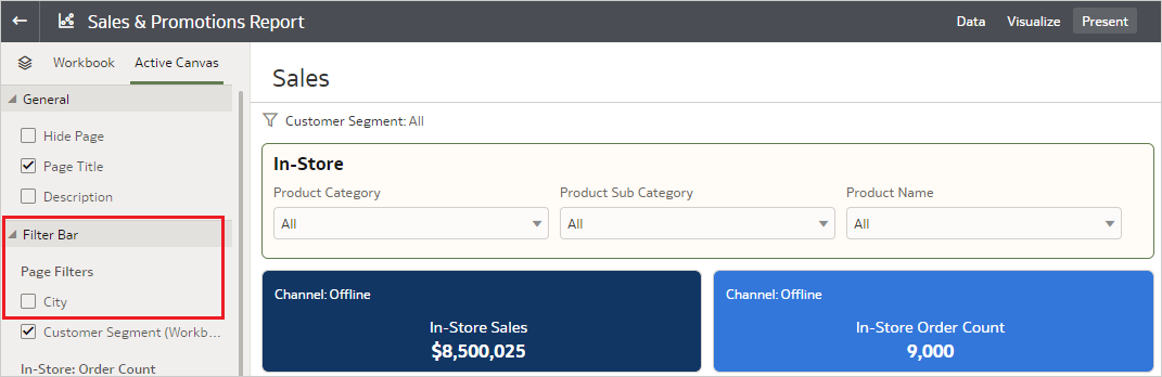
In the above image, the unpinned filter City is unselected so that only the Customer Segment filter is displayed to users.
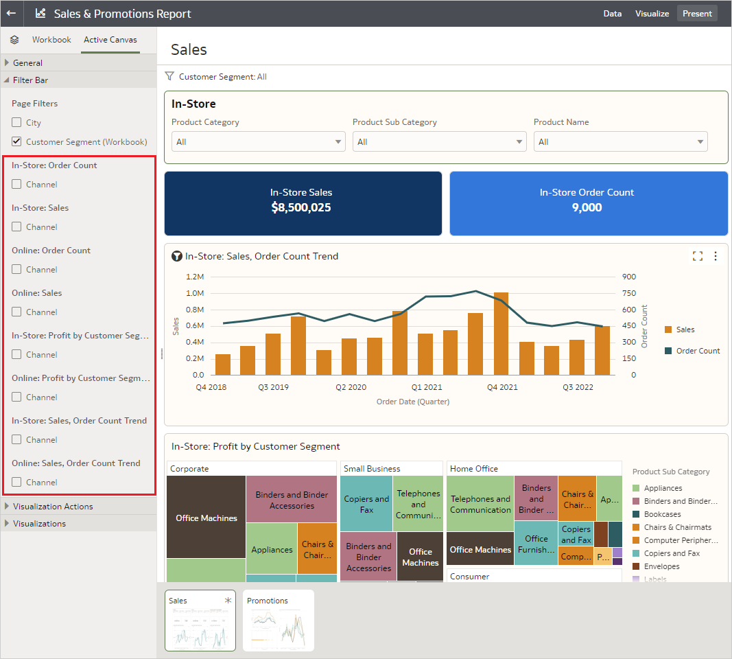
- Show/Hide Visualization Filters
Visualization filters can be individually configured to be shown or hidden. On the Sales dashboard, all the individual visualizations have their filters unchecked because each controls sales channel data, which must not be changed by users.
Each filter type in OAC provides a wide variety of advanced capabilities that can be used to slice and dice data as you require. To learn more about these capabilities, see Explore Data with Filters (Part 1) (oracle.com) and Create and Apply Filters. Visit the Oracle Analytics community to post any queries or ideas.