In today’s fast-moving business environment, leaders need quick answers to questions like “How did profit this quarter compare to last year?” or “Are expenses trending differently from revenue?” At the same time, developers and analysts want to avoid building multiple dashboards for every possible metric or time comparison.
Oracle Analytics solves this challenge through parameter-driven dynamic metric selection. With this capability, business users can interactively choose the metric they want to analyze such as revenue, expenses or profit while developers can design a single, flexible dashboard that adapts instantly to those choices.
This approach combines business agility with technical efficiency:
-
For business users: It means fewer dashboards to navigate and faster insights.
-
For developers: It reduces redundant work, simplifies maintenance, and ensures consistency across analyses.
In this blog, we’ll explore how to implement dynamic metric selection with year-over-year (YoY) and quarter-over-quarter (QoQ) analysis using parameters in Oracle Analytics – helping both business users and developers unlock more value from their data.
Why Dynamic Metric Selection?
Traditional dashboards often hard-code KPIs. For example, one visualization may show revenue trends, while another shows expense trends. This leads to cluttered dashboards and reduced flexibility.
Dynamic metric selection solves this problem by letting users choose the metric of interest via a parameter, while the same visualization adapts automatically.
Key benefits:
-
Single visualization, multiple metrics
-
Interactive exploration without editing dashboards
-
Consistent comparison across time periods
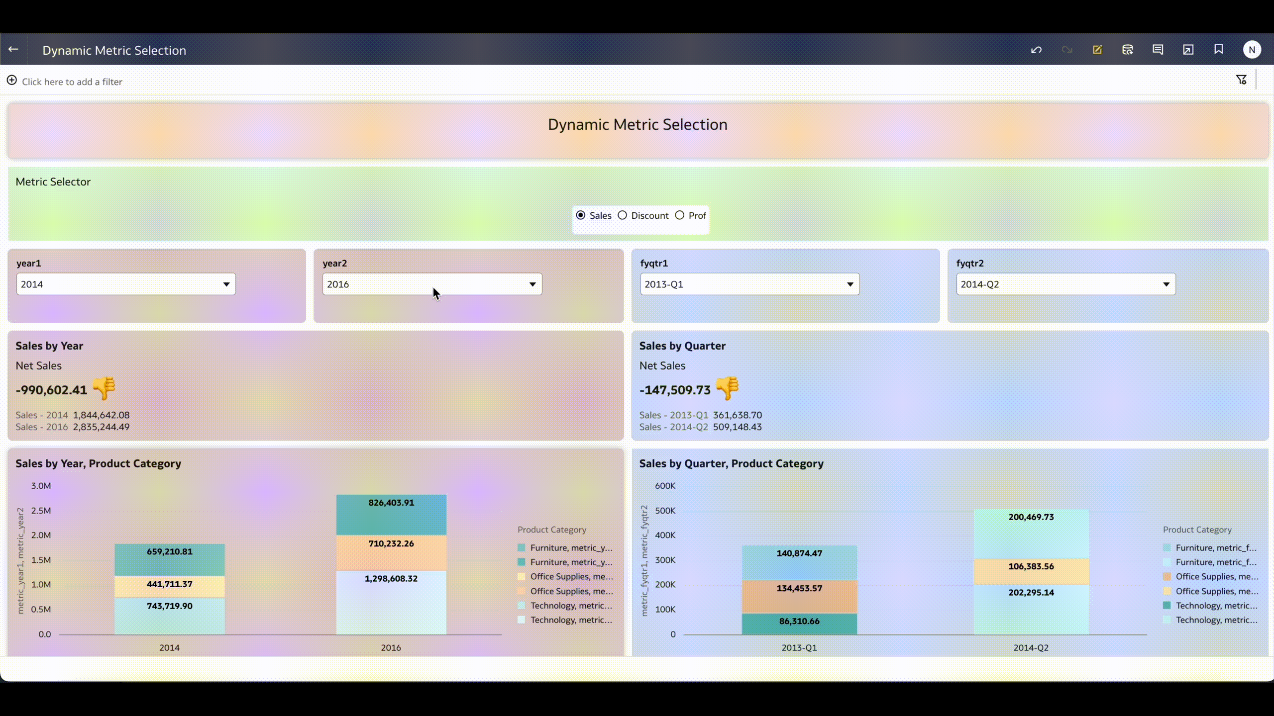
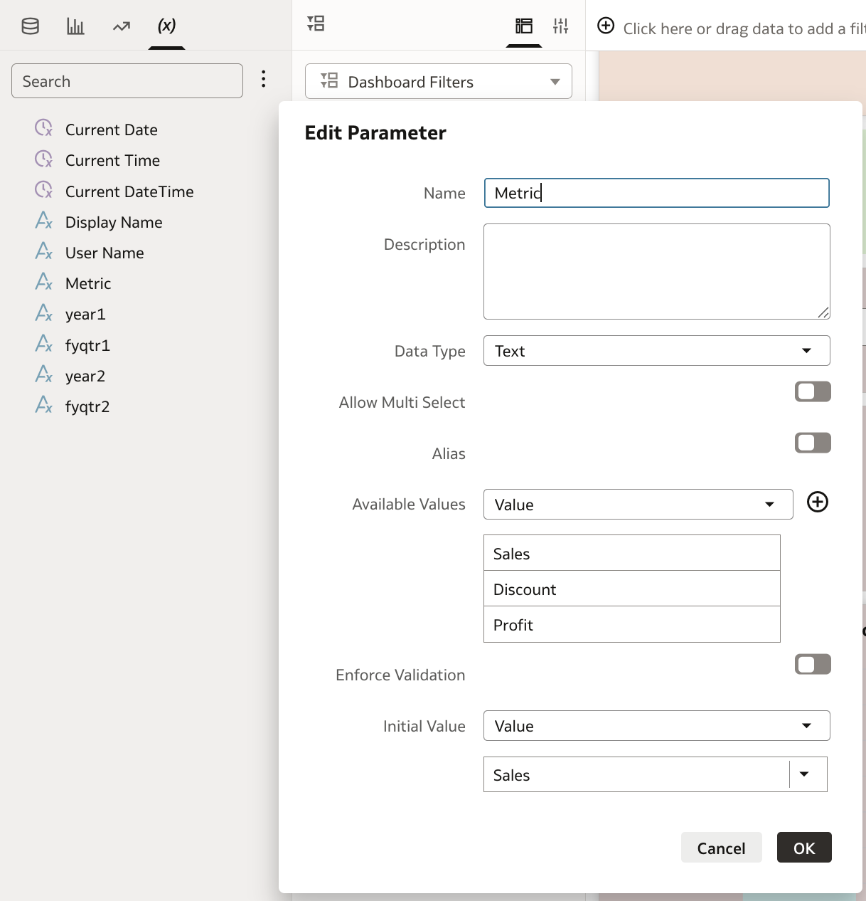
Step 1: Create a Parameter for Metric Selection
- Navigate to the Parameters pane in Oracle Analytics.
- Create a new parameter, e.g.,
Metric. - Define a list of metric values (e.g, Sales, Discount, Profit).
- Assign a default value such as Sales.
This parameter will control which measure the dashboard displays.
Step 2: Build a Case Statement for Dynamic Metrics
Using the parameter, create a calculated measure that switches values dynamically.
CASE @Parameter("Metric")
    WHEN 'Sales' THEN "Sales"
    WHEN 'Profit' THEN "Profit"
    ELSE "Discount"
END
This formula ensures that whichever metric is selected via the parameter is shown in your visualization
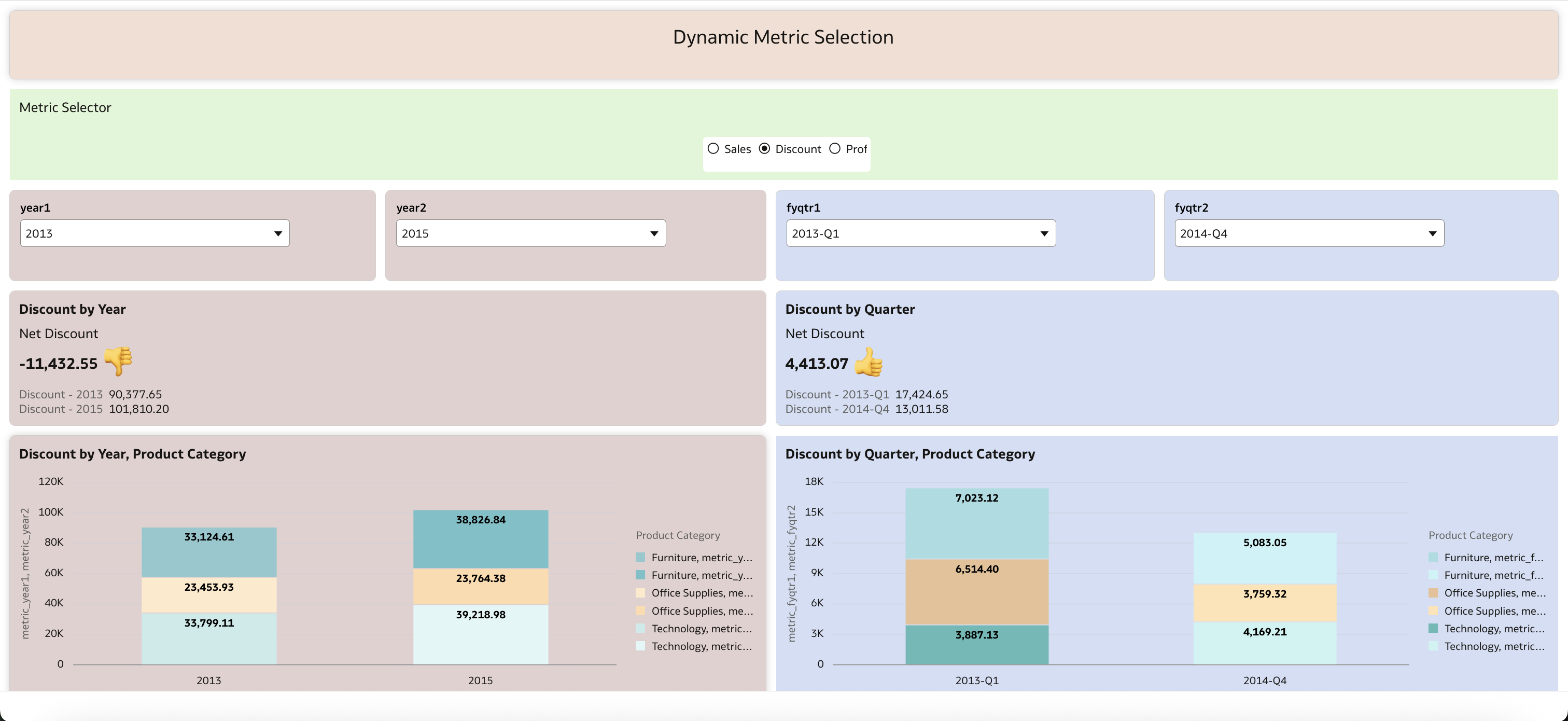
Step 3: Add Year & Quarter Comparisons
After enabling dynamic metric selection, the next step is to extend it for time-based comparisons. Business users don’t just want to view a metric in isolation – they often want to compare it across different years or quarters.
Using Parameters for Flexible Year Selection
Instead of hardcoding a “previous year” calculation (like AGO), we created two parameters:
-
Year1→ The base year -
Year2→ The comparison year
This way, business users can pick any two years (for example 2013 vs. 2015) to see differences in their chosen metric.
Dynamic Metric with Year Filtering
We combined the Metric parameter (Sales, Profit, or Discount) with Year parameters inside a FILTER statement, as shown below:
-- Metric filtered for Year1
FILTER(
    (CASE @parameter("Metric")
        WHEN 'Sales'   THEN "Sales"
        WHEN 'Profit'  THEN "Profit"
        ELSE "Discount"
     END)
USING "OrderdateYear" = @parameter("year1")
)
Net Yearly Difference
The year-over-year difference is then calculated by subtracting the results of the two filters:
-- YoY Difference between Year1 and Year2
FILTER(
    (CASE @parameter("Metric")
        WHEN 'Sales'   THEN "Sales"
        WHEN 'Profit'  THEN "Profit"
        ELSE "Discount"
     END)
USING "OrderdateYear" = @parameter("year1")
)
-
FILTER(
    (CASE @parameter("Metric")
        WHEN 'Sales'   THEN "Sales"
        WHEN 'Profit'  THEN "Profit"
        ELSE "Discount"
     END)
USING "OrderdateYear" = @parameter("year2")
)
Extending to Quarter Comparisons
The same logic can be applied to quarters by creating Quarter1 and Quarter2 parameters, and filtering on the OrderdateQuarter column instead of OrderdateYear.
Step 4: Design the Visualization
- Drag your dynamic metric into the visualization.
- Add Year and Quarter to the category axis.
- Include the YoY and QoQ measures as comparison lines or KPIs.
- Add the parameter control to the canvas so users can switch metrics on the fly.
Result: A single visualization where users can toggle between Sales, Discount and Profit while instantly viewing YoY and QoQ comparisons.
Example Use Case
Imagine a CFO reviewing quarterly performance. Instead of navigating across multiple dashboards, the CFO selects Profit in the parameter, instantly seeing YoY and QoQ trends. With one click, they can switch to Sales and analyze the same time-based comparisons
With dynamic metric selection and parameter-driven year and quarter comparisons, Oracle Analytics shifts from static reporting to true interactive analysis. Business users gain the freedom to explore the metrics that matter most, while developers build smarter, leaner dashboards that adapt seamlessly.
This approach not only simplifies maintenance but also accelerates decision-making – turning data into actionable insights faster.