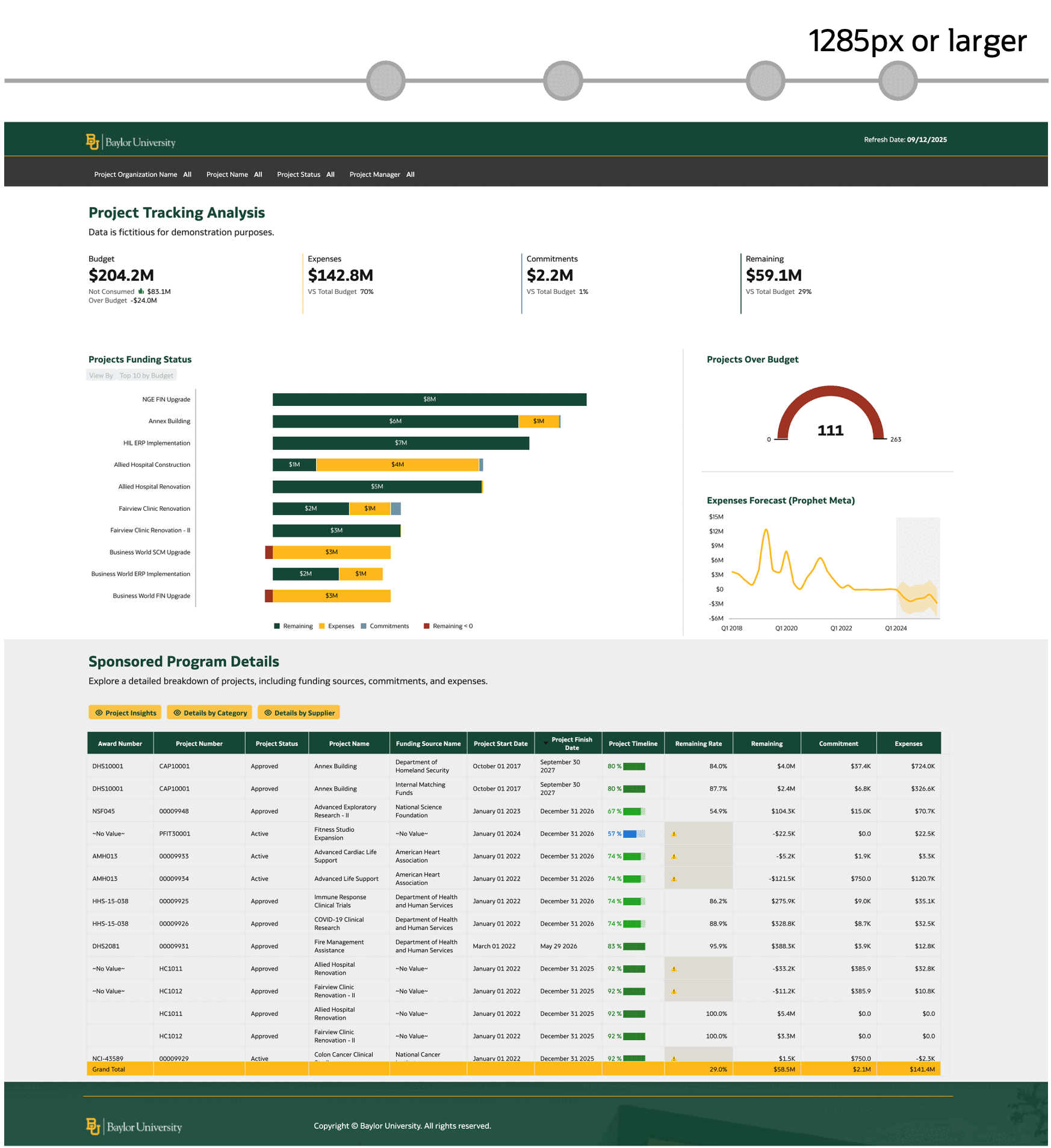
With mobile devices accounting for 60-65% of global digital traffic, analytics dashboards must deliver seamless experiences across all screen sizes, not just shrunk-down desktop versions.
Prerequisites
Before diving in, familiarize yourself with Oracle Analytics’ responsive capabilities:
- Oracle Help Center: Design Canvas Layouts for Different Screen Sizes
- YouTube video: Responsive canvas layout editor in Oracle Analytics
Key Mobile-Friendly Principles
Designing for mobile isn’t just about making things smaller, it’s about rethinking how users consume data on the go. Mobile users typically need quick insights, have limited attention spans, and interact with touch interfaces. This fundamental shift requires a strategic approach to information architecture and visual hierarchy.
- Prioritize readability: Ensure data is readable without zooming and avoid complex graphics.
- Minimize clutter: Eliminate horizontal scrolling and unnecessary components.
- Focus on critical data: Show essential KPIs and summaries.
Oracle Analytics Responsive Canvas Setup
Oracle Analytics allows you to design canvas layouts that respond to different device sizes, optimizing content to fit each screen perfectly. You’ll define breakpoints, where each represents a different arrangement of visualizations for specific screen sizes.
Recommended Canvas Layout
Right-click a canvas tab and select Canvas Properties.
- Layout: Autofit
- Width: Screen
- Height: Grow or Fixed
This setup ensures all visualizations stack properly, and between breakpoints, visualization widths automatically adjust to fit the user’s screen size.
Recommended Workflow
1. Find breakpoints: Manually reduce screen size in the responsive canvas editor until visualizations become unreadable or scroll bars appear in tables.
2. Create breakpoints: Click the + button to establish a new breakpoint when issues arise.
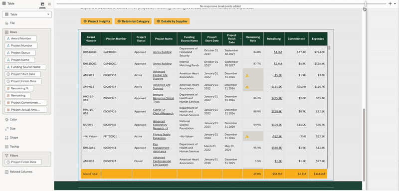
3. Optimize layout: For each breakpoint, make targeted adjustments:
- Remove unnecessary design components
- Simplify visualizations by reducing attributes or measures (remove table columns, for example)
- Switch from horizontal to vertical layouts
- Adjust font sizes and spacing
Here’s a pro tip: When you need to modify a visualization at a specific breakpoint, such as reducing title font size or removing table columns, duplicate the existing visualization, hide the original, and make edits to the new copy.
This approach ensures your dashboards maintain functionality and readability across all device types, while preserving the full desktop experience where appropriate.
See it in action: View this workbook in consumer mode on OAC Public.
Infographics or Advanced Design Dashboards
If you have more complex design requirements, you can also make a freeform layout responsive. This means that you can position all visualizations at the exact position in the canvas.
Recommended Canvas Layout
Right-click a canvas tab and select Canvas Properties.
- Layout: Freeform
- Width: Grow or Fixed
- Height: Grow or Fixed
Also configure presentation settings: Toggle Zoom on and set scale to “Width”.
With this setup, visualizations maintain fixed size and position, but the entire canvas resizes between breakpoints based on the user’s screen.
See it in action: View this workbook in consumer mode on OAC Public.
Set up the Default Layout for the Oracle Analytics Mobile App
After creating your responsive dashboard, you can set up the default optimal workbook experience for the Mobile app. You set the mobile experience option in Present. Oracle Analytics applies the option when a user opens the workbook in the app.
Desktop Mode
Maintains the exact layout and design of your breakpoint configuration. All web-based visualization functionalities and interactive features are preserved, providing a consistent desktop experience that mirrors your original design intent.
Mobile Workbook
Offers an optimal balance between visual design and mobile usability. Visualizations retain their original layouts and unique styling while incorporating mobile-optimized touch interactions and navigation patterns for enhanced user experience on smaller screens.
Mobile Stacked
Delivers a mobile-first experience with a vertically stacked layout optimized for touch devices. Visualizations are arranged in a streamlined, news feed-style format that prioritizes readability and ease of navigation on mobile devices.
Mobile Stacked mode bypasses responsive breakpoints and is best suited for data-focused dashboards containing primarily charts and graphs. This mode is not recommended for dashboards that include design elements such as images, spacers, or text-based visualizations, as these components may not display optimally in the stacked format.
Call to Action
Creating truly mobile-responsive analytics dashboards requires more than technical setup, it demands understanding how mobile users interact with data. By following these principles and leveraging Oracle Analytics’ responsive capabilities, you’ll create dashboards that work beautifully across every device.
Remember: Test early, test often. Preview your dashboards on actual mobile devices to ensure the experience matches your expectations.
Ready to showcase your work? Share your responsive dashboard designs in the Oracle Analytics Gallery and connect with the Analytics Community to exchange ideas, get feedback, and inspire others with your mobile-first approach.