Updated Feb 202 for JET 12
About this Article
When this article was origionally written, JET had yet to introduce either Custom Web Components or the <oj-form-layout> component, but those capabilities now exist and things have moved on. I have left that old approach below under the “Historical Approach” section. In modern JET applications it is highly unlikely that you will be using CSS classes to arrange your form layouts, the <oj-form-layout> component makes it much easier.
Working with <oj-form-layout>
There is still a question, however, of how your component can provide a label when used with an <oj-form-layout> component. Well the approach is actually quite simple. You will need to include a standard property called labelHint on the API of your component. It should be defined like this:
"labelHint": {
  "description": "Represents a hint for oj-form-layout element to render a label on the editable component.",
  "type": "string",
  "displayName": "Label Hint",
  "translatable": true
}
The will automatically promote any value that you have provided in this property at runtime to be the label in the form
Historical Approach
Introduction
One way in which you might want to use a Composite Component is to combine a particular type of input field and it’s label into a single component. If you recall, this was actually an example that I used way back in Article I of this series. On the surface, this seems to be trivial, however, there is a small trick to getting this play nicely with oj-form-layout. Let’s look at that.
The Pattern
In this pattern I’m making the assumption that you are using oj-form-layout to provide a responsive layout for form fields, and maybe you already have some fields in place. Meanwhile you have created a CCA that will include a label and one or more fields that you want to be able to drop in and align correctly. So here’s an example of an existing form where we have a vanilla field and label combination:
<div class="oj-form-layout">
  <div class="oj-form oj-sm-odd-cols-12
           oj-md-odd-cols-3 oj-md-labels-inline">
    <div class="oj-flex">
      <div class="oj-flex-item">
        <label for="f1">Label for normal input</label>
      </div>
      <div class="oj-flex-item">
        <input id="f1" data-bind="ojComponent: {component: 'ojInputText',
                                                value:someValue}"/>
      </div>
    </div>
  </div>
</div>
Step 1 – The Composite View
Inside of the composite view we want to emulate the layout container <div>s that we would use for a label / field pair in a standard form. Note, however, that we omit the outer oj-flex and just use the oj-flex-item <div>s. So the CCA view might look like this:
<div class="oj-flex-item">
  <label data-bind="attr:{for:'ccaf1'+$unique,text:$props.label}">
</div>
<div class="oj-flex-item">
  <input data-bind="attr:{id:'ccaf1'+$unique},
                    ojComponent: {component: 'ojInputText',
                                  value:$props.value}"/>
</div>
Note how I’m being careful to use unique IDs as outlined in the last article.
Step 2 – Using the Composite Component
The key to getting the layout to work comes in this next step. When consuming the component you set the class of the component itself to oj-flex. Remember that all CCAs extend the base HTML element type and so include the id and class attributes automatically. So when using the component in our simple form it will look like this:
<div class="oj-form-layout">
  <div class="oj-form oj-sm-odd-cols-12 oj-md-odd-cols-3 oj-md-labels-inline">
    <div class="oj-flex">
      <div class="oj-flex-item">
        <label for="f1">Label for normal input</label>
      </div>
      <div class="oj-flex-item">
        <input id="f1" data-bind="ojComponent: {component: 'ojInputText',
                                                value:someValue}"/>
        </div>
      </div>
      <labeled-input-cca label="CCA Label"
                         value="{{someOtherValue}}
                         class="oj-flex">
  </div>
</div>
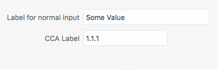
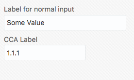
And that’s it. When we run the form, we can see, as shown here, that the fields align correctly even when a small screen size forces the labels to the top of the fields:
JET Custom Component Series
If you’ve just arrived at Custom JET Components and would like to learn more, then you can access the whole series of articles on the topic from the Custom JET Component Learning Path