Introduction
One of the great things about Autonomous Database is that it includes everything needed to build rich, analytic web-based applications. I recently built an application using APEX in an Autonomous Database that highlights some commonly requested features: hierarchical drilling from reports and charts, and time series analysis. With the right data structures, both are relatively easy to implement in APEX.
The subject of my application is budget and actual spending data from the State of New York. The source data is available here: New York State Open Budget – Budget and Actuals. Before continuing, you may want to take a look at the original site. My goal was to rehost this data in an Autonomous Database, build a web-based application with similar interactivity, and add time series transformations to the data—using only the tools included with Autonomous Database.
If you have built applications with APEX, you know that it is your responsibility to provide the SQL used by reports and charts. For simple reports or charts, this is straightforward—selecting data from a table and substituting filter values into a query. But for reports or charts that span multiple dimensions, include data at different levels of aggregation, or require calculations such as time series, you often need to write an SQL generator. That makes the task much more complex.
I avoided complex SQL generation by using an Oracle Analytic View as the foundation of my application. Analytic Views provide a rich, dimensional, hierarchical semantic model layered over tables or views. The model includes:
-
a physical layer (tables, joins)
-
a business model layer (aggregations, hierarchies, calculated measures)
-
a presentation layer (making the data intuitive to business users)
Analytic Views hide the complexity of the physical and business model layers, so generator SQL becomes much simpler for the APEX developer.
If this sounds familiar, you’re right: Analytic Views are similar to subject areas in Oracle Analytics. The key differences are that Analytic Views are created directly in the Oracle Database (making them usable by any SQL-based application) and that they focus entirely on dimensional models—a very significant distinction. Oracle Analytics can also consume Analytic Views as datasets, enabling you to model in the database and immediately analyze in Oracle Analytics without additional modeling effort.
The dataset I used is straightforward: spending dollars by functional area or agency, funding sources, and financial plans. The data is intuitive enough to follow, but you can explore the original website for more detailed explanations. It also provides an excellent overview of budget terminology, which you’ll see reflected in the application.
New York State Spending Analytic View
My analytic view is layered over a single table and includes four hierarchies: time, function, fund, and financial plan. It starts with the original measure, dollars, and adds several time-series measures such as inflation-adjusted dollars, change year ago, percent change year ago, and dollars indexed to the first time period.
Autonomous Database includes an analytic view design tool in Data Studio, part of the suite of data tools provided with every instance of Autonomous Database. If you haven’t explored Data Studio yet, you should. It offers excellent data loading and sharing capabilities—essential for nearly every project—along with integration, catalog, and analysis tools. For this project, I used Data Studio to load the dataset in just a few minutes.
Expect to invest some effort in designing an analytic view. Defining a semantic model forces you to think carefully about how the data will be used: What are the dimensions? How should data be aggregated? How should hierarchies be structured? What calculations are needed?
This upfront effort pays dividends in the form of higher-quality data, better context, easier SQL generation, and richer applications. By defining the semantic model, you control how the data is calculated so that end users don’t have to figure it out for themselves—helping them avoid mistakes and ensuring consistency. It also builds valuable modeling skills for the team.
There are at least three roles in this process:
-
Data modeling – preparing the table and designing the analytic view. This typically involves someone who understands the data and how it should be calculated and presented—often a partnership between a data engineer and a subject matter expert.
-
APEX application developer – who benefits greatly from the analytic view and a well-structured model.
-
Application end user – who can focus entirely on analysis and decision-making, without worrying about modeling or calculation rules.
New York State Spending Sample Application
My application is similar020 the source website in that it includes two pages: one with functional areas and agency-level data over time and another with breakouts by functional area, fund, and financial plan. You can access my application here: NYS Spending—Actuals and Budget.
Home Page – Function Trends
To use the first page, choose a measure, a level (totals or more detail), and functions and agencies appropriate for the level. The chart and report are driven from the same selections.
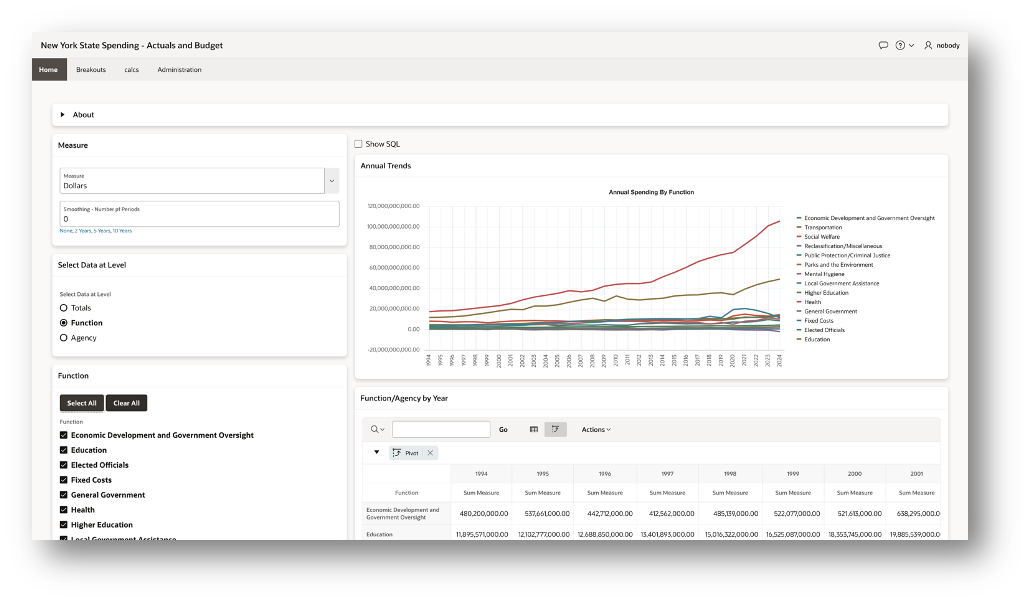
Note the Show SQL button above the chart. This button allows you to see the SQL used by the chart and report.
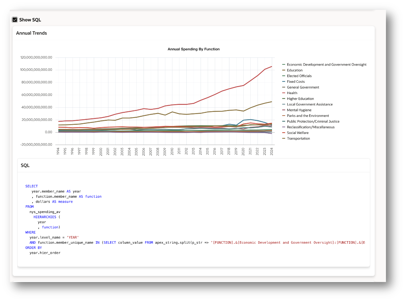
Because the query selects from an analytic view, it may look a bit unfamiliar at first. The query selects from an analytic view, references its hierarchies, and uses columns such as MEMBER_NAME, LEVEL_NAME, and MEMBER_UNIQUE_NAME. These columns are automatically included in every analytic view. Once you learn the query pattern, you can use it repeatedly—and it’s straightforward to generate.
The chart and report shown above select data at the year and function levels. Here’s the query (for readability, I shortened the list of functions in the WHERE clause):
SELECT
   year.member_name AS year
   , function.member_name AS function
   , dollars AS measure
 FROM
   nys_spending_av
     HIERARCHIES (year,function )
 WHERE
   year.level_name = 'YEAR'
   AND function.member_unique_name IN (
     SELECT column_value FROM apex_string.split(
       p_str => '[FUNCTION].&[Education]:[FUNCTION].&[Health]:[FUNCTION].&[Higher Education]'
       , p_sep => ':' )
 ) ORDER BY year.hier_order
How the query works
-
The year and function values are returned using the
MEMBER_NAMEcolumn. This column can display data at any level of aggregation (e.g., Total, Functions, Agencies). -
The dollars measure is selected directly.
-
The query selects from the NYS_SPENDING_AV analytic view.
-
Two hierarchies are used: TIME and FUNCTION.
-
Data is filtered to the YEAR level and to the selected functions.
-
The results are ordered by the built-in sorting column, HIER_ORDER.
This is a common query pattern when working with analytic views.
If you’re familiar with APEX, you know that APEX_STRING.SPLIT transforms a delimited list of values (such as those from a Checkbox Group item) into rows. That makes it easy to apply the selected values in an IN filter list.
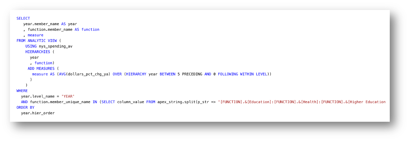
The analytic view also includes several calculated measures, defined with expressions. To use one, simply select it—nothing else in the query changes. For example, here’s the same query using the calculated measure Dollars % Change Year Ago, filtered to three functions.
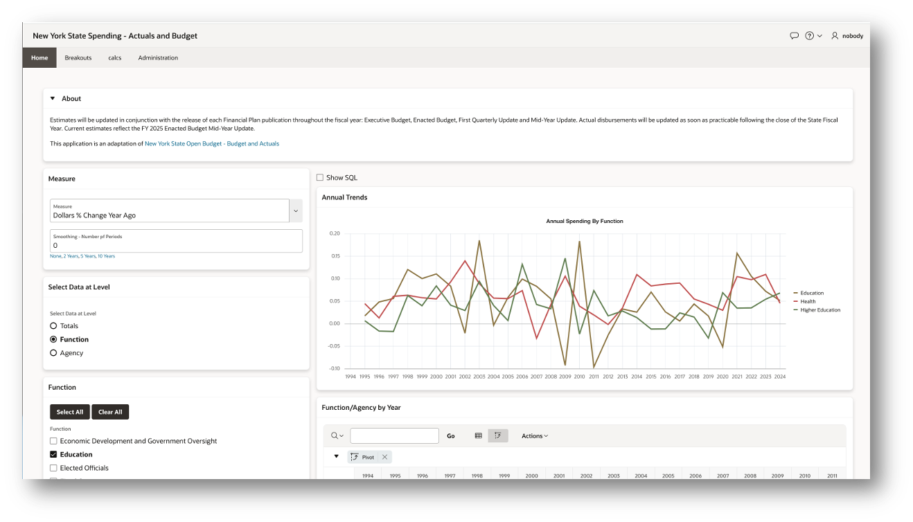
In the next query, DOLLARS is replaced with DOLLARS_PCT_CHG_YA, and the IN list of functions is updated. All calculations are resolved by the analytic view itself—no additional SQL logic is required. Notice also that no joins or aggregation (GROUP BY) are needed in the query.
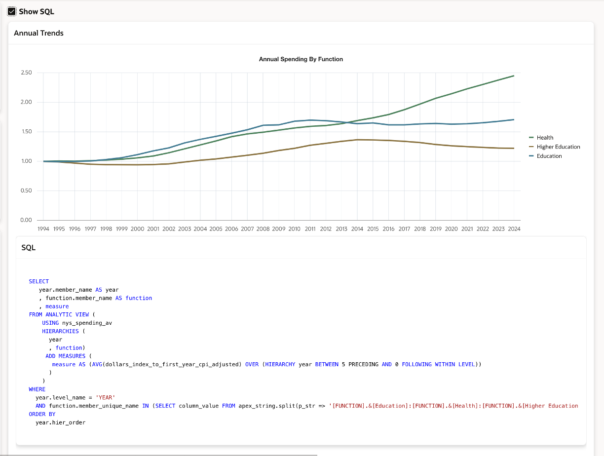
The Dollars % Change Year Ago values are easy to read in a tabular report, but the chart can be harder to interpret, with multiple functions overlapping. To make the trends clearer, the application supports smoothing the data with a five-year moving average. The user can select the smoothing interval (number of years) directly under the measure selection, making it simple to adjust how the data is displayed.
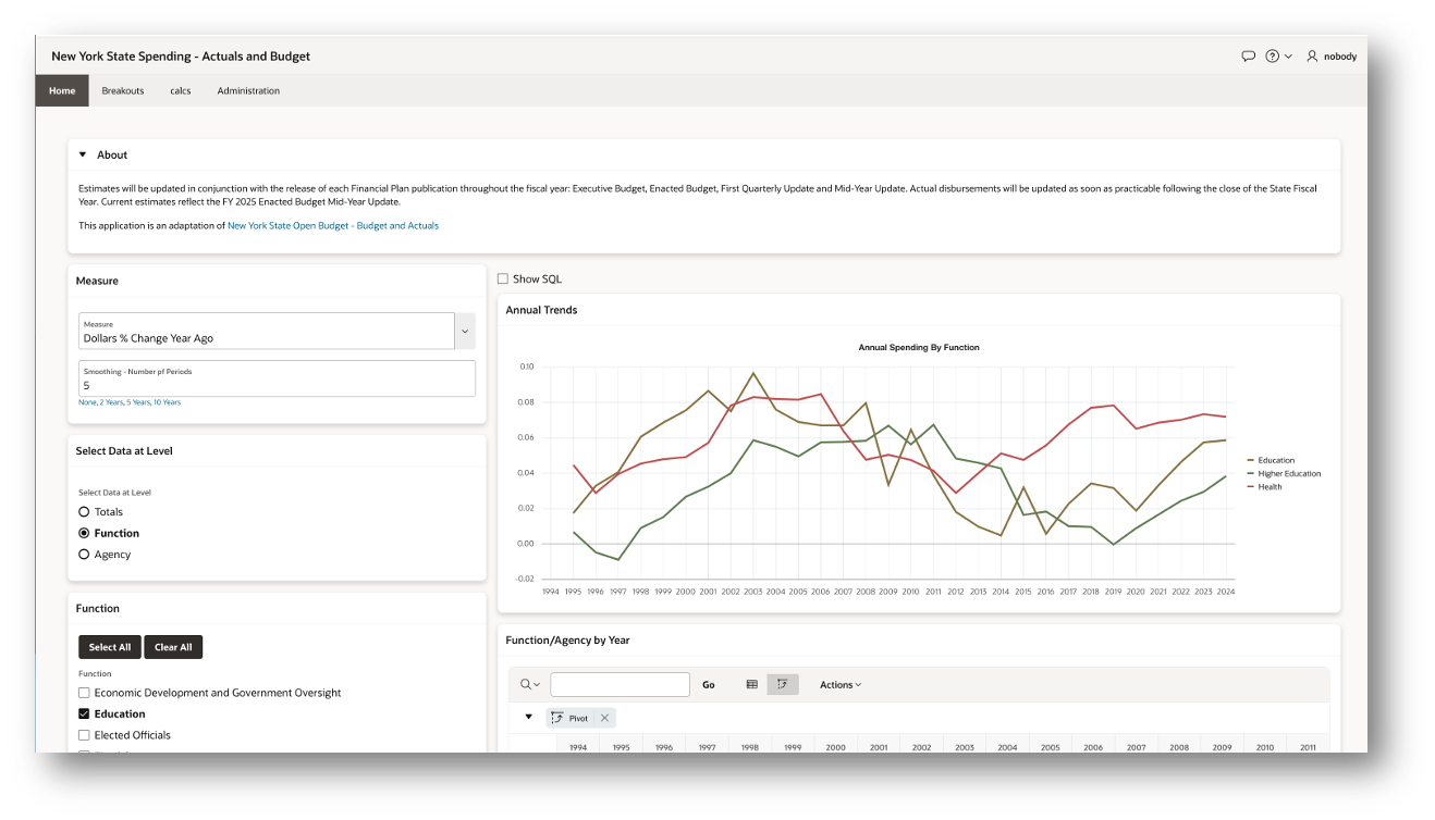
Here we see a different feature of the query. When selecting from an analytic view, applications can define calculated measures on the fly in the ADD MEASURES clause. In this case, DOLLARS_PCT_CHG_YA is wrapped in a moving average expression.
The expression is straightforward to generate in the application, but think about the effort required if this page queried directly from tables. You would need to write an SQL generator to handle joins, aggregations, and calculations—making the implementation far more complex. By using the analytic view, all of this complexity is handled in the model, and the application developer simply adds the desired measure.
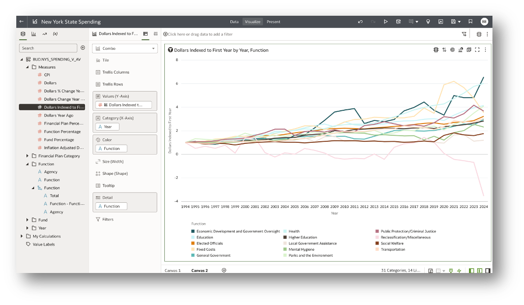
We can also view trends by indexing inflation-adjusted dollars to the first time period. With this perspective, the trends become clearer: functions with higher values have grown more over the duration of the dataset. From a budget standpoint, this highlights which functional areas are receiving more resources over time.
The SQL is no more complex. Inflation Adjusted Dollars Indexed to the First Period is defined as a measure in the analytic view, and the smoothing expression is applied in the same way as with other measures.
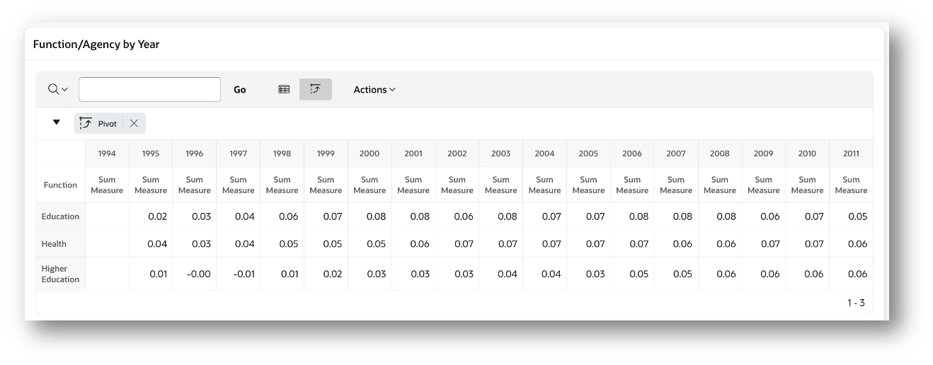
Pivoting Rows to Columns
While APEX does not provide a full pivot table with hierarchical navigation and nested hierarchies, it is still possible to pivot time to columns by using the built-in pivot feature of an APEX Interactive Grid. This allows users to compare values across time periods in a compact, pivoted format, even without full OLAP-style navigation.
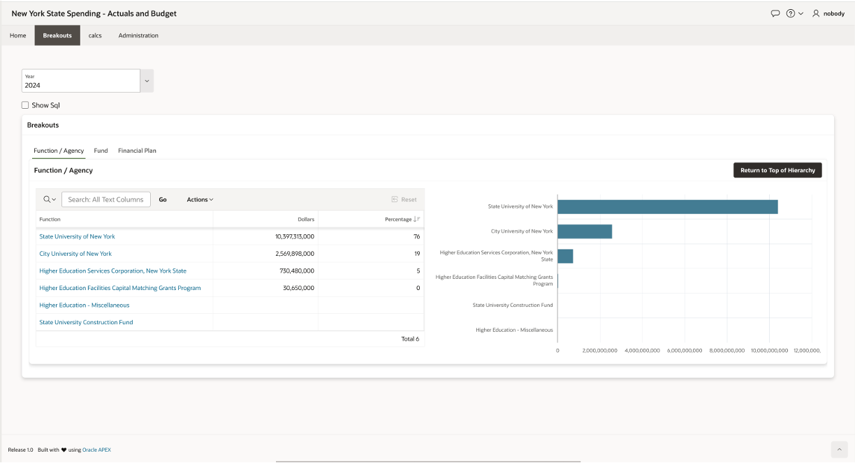
Breakouts Page
The Breakouts page allows the user to examine data in each dimension and drill to the next level of detail. Here, we see the Function/Agency tab. The chart mirrors the report.
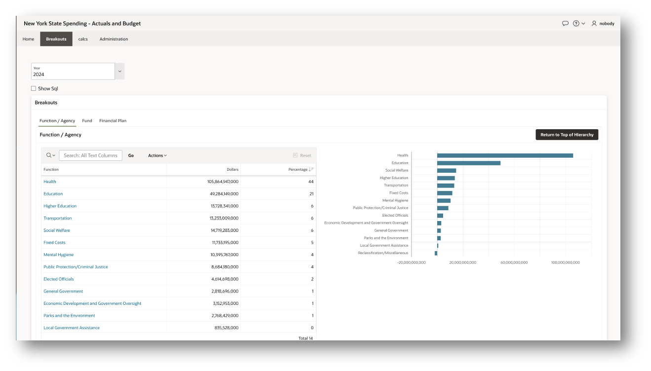
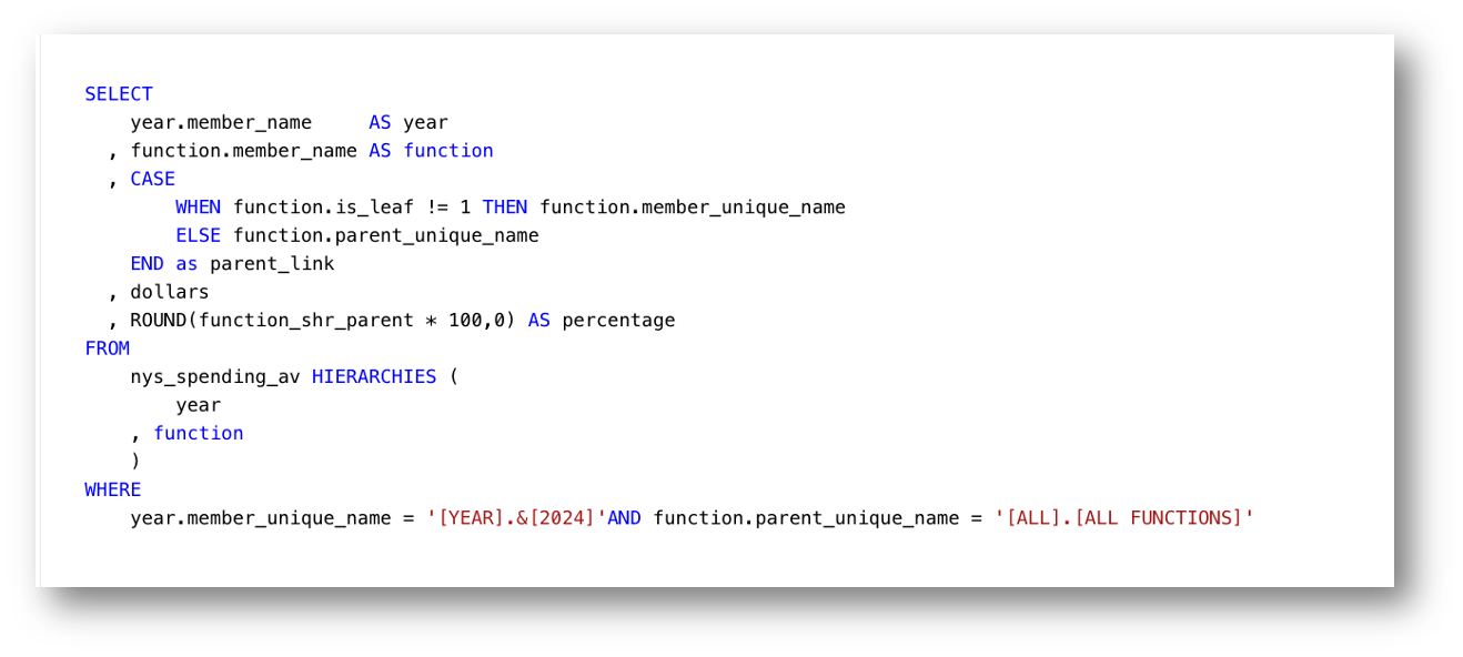
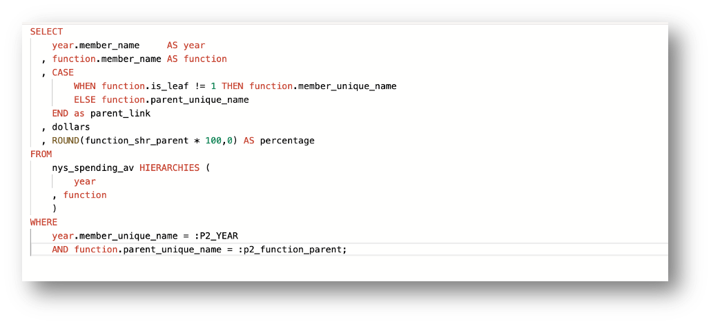
The queries follow the same general pattern we saw on the first page, with one key difference in the WHERE clause. Here, the values of the function hierarchy are filtered using the PARENT_UNIQUE_NAME column.
The PARENT_UNIQUE_NAME column contains the key value of a hierarchy member’s parent. For example, in a time hierarchy, the parent of a month might be a quarter or a year. Filtering by PARENT_UNIQUE_NAME makes it easy to retrieve all child members of a given parent in the hierarchy.
The report and chart on this page work by setting a page item to the topmost hierarchy value either on the initial page load or when the Return to Top of Hierarchy button is pressed.
In this example, the key value is [ALL].[ALL FUNCTIONS]. The query then returns all children of this top value, which in turn means all of the function-level members.
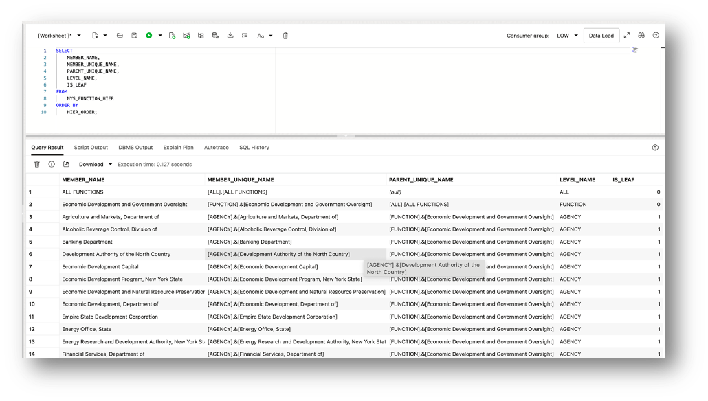
The analytic view makes this technique straightforward because every hierarchy includes a parent-child pair of columns: PARENT_UNIQUE_NAME and MEMBER_UNIQUE_NAME. These columns contain data at all hierarchy levels, which means you can continually drill down through the hierarchy simply by working with these two values.
These and other hierarchy-related columns are automatically included in the hierarchy view. Below is sample data for the columns used in the query to support drilling:
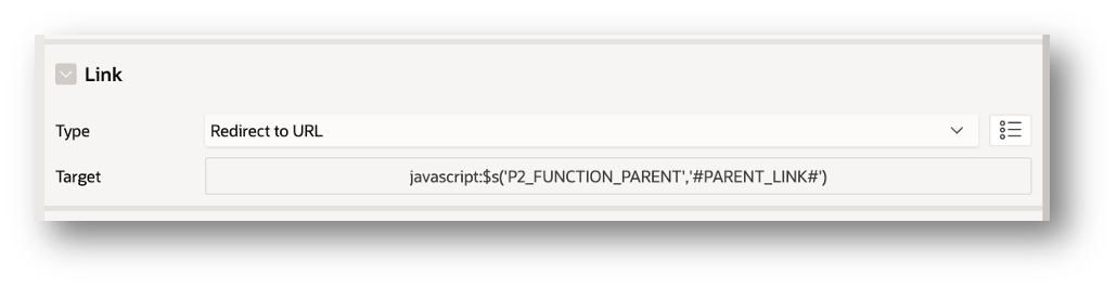
In this report, the Function column type is defined as a Link. When a value is selected, the key value is stored in the hidden page item P2_FUNCTION_PARENT. That page item is then used as a substitution value in the function.parent_unique_name filter, allowing the report and chart to dynamically drill to the children of the selected function.
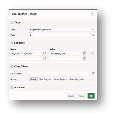
Dynamic Actions in P2_FUNCTION_PARENT Refresh each region that uses that value in a query.
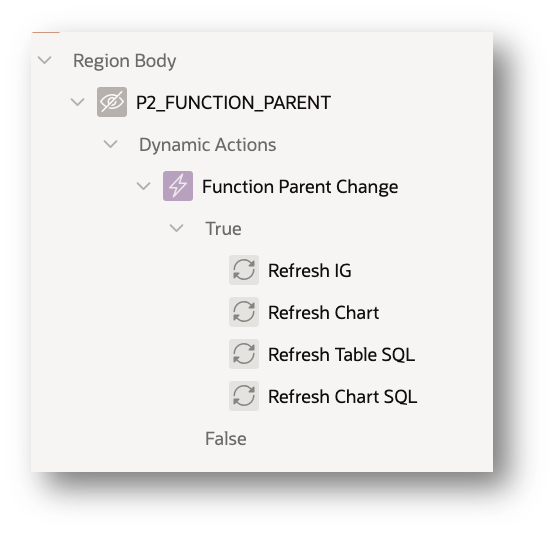
This chart/report query also returns a parent link to support navigation. The PARENT_LINK column holds the parent of the current member. If the member is a leaf, the link simply points to the current member so you don’t “drill out” the bottom of the hierarchy. The IS_LEAF flag makes this logic straightforward.
The application also supports drilling directly from the chart by clicking on a bar. The implementation is the same as with the report: it uses the hidden page item P2_FUNCTION_PARENT along with a query filter that references the page item value.
In this case, the value of P2_FUNCTION_PARENT is set through the chart’s Link property, using a small piece of JavaScript. This ensures that when a bar is clicked, the selected value is stored in the page item, and the chart and report refresh to show the children of that member.
When a bar is clicked, the value of the PARENT_LINK column is assigned to the hidden page item P2_FUNCTION_PARENT. The same Dynamic Actions defined on P2_FUNCTION_PARENT then trigger refreshes of the affected regions. Because both the chart and the report use this page item, they share selections and remain synchronized during drilling.
Using Analytic Views in Oracle Analytics
I mentioned earlier that an analytic view can also be used in Oracle Analytics. This is one of the major advantages of defining the semantic model in the database as an analytic view: the same model can be used in APEX, Oracle Analytics, and other SQL-based tools.
I’m fortunate to have access to both Autonomous Database and Oracle Analytics, so I often use Oracle Analytics to design and test data visualizations before building them into an APEX-based application. Business users can also choose whichever tool best fits their needs—or use both.
Oracle Analytics recognizes analytic views as a specific type of data source. To use an analytic view, first create an Analytic View connection, then build a new dataset from that analytic view. Oracle Analytics automatically imports the full semantic model—complete with presentation labels, hierarchies, and all defined measures—into a ready-to-use dataset. No additional modeling is required.
Summary
Oracle APEX and analytic views in Oracle Autonomous Database provide a powerful combination for building interactive, feature-rich analytic applications. Analytic views deliver a rich, easy-to-query data foundation, streamlining development by removing the need to build complex SQL generators.
By leveraging the hierarchical drilling capabilities built into analytic view hierarchies, developers can enable intuitive exploration of data with minimal effort. Combined with the customizable features of Interactive Grid columns and chart series, APEX applications become dynamic tools for uncovering insights—making it easier than ever to deliver value-driven analytics.
Learn More
Oracle Live SQL and Live Labs are great places to learn about analytic views. On both sites, simply search ‘analytic view’. Be sure to look into the Data Studio Analysis analytic view design tool.Here are a few recommendations:
- Oracle Live Labs: Get Started With Analytic Views using Data Studio
- Oracle Live SQL: Analytic View Quick Start Part 1 – Create AVs using Simple DDL
- Oracle Live SQL: Analytic View Quick Start Part 2 – Simple Query Templates for Developers
Questions and Feedback
If you have questions or feedback, please do not hestiate to get in touch by emailing me at william.endress@oracle.com.