
Oracle APEX 26.1 continues the evolution of Universal Theme with a more modern look and feel and less reliance on custom CSS. From the new Iris theme style to smarter templates and flexible layout options, this release introduces practical enhancements that help developers build polished, maintainable enterprise applications more easily.
Universal Theme Styling: Introducing Iris
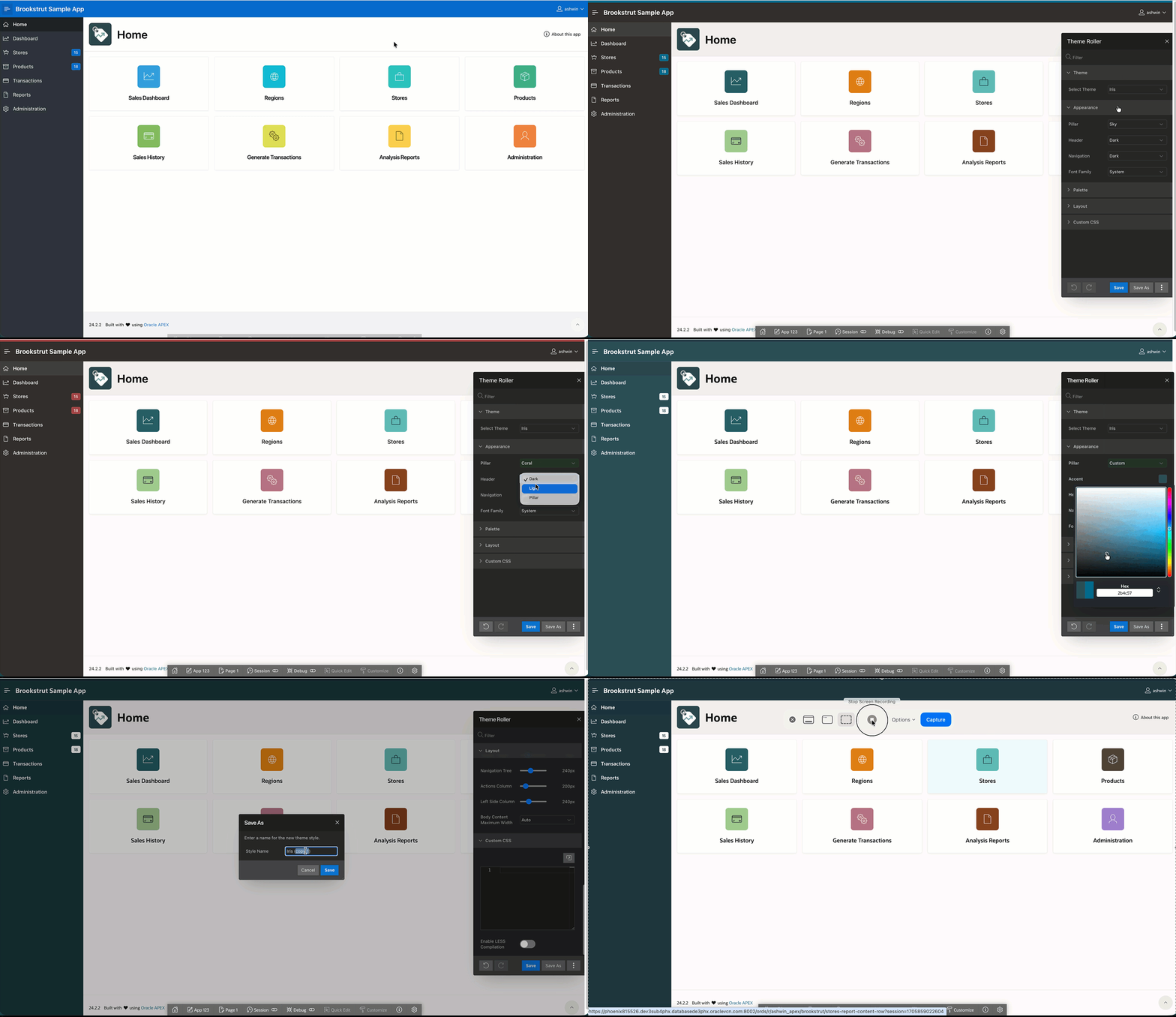
APEX 26.1 introduces an updated Universal Theme style called Iris. While it is built on the Vita framework under the hood, it is aligned with the Redwood design system, helping applications feel more consistent with modern Oracle UX standards and expectations.
Iris brings a more flexible and modern approach to theme styling, combining the familiarity of Redwood Lite with the adaptability of Vita.
You can choose between predefined pillar styles using familiar pillar colors, now expanded with additional options beyond Redwood Lite. For greater control, Iris also supports a Custom pillar model, similar to Vita. This allows you to define your own accent colors using a color picker, enabling a fully branded experience while still staying within a theme-supported, upgrade-friendly approach avoiding the need for complex and hard-to-maintain CSS overrides.
The header and navigation remain consistent with Redwood Lite styling, preserving a familiar user experience. A notable enhancement is the addition of font family selection, allowing you to switch between the system default font and Oracle Sans.
From a layout perspective, Iris follows the Vita structure, offering a clean and balanced visual arrangement.
Additionally, the Vita color palette remains available, so you can continue using it if preferred while benefiting from the enhancements Iris provides.
Explore the Iris Theme Style and experiment with different theme styles here
Note:
- The new Iris theme style is not available immediately and appears only after a theme refresh. If your application uses custom theme styles, you must open Theme Roller after refreshing, re-save your custom style, and set it as current.
- By default, the Iris theme style is applied once the theme is refreshed.
- Newly created applications will now use the Iris theme style by default.
New Theme Components
Metric Cards: Built for Dashboards and KPIs
APEX applications often start with data entry and workflow and quickly evolve into operational dashboards. In previous releases, developers commonly built KPI tiles using generic cards, custom HTML, or repeated region templates.
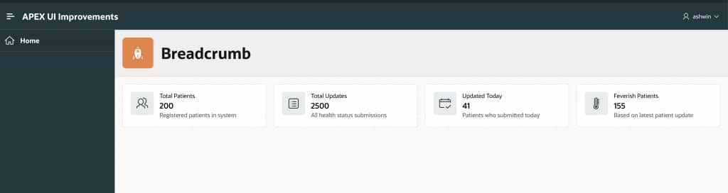
In APEX 26.1, Metric Cards arrive as a theme component that works well for a range of summary and dashboard-style use cases, such as:
- Executive dashboards
- Operational KPI pages
- Data summaries
Why it matters
- Faster to implement than bespoke card layouts
- More consistent UI across the app
- Better maintainability through theme driven design
To explore additional Metric Card examples and configurations, see them here.
How to Set It Up
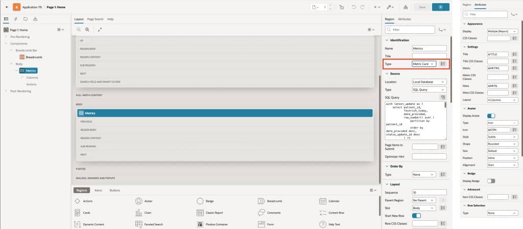
- Create Region → Set Type = Metric Card
- Add Source
- Supports all standard source types (like other theme components)
- Map Fields (Attributes)
- Title
Text or column substitution (e.g.,&TITLE.) used as the card title - Metric
Text or column substitution used as the main value - Meta
Text or column substitution for additional info (optional) - Tip: You can apply CSS classes to each attribute for custom styling
- Title
- Avatar (Optional)
- Types: Icon, Image, Initials
- Badge (Optional)
- Enable to show labels (e.g., status)
- Styling (Optional)
- Use CSS classes for custom design
- Row Selection
- Enable for click/selection behavior
- Enable for click/selection behavior
Flexbox Container
APEX 26.1 introduces the Flexbox Container, a new theme component that brings modern Flexbox layout capabilities into the declarative layer. It allows you to arrange and align regions using simple property settings, eliminating the need for custom CSS in most layout scenarios.
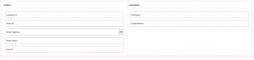
In default APEX layouts, regions can be placed side by side easily, but their heights depend on the content inside them. This often leads to uneven dashboards where one region appears much taller than the other, causing misaligned cards and an unbalanced UI.
For example, consider the figure below: the Orders region contains more form fields, while the Customers region has fewer fields. As a result, their heights don’t match, making the layout look inconsistent.
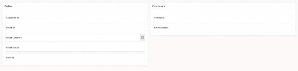
The Flexbox Container solves this by allowing regions to stretch and share space, ensuring they align neatly with equal height.
Beyond solving unequal region heights, the Flexbox Container also gives you flexible control over region layout and behavior.It lets you declaratively manage direction, wrapping, alignment, spacing, overflow, and sizing without relying on custom CSS.
To explore more Flexbox layout examples, click here.
How to Set It Up
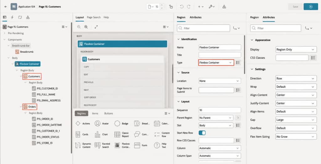
- Create a Flexbox Container
Add a new region and set its type to Flexbox Container. - Add Child Regions
Move or create your regions (e.g., Orders and Customers) under this container so they become child regions. - Configure Flexbox Settings
In the Flexbox Container attributes, set:- Direction: Defines how items are arranged (row or column) and sets the main layout direction.
- Wrap : Decides whether items stay in one line or move to the next line when space runs out.
- Align Items: Controls how items align vertically (or across the cross axis) within the container.
- Justify Content : Controls how regions are positioned along the main axis (for example, left, center, or spaced around).
- Align Content: Controls spacing between rows when items wrap onto multiple lines.
- Gap : Sets the spacing between regions (both rows and columns).
- Overflow : Defines what happens when content is too large (Scroll, Hidden, Visible, Clip).
- Flex Item Sizing
- Fill Space: Makes regions grow evenly and share available width (best for equal layout)
- Grow as Needed: Allows regions to expand based on content and available space
- No Grow: Keeps region at fixed size without expanding
New Page Template: Blank
APEX is known for enterprise application layouts, but modern apps often need pages that intentionally do not look like standard application pages. APEX 26.1 introduces a Blank page template for scenarios where you want an empty canvas with no header, footer, and navigation.
Common use cases include:
- Marketing-style landing pages inside an app
- Third-party embedded experiences
- iFrame pages
- PDF print preview pages
How to Set It Up
- Open your page in Page Designer
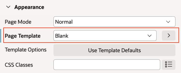
- In the Page attributes, locate the Template property
- Change the template to Blank
New Page-Level Template Options: Vertical Alignment Without Custom CSS
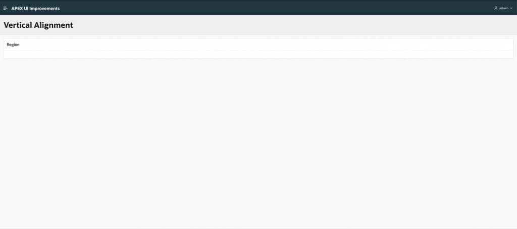
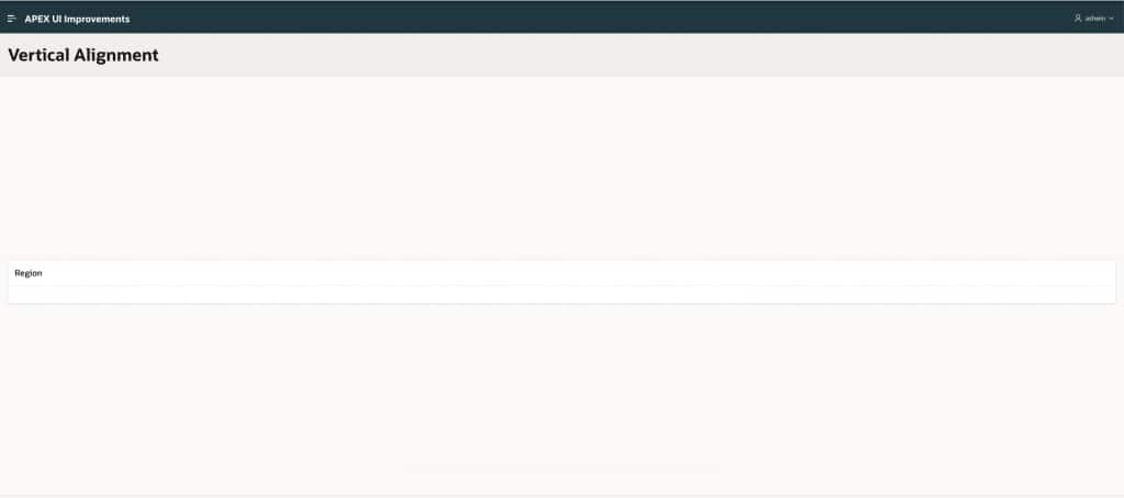
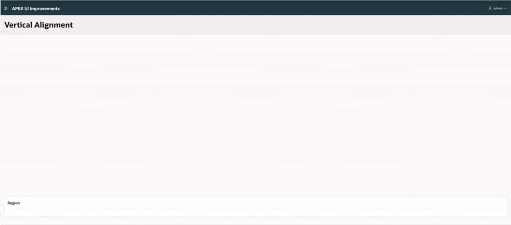
Small layout adjustments often become complex CSS hacks. APEX 26.1 reduces that pressure by adding page-level template options such as content vertical alignment, allowing developers to set this behavior without writing CSS.


How to Set It Up
- Open your page in Page Designer
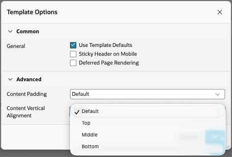
- In the Page attributes, locate Template Options
- Under Advanced → Content Vertical Alignment, choose the required option:
- Top (default): Aligns content to the top of the page
- Middle: Aligns content to the center of the page
- Bottom: Aligns content to the bottom of the page
Drawers Get More Flexible: New Top and Bottom Positions
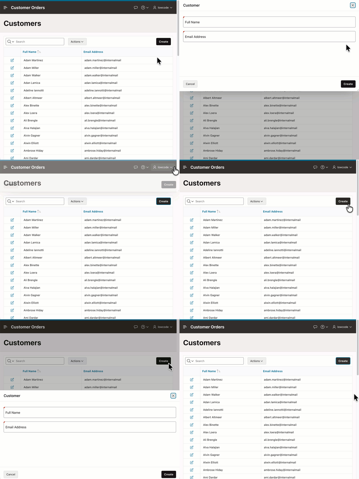
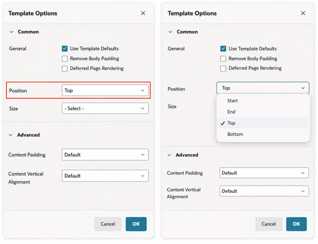
In APEX 26.1, drawers now support opening from the top and bottom, in addition to the existing left and right directions, giving more flexibility in how content is presented.
How to Set It Up
- Open your page in Page Designer and ensure Page Mode = Modal Dialog with Dialog Template = Drawer
- Go to Template Options
- Set the Position to Top or Bottom
Comments Template Component: Better Alignment and Style Control
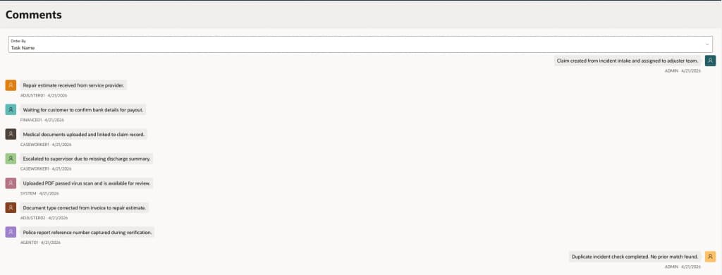
APEX 26.1 enhances the Comments template component by adding message alignment options, allowing you to align messages to the start or end for better layout control and improved visual structure
This makes it easier to create clearer, more conversation-like layouts, especially in use cases such as chat, activity streams, or threaded discussions.
How to Set It Up
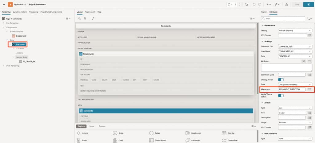
- Open the Comments region attributes.
- Look for the Alignment setting.
- Set the value to inbound to show comments on the left (received side) or outbound to show them on the right (sent side).
- You can either set this as a fixed value or use a column from your source to control it dynamically.
View examples of inbound and outbound message alignment here
Font APEX 2.5: More Icons and Modifiers
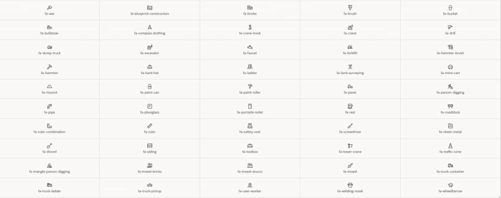
Font APEX has been expanded with the addition of 66 new icons and additional modifiers, with a focus on Construction, tools, and infrastructure use cases.
Explore the full Font APEX icon library, including the new icons and modifiers here
Explore the complete set of Universal Theme updates here.
Conclusion
APEX 26.1 shows how Universal Theme is continuing to evolve in the right direction – more modern, more flexible, and much easier to work with. With Iris, developers get a refreshed theme experience that balances a modern look with the customization and stability they rely on. And with additions like Metric Cards, Flexbox Container, Blank pages, enhanced drawers, and better template options, building polished enterprise experiences now takes less custom CSS and less effort overall.