Accessibility Policy
Skip to content
Oracle
Oracle Connect
Search
Exit Search Field
Clear Search Field
Menu
CATEGORIES
Comment
Back
Comment
Analyst s Corner
In the Field
Time Capsule
Community
Back
Community
Architect
Community Bulletin
Data Types
Developer Productivity
New Normal
Oracle Groundbreaker Ambassador
Peer-to-Peer
Up Close
Features
Back
Features
Customer Features
Sponsored Content
Thought Leadership
Role
Back
Role
Application Developer
Database Developer
DBA
IT Manager
Technology
Back
Technology
.net
Analytics and Big Data
Application Development
Autonomous
Browser-based
Database, SQL and PL SQL
Emerging Technologies
Identity and Security
Infrastructure
Integration
IT Innovation
Mobile
OCP
PL SQL 101
SQL 101
SQL 201
Up Front
Back
Up Front
Events
From the Editor
Interview
MashUp
News
Blogs Home
RSS
Oracle Connect
Ideas for a competitive edge
Follow:
RSS
Facebook
Twitter
LinkedIn
YouTube
Instagram
4
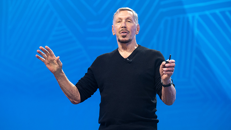
Larry Ellison commits Oracle to take on healthcare’s biggest ...
Robert Preston
5 minute read
Oracle Applications Platform empowers developers to extend Fusion ...
Joseph Tsidulko
3 minute read
Oracle helps any company become a cloud services provider with Oracle ...
Natalie Gagliordi
3 minute read
While the timid lag, bold businesses counter volatility with cloud ...
Aaron Ricadela
4 minute read
Search Oracle Blogs
Search this site
Type your search term and press Enter.
Subscribe to receive the latest blog updates
Subscribe to email updates
Recent Posts
New healthcare cloud capabilities are the right medicine
Margaret Lindquist
4 minute read
Oracle’s Sicilia on the five core components of taking on ...
Margaret Lindquist
4 minute read
4 drone pilots show what’s needed to put the devices to work in ...
Margaret Lindquist
3 minute read
With Oracle Cloud, Aurora Public Schools aims to tie spending more ...
Mark Jackley
5 minute read
Oracle Red Bull Racing lets fans drive the excitement with Oracle ...
Mark Jackley
3 minute read
Colleges opt for the cloud to deliver a student experience as simple ...
Margaret Lindquist
4 minute read
A ‘rage’ to learn: Red Bull Advanced Technologies uses OCI to test AI ...
Chris Murphy
5 minute read
MySQL HeatWave Lakehouse brings transactional and semistructured data ...
Jeffrey Erickson
4 minute read
Oracle B2B Commerce makes corporate finance, logistics easier
Mark Jackley
3 minute read
Oracle Cloud adds NVIDIA chips, software to speed enterprise AI uptake
Aaron Ricadela
3 minute read
Meet me in the Metaverse: How CSPs can become the backbone of the ...
Guest Author
4 minute read
Join me at Oracle CloudWorld 2022 and see how Oracle Cloud ...
Douglas Kehring
3 minute read
View more
Subscribe to receive the latest blog updates
Subscribe to email updates
Resources for
About
Careers
Developers
Investors
Partners
Startups
Why Oracle
Analyst Reports
Best CRM
Cloud Economics
Corporate Responsibility
Security Practices
Learn
What is Customer Service?
What is ERP?
What is Marketing Automation?
What is Procurement?
What is Talent Management?
What is VM?
What's New
Try Oracle Cloud Free Tier
Oracle Sustainability
Oracle COVID-19 Response
Oracle and SailGP
Oracle and Premier League
Oracle and Red Bull Racing Honda
Contact Us
US Sales 1.800.633.0738
How can we help?
Subscribe to Oracle Content
Try Oracle Cloud Free Tier
Events
News
© 2026 Oracle
Privacy
/
Do Not Sell My Info
Ad Choices
Careers