Accessibility Policy
Skip to content
Oracle
Developers Blog
Search
Exit Search Field
Clear Search Field
Menu
RELATED CONTENT
Oracle Developers Portal
Oracle Developers on Medium
Oracle Code
Blogs Home
RSS
Developers Blog
Follow:
RSS
Facebook
Twitter
LinkedIn
YouTube
Instagram
Technology
Extracting Insights from Video using OCI Generative AI
Niveditha Bhat
3 minute read
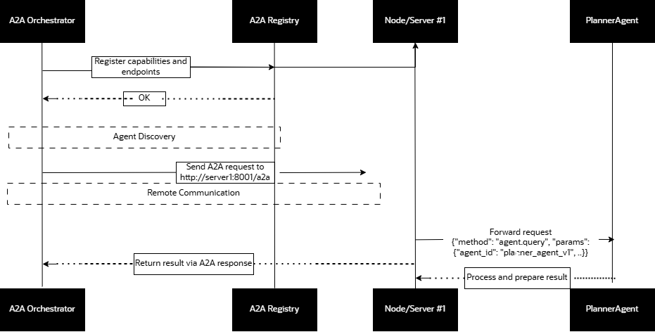
Build a Scalable Multi Agent RAG system with A2A Protocol and ...
Nacho Martinez
11 minute read
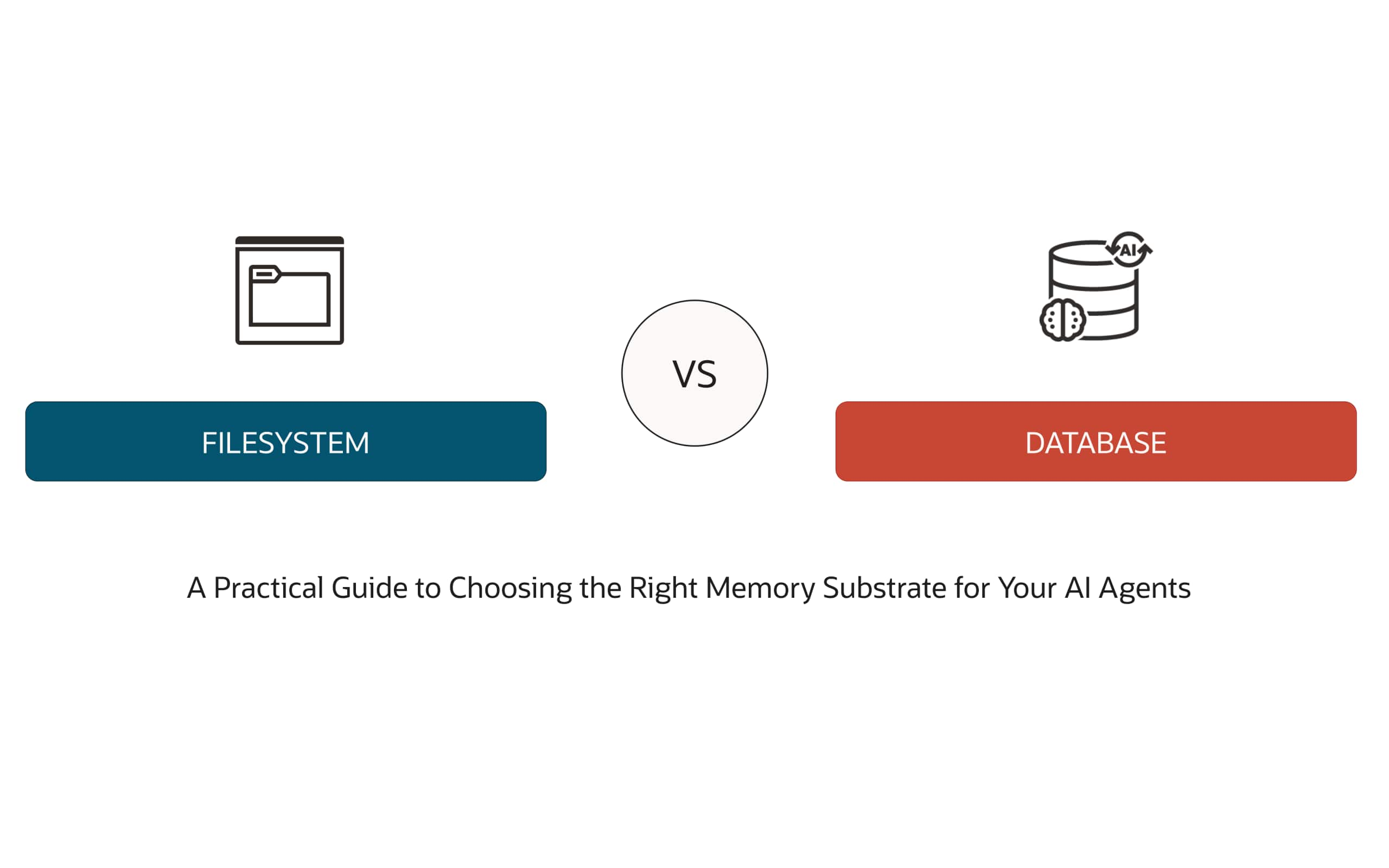
Comparing File Systems and Databases for Effective AI Agent Memory ...
Richmond Alake
34 minute read
HA App Dev: A Developer’s Journey to High Availability
Irina Granat
5 minute read
Best Practices for AI Microservices, Containers, K8s, and Oracle ...
Mark Nelson
6 minute read
Quick Peek into New Features/Capabilities from Oracle JDBC 23ai
Nirmala Sundarappa
17 minute read
Develop Agentic AI Workflows with Langflow and Oracle Database MCP, ...
Paul Parkinson
24 minute read
Easy Configuration of UCP with Spring Boot
Nirmala Sundarappa
1 minute read
What’s new for Developers in Oracle Database 23.7
Gerald Venzl
13 minute read
What’s new for Developers in Oracle Database 23.6
Gerald Venzl
7 minute read
What’s new for Developers in Oracle Database 23.5
Gerald Venzl
4 minute read
Updated: Implementing DevOps Principles with Oracle Database Tech ...
Martin Bach
1 minute read
View more
Receive the latest blog updates
Sign up for Developer Newsletter
Resources for
About
Careers
Developers
Investors
Partners
Startups
Why Oracle
Analyst Reports
Best CRM
Cloud Economics
Corporate Responsibility
Security Practices
Learn
What is Customer Service?
What is ERP?
What is Marketing Automation?
What is Procurement?
What is Talent Management?
What is VM?
What's New
Try Oracle Cloud Free Tier
Oracle Sustainability
Oracle COVID-19 Response
Oracle and SailGP
Oracle and Premier League
Oracle and Red Bull Racing Honda
Contact Us
US Sales 1.800.633.0738
How can we help?
Subscribe to Oracle Content
Try Oracle Cloud Free Tier
Events
News
© 2026 Oracle
Privacy
/
Do Not Sell My Info
Ad Choices
Careers