The Oracle Analytics Cloud (OAC) January 2024 update is part of Oracle’s ongoing commitment to deliver regular innovative product updates to OAC. This post highlights the top features included in this update.
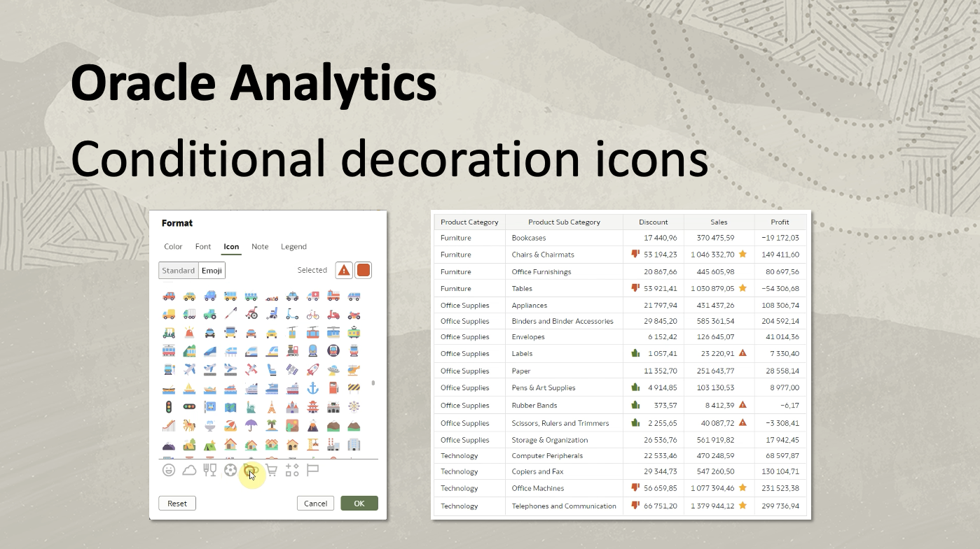
- Workbook authors can apply conditional decoration icons (aka emojis) to tables and pivot table visualizations. Specific icons or emojis can be displayed based on predefined conditions for data values. For example, a star icon can be assigned to product subcategories with sales exceeding $1 million, while a warning sign can be applied to those with sales below $50,000. Authors can easily configure these conditions through a user-friendly interface, providing a visually intuitive way to emphasize significant data points. The customization options include adjusting icon size and positioning, offering a dynamic and impactful representation of data in tables and pivot tables.
Watch a video on Conditional decoration icons on YouTube
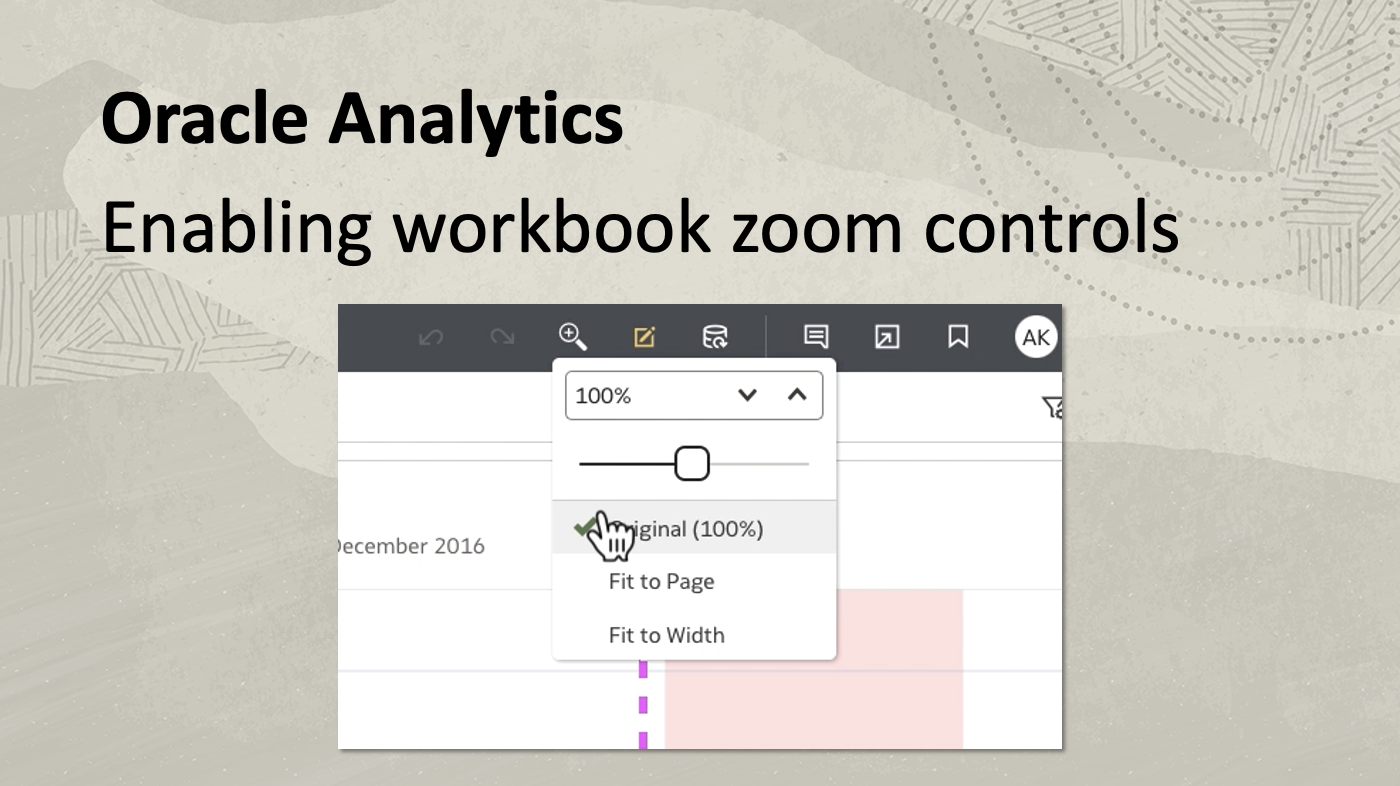
Conditional Decoration Icons - Consumer users can utilize zoom functionality for canvas content within workbooks. During the presentation flow curation, the workbook author can activate a Zoom option in the workbook header bar. Authors can define canvas layout and styling properties in edit mode, choosing between autofit or free form, and setting canvas dimensions in pixels. Fixed-size canvases support runtime Zoom controls. In Present mode, authors can customize Zoom properties, including scale options such as original, fit to page, or fit to width. Consumer users can interact with the Zoom controls during runtime, manually adjusting the zoom percentage, using a slider for up to 500% expansion, or selecting fit to page or fit to width options for optimal content visibility without scroll bars.
Watch a video on enabling workbook zoom controls on YouTube.
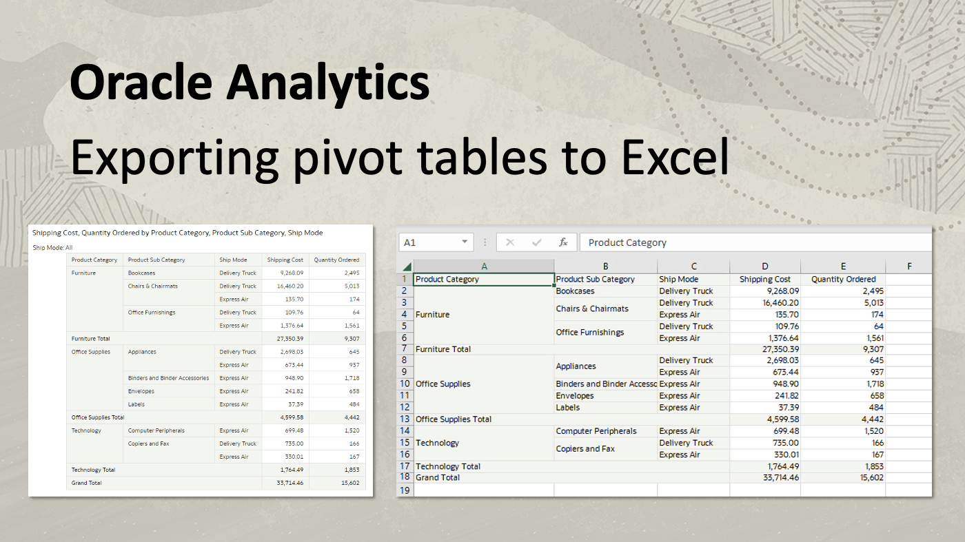
Enabling Workbook Zoom Controls - The Export to Excel feature enhances the functionality of exporting table and pivot table visualizations to Excel files. Users can either access the Export popup from the workbook header bar or right-click the table visualization for a contextual menu with export options. Selecting the Excel format and specifying the file name initiates the export process, saving the file locally. The exported Excel file accurately replicates the table data from OAC, providing a seamless transition for offline reference. Additionally, users can apply dashboard filters before exporting. The exported pivot table maintains filtered data, including subtotals and total records, mirroring the appearance on the OAC dashboard.
Watch a video on exporting pivot tables to Excel on YouTube.
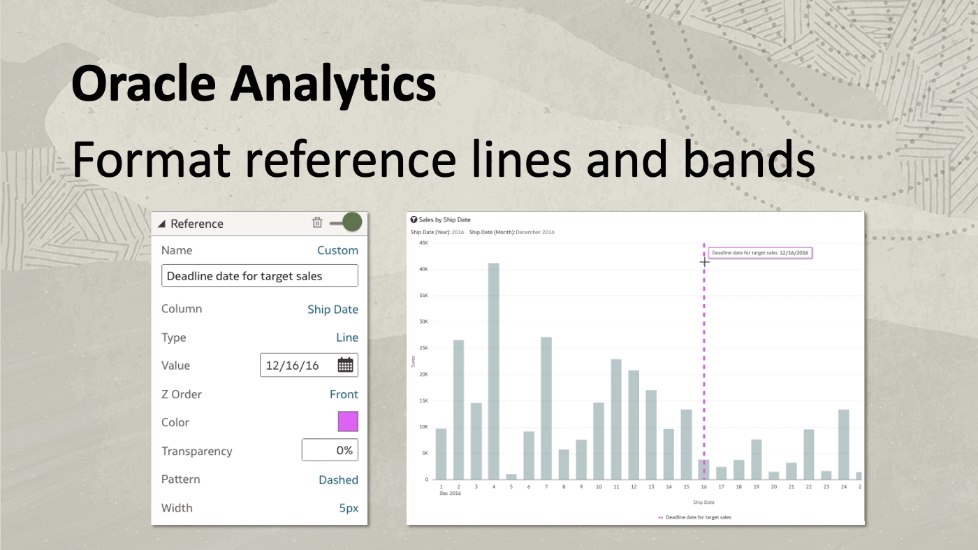
Exporting Pivot Tables to Excel - Workbook authors can draw reference lines for category-based date-time columns. While reference lines were traditionally applicable only to measures, this feature extends to category columns, specifically those involving dates or date-time data. For example, in a bar chart that depicts sales figures filtered by ship date, authors can draw reference lines based on date categories, offering valuable insights. Customization options include setting reference line dates, adjusting the z-order for visual placement, changing colors and patterns for prominence, and even adding custom labels for informative tooltips. Moreover, this feature seamlessly adapts to different visualization types, ensuring a dynamic and versatile representation of reference lines in OAC while enhancing data interpretation for strategic decision-making in business contexts.
Watch a video on formatting reference lines and bands on YouTube.
Format Reference Lines and Bands - Map visualization styling features enhance customization without the need to associate columns explicitly. This functionality streamlines the styling process, providing users with a straightforward way to tailor map visualizations to their preferences and enhancing the overall visual impact of geographical data representation in OAC. Users can set the color of regions and point layers directly in the map visualization. For example, in a map displaying shipwreck locations around Australia’s marine boundaries, changing the color of the ocean boundary involves accessing the map data layers and adjusting the color property to a custom blue. Similarly, users can select custom colors for shipwreck location points and modify the ocean lines’ thickness and color.
Watch a video on settng map colors on YouTube.
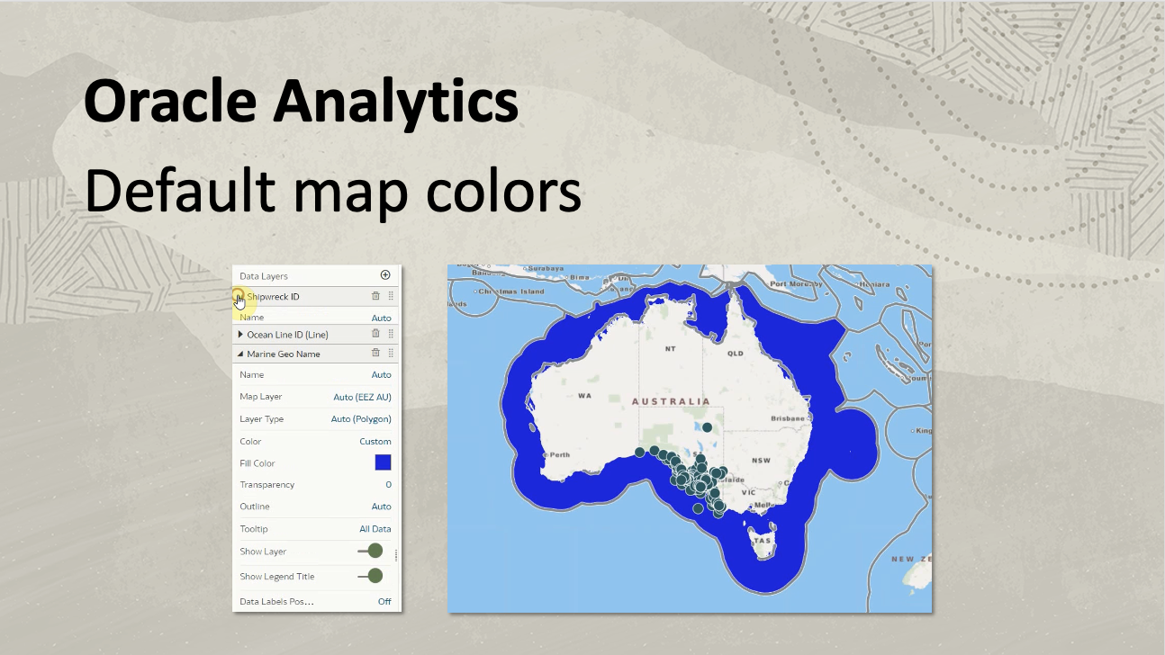
Default Map Colors - Personalizing dashboard filters in OAC workbooks allows consumer users to customize reports through the persistence of filter selections. This feature streamlines the user experience, enabling them to seamlessly pick up where they left off, avoiding the need to recreate filter selections. Users can personalize dashboard filters, visualization filters, and parameters, ensuring that their selections remain intact when reopening the workbook. For instance, a dashboard with a column selector parameter enables users to select text values, influencing the data displayed in visualizations below. The persistence extends to data fields such as product subcategory and ship mode, where filter selections in pivot tables are retained. Users can easily revert to the author-defined state by clicking the “All Changes” button. To prohibit personalization, workbook authors can disable it in the Present workspace.
Watch a video on personalizing workbook filters on YouTube.
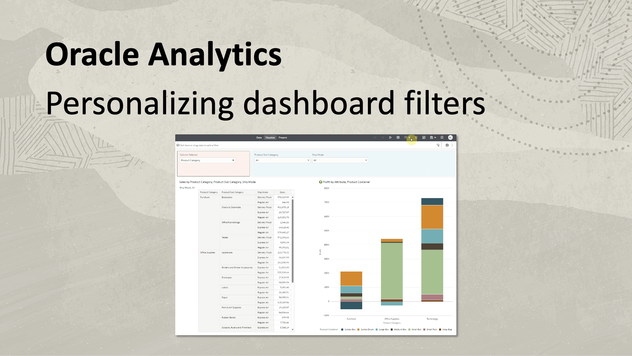
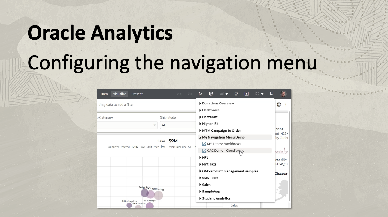
Personalizing Dashboard Filters - Users can enhance their navigation experience by adding menu options to the persistent navigation menu. This feature streamlines the access to essential reports, enhancing user efficiency and providing a customized navigation menu tailored to specific needs. At the top of the page, the bookmark icon provides quick access to curated reports. During the save process of any workbook or dashboard, users can register the content within the navigation menu by selecting the “Save As” option and choosing a shared folder. The “Add to the Navigation Menu” option enables the content to appear seamlessly in the specified folder, creating a personalized and easily accessible navigation experience for users.
Watch a video on configuring the navigation menu on YouTube.
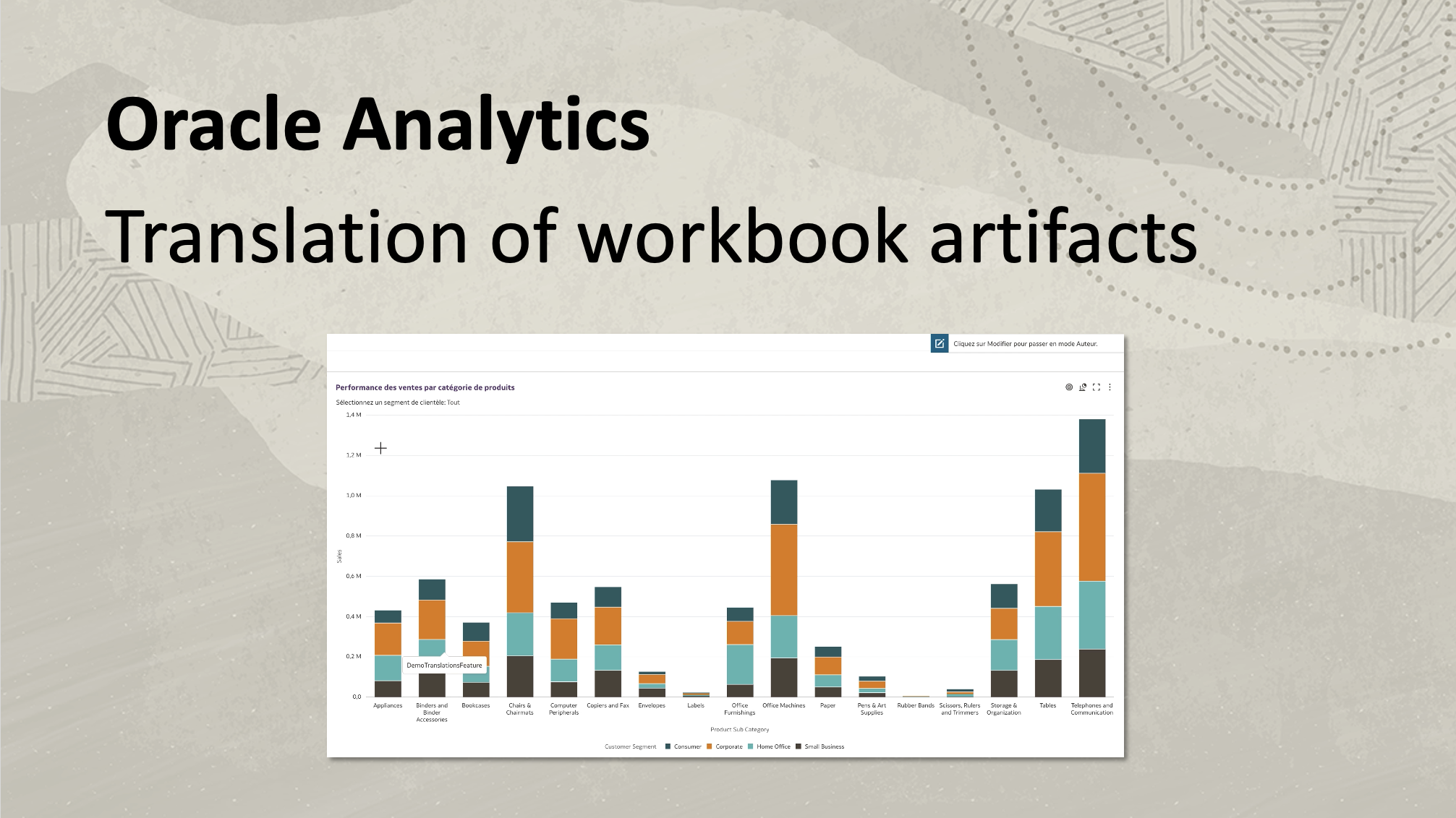
Configuring the Navigation Menu - Administrators can enable the translation of custom strings in workbooks. Administrators can access the Translation tile in the console, offering options to export content from a shared folder and import translated files in a ZIP format. After exporting and navigating to the translated files, the administrator edits the captions.js file to convert English strings to French custom strings, for example. When the workbook is opened, the translated custom strings are visible to demonstrate OAC’s versatility in supporting multilingual customization.
Watch a video on enabling transation on custom workbook artifacts on YouTube.
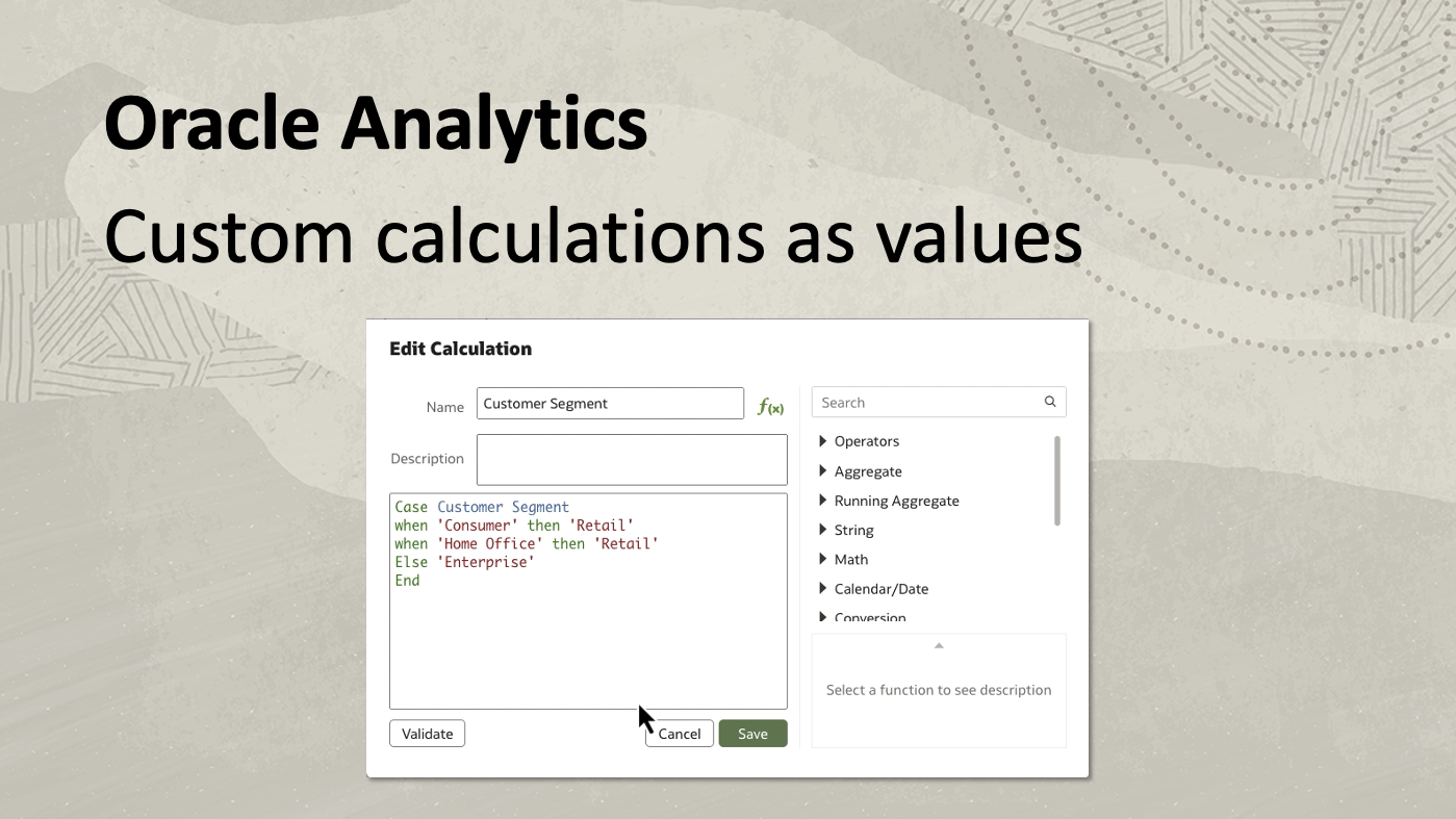
Translation of Workbook Artifacts - The ability to add custom calculations as values comprises two enhancements in the parameter user experience within OAC. The first enhancement focuses on setting a calculation as a column type for available values in the parameter definition. By creating a parameter (such as “pcore customer segment”) and selecting a text data type, users can select calculations from the workbook, aligning with the parameter’s data type. For example, a case statement grouping values into retail and enterprise based on customer segment can be utilized as available values. The second enhancement involves refining the initial values of the parameter definition. When creating a parameter such as “pcore liquids” with a text data type and specifying manual values such as water, Pepsi, and Coke, turning on “enforce validations” displays the initial values as a list control. This enhancement streamlines the workbook author’s ability to pick and choose initial values for the parameter definition, providing a more intuitive and user-friendly experience.
Watch a video on adding calcuations as values on YouTube.
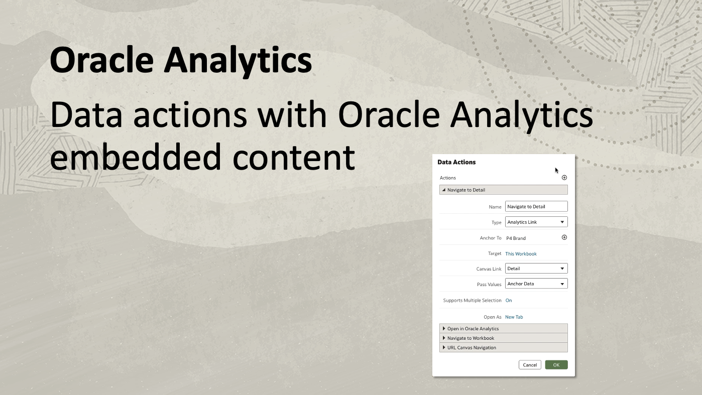
Custom Calculation as Values - In previous updates, analytics links within embedded content in workbooks weren’t visible. With this update, users can enable analytics links with a key setting being “open as in a new tab.” For example, from within an OAC Classic dashboard, clicking the data action navigator detail opens the target within a new tab. A second example involves embedded content using the JavaScript embedding framework. Users can create data actions to open the embedded canvas within OAC itself. By crafting a data action without passing values, the embedded canvas seamlessly opens within Oracle Analytics. This functionality extends to drilling out to detailed canvases, providing a more integrated and versatile experience for users working with embedded content.
Watch a video on enabling data actions with embedded content on YouTube.
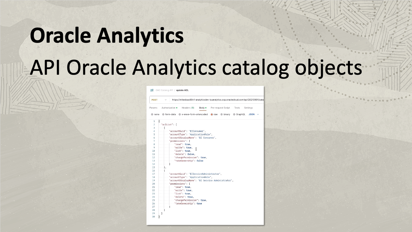
Data actions with Oracle Analytics Embedded Content - The Catalog API empowers users with comprehensive control and automation over catalog-related tasks, enhancing efficiency and flexibility in managing analytics content. With the Catalog API, users familiar with the Catalog user interface can search, move, copy, and inspect objects, as well as access valuable information such as last modification date and object ID. Similar functionality is available for shared objects.
Watch a video on Catalog API on YouTube.
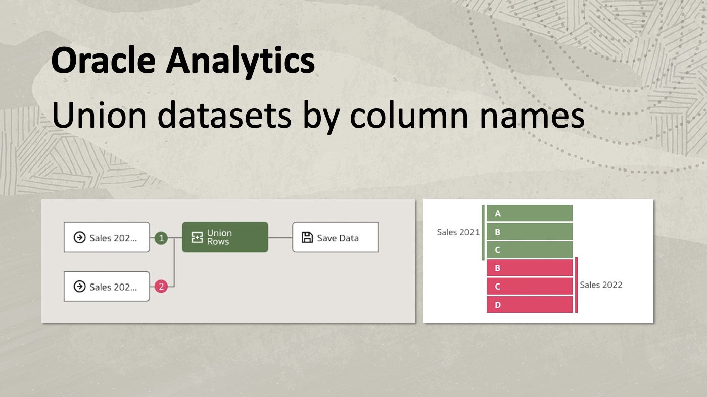
API Oracle Analytics catalog objects - Users can join datasets using column names instead of positions. Employing union by name is beneficial for combining information from datasets with columns listed in different orders. It eliminates the need for manual column reordering. For example, using two sales datasets from 2021 and 2022 that have the same columns but in different orders, simply click the union rows node in the data flow to see options to match by column order or column name. Matching by column name generates a successful preview, while matching by column order generates an error due to data type mismatches.
Watch a video on joining datasets by column names on YouTube.
Union Datasets by Column Names
Learn more:
Watch short demo videos of each of the new features in the YouTube playlist.
For more information visit Oracle Analytics platform page.
Have a look at the Oracle Analytics platform capabilities explorer.