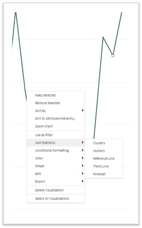
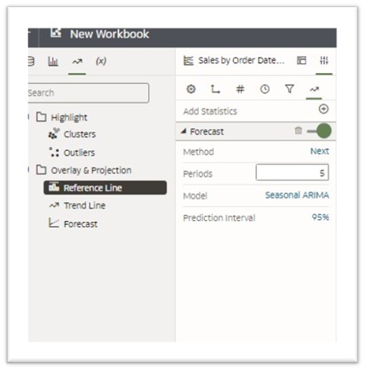
This article provides details about multiple easy-to-use statistical features available in Oracle Analytics Cloud including clusters, outliers, and forecasting. You can add these advanced analytics features by right-clicking the chart, or by using the Analytics functions in the left pane in OAC, as shown in this figure:
- Clusters
Cluster analysis or clustering refers to grouping a set of data points so that data points in the same group (or cluster) are more similar to each other than those in other groups. This method is often used to classify data into groups to make the analysis process easier.
- K-Means Clustering: It’s a popular unsupervised machine learning algorithm. It’s a clustering method used to partition a set of data into a defined (K) number of clusters with the nearest mean. In OAC, you can identify the required number of clusters using the “Groups” entry field.
- Hierarchical Clustering: It’s an unsupervised clustering algorithm that involves creating clusters that have predominant ordering built either by an agglomerative (bottom-up) or a divisive (top-down) approach.
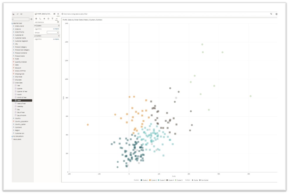
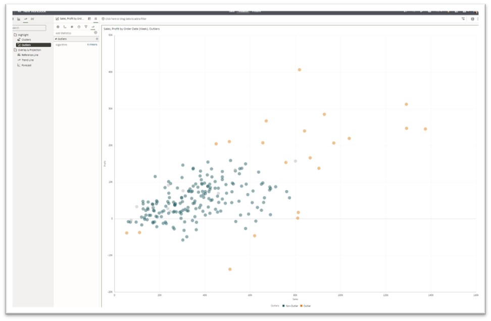
- Outliers
An outlier is data that differs substantially from the rest of the data points. They’re either an error that needs to be excluded from the dataset, or they’re valid data that can reveal insights into special findings in the dataset. OAC offers an option to choose between K-means and Hierarchical algorithms. You see outliers in the chart below in orange, while the rest of the data points are in green.
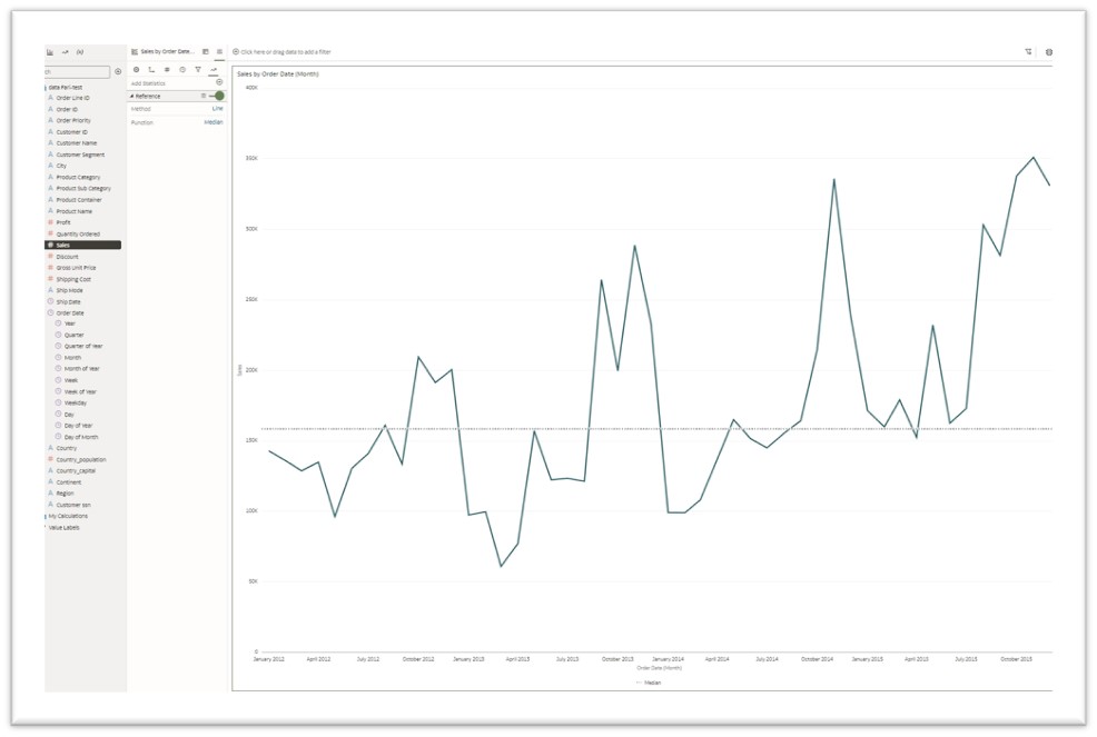
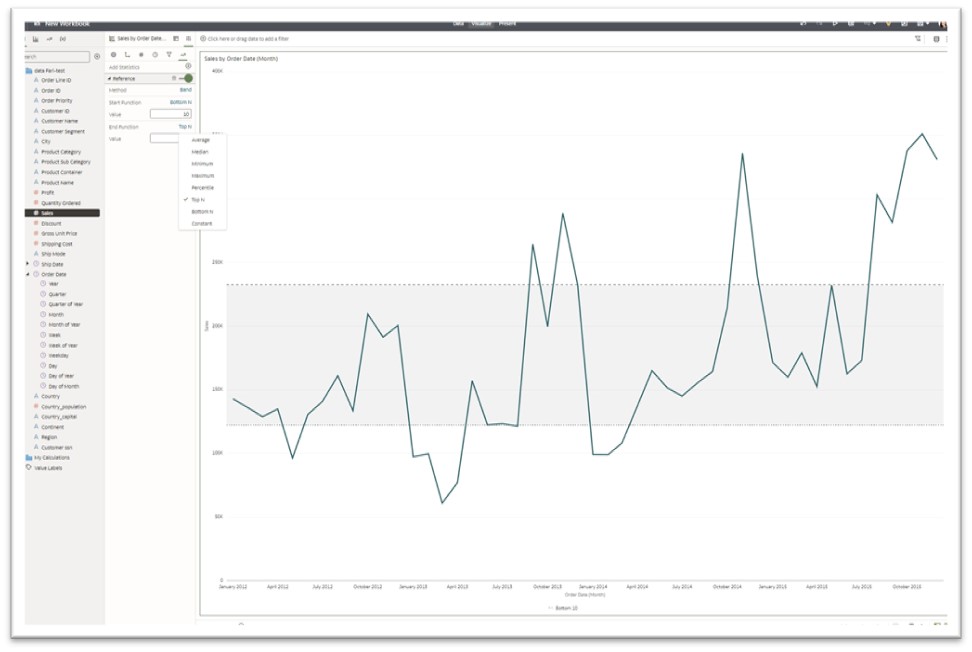
- Reference Line
A reference line is a user-defined vertical or horizontal line in the chart. You can use reference lines to compare or reference the data values according to the selected method described in this list.
- Line: Average-Median-Min-Max-Percentile-Top N-Bottom N-Constant
- Average is calculated by dividing the total of all the values by the number of values.
- Median is the value in the middle of a data set, meaning that 50% of data points have a value smaller or equal to the median and 50% of data points have a value higher or equal to the median.
- Min is the smallest value of a dataset.
- Max is the largest value of a dataset.
- Percentile is a number where a certain percentage of scores fall below that number. K-th percentile means K percentage of data points fall below that number.
- Top N and Bottom N refer to the first and last data points, where N is a value the user selects that can be static or controlled by a parameter.
- Band: Shows a range of data, and you can select percentile, min and max, standard deviation, or constants to set the range.
- Standard deviation is a measurement of the amount of variation or dispersion of a set of values from the mean. A low standard deviation indicates that the values tend to be close to the mean of the set, while a high standard deviation indicates that the values are spread out over a wider range.
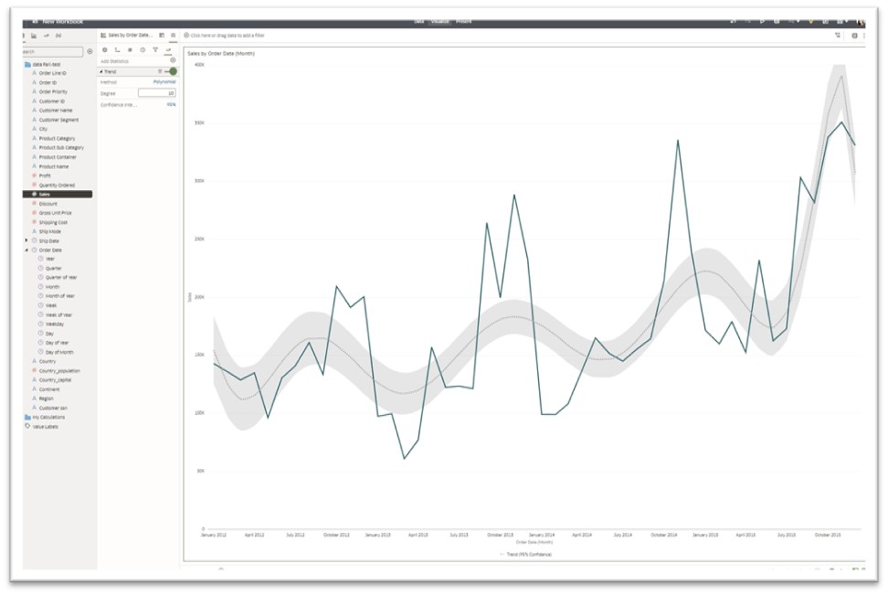
- Trend Line
A trend line is a line drawn on a chart uncovering a pattern within the dataset that can be a linear, polynomial, or exponential trend.
- Linear: A linear trendline usually shows that something is increasing or decreasing at a steady rate, mainly used for datasets with linear trends.
- Polynomial: A polynomial trendline is a curved line that’s used when data fluctuates. An example of its use case is for analyzing gains and losses. The order of the polynomial can be determined by the number of fluctuations in the data.
- Exponential: The exponential trendline is a curved line that illustrates a rise or fall in data values at an increasing rate; therefore the line is usually more curved at one side
When setting up the trendline specifics, you can use the default confidence interval or change it according to your use case.
- Confidence Interval
A confidence interval is a range of estimates for an unknown parameter and is computed at a designated confidence level; the 95% confidence level is the most common, but other levels, such as 90% or 99%, are also used.
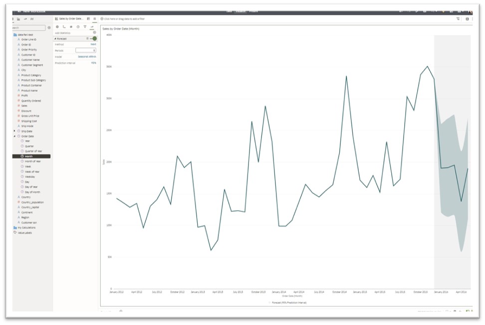
- Forecast
Forecasting is an advanced analytics technique used to predict future trends by studying historical data and past trends.
- Period: Set to 3 by default; however you can change the period to an appropriate time frame applicable to your use case.
- Model: Seasonal ARIMA, ARIMA, ETS
- ARIMA: An autoregressive integrated moving average model is a form of regression analysis that gauges the strength of one dependent variable relative to other changing variables.
- Seasonal ARIMA: Used when there are regular changes in historical data. Seasonality in a time series is a regular pattern of changes that repeats over periods of time.
- ETS: Exponential Triple Smoothing (ETS) is often used in the analysis of time series data.
- Prediction Interval
- A prediction interval is a range of values likely to contain the value of a single new observation given the predicted settings of the predictors. For example, for a 95% prediction interval of [5 10], you can be 95% confident that the next new observation will fall within this range. (A prediction interval is an estimate of an interval in which a future observation will fall, given what has already been observed, with a certain probability.) This can be set to 90%, 95%, and 99%.
Click this link to access Oracle Analytics Help Center and learn more about leveraging the advanced analytics features in OAC:
Enhance Data in Visualizations with Advanced Analytics Functions